Visualization
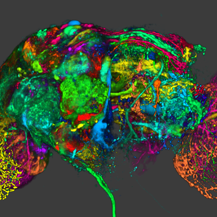
Visualization, sometimes referred to as visual data analysis, uses the graphical representation of data as a means of gaining understanding and insight into the data. Visualization research at SCI has focused on applications spanning computational fluid dynamics, medical imaging and analysis, biomedical data analysis, healthcare data analysis, weather data analysis, poetry, network and graph analysis, financial data analysis, etc.Research involves novel algorithm and technique development to building tools and systems that assist in the comprehension of massive amounts of (scientific) data. We also research the process of creating successful visualizations.
We strongly believe in the role of interactivity in visual data analysis. Therefore, much of our research is concerned with creating visualizations that are intuitive to interact with and also render at interactive rates.
Visualization at SCI includes the academic subfields of Scientific Visualization, Information Visualization and Visual Analytics.

Mike Kirby
Uncertainty Visualization
Alex Lex
Information VisualizationCenters and Labs:
- Visualization Design Lab (VDL)
- CEDMAV
- POWDER Display Wall
- Modeling, Display, and Understanding Uncertainty in Simulations for Policy Decision Making
- Topological Data Analysis for Large Network Visualization
Funded Research Projects:
Publications in Visualization:
  Predicting intent behind selections in scatterplot visualizations K. Gadhave, J. Görtler, Z. Cutler, C. Nobre, O. Deussen, M. Meyer, J.M. Phillips, A. Lex. In Information Visualization, Vol. 20, No. 4, pp. 207-228. 2021. DOI: 10.1177/14738716211038604 Predicting and capturing an analyst’s intent behind a selection in a data visualization is valuable in two scenarios: First, a successful prediction of a pattern an analyst intended to select can be used to auto-complete a partial selection which, in turn, can improve the correctness of the selection. Second, knowing the intent behind a selection can be used to improve recall and reproducibility. In this paper, we introduce methods to infer analyst’s intents behind selections in data visualizations, such as scatterplots. We describe intents based on patterns in the data, and identify algorithms that can capture these patterns. Upon an interactive selection, we compare the selected items with the results of a large set of computed patterns, and use various ranking approaches to identify the best pattern for an analyst’s selection. We store annotations and the metadata to reconstruct a selection, such as the type of algorithm and its parameterization, in a provenance graph. We present a prototype system that implements these methods for tabular data and scatterplots. Analysts can select a prediction to auto-complete partial selections and to seamlessly log their intents. We discuss implications of our approach for reproducibility and reuse of analysis workflows. We evaluate our approach in a crowd-sourced study, where we show that auto-completing selection improves accuracy, and that we can accurately capture pattern-based intent. |
  Investigating In Situ Reduction via Lagrangian Representations for Cosmology and Seismology Applications, S. Sane, C. R. Johnson, H. Childs. In Computational Science -- ICCS 2021, Springer International Publishing, pp. 436--450. 2021. DOI: 10.1007/978-3-030-77961-0_36 Although many types of computational simulations produce time-varying vector fields, subsequent analysis is often limited to single time slices due to excessive costs. Fortunately, a new approach using a Lagrangian representation can enable time-varying vector field analysis while mitigating these costs. With this approach, a Lagrangian representation is calculated while the simulation code is running, and the result is explored after the simulation. Importantly, the effectiveness of this approach varies based on the nature of the vector field, requiring in-depth investigation for each application area. With this study, we evaluate the effectiveness for previously unexplored cosmology and seismology applications. We do this by considering encumbrance (on the simulation) and accuracy (of the reconstructed result). To inform encumbrance, we integrated in situ infrastructure with two simulation codes, and evaluated on representative HPC environments, performing Lagrangian in situ reduction using GPUs as well as CPUs. To inform accuracy, our study conducted a statistical analysis across a range of spatiotemporal configurations as well as a qualitative evaluation. In all, we demonstrate effectiveness for both cosmology and seismology—time-varying vector fields from these domains can be reduced to less than 1% of the total data via Lagrangian representations, while maintaining accurate reconstruction and requiring under 10% of total execution time in over 80% of our experiments. |
  Scalable In Situ Computation of Lagrangian Representations via Local Flow Maps S. Sane, A. Yenpure, R. Bujack, M. Larsen, K. Moreland, C. Garth, C. R. Johnson,, H. Childs. In Eurographics Symposium on Parallel Graphics and Visualization, The Eurographics Association, 2021. DOI: 10.2312/pgv.20211040 In situ computation of Lagrangian flow maps to enable post hoc time-varying vector field analysis has recently become an active area of research. However, the current literature is largely limited to theoretical settings and lacks a solution to address scalability of the technique in distributed memory. To improve scalability, we propose and evaluate the benefits and limitations of a simple, yet novel, performance optimization. Our proposed optimization is a communication-free model resulting in local Lagrangian flow maps, requiring no message passing or synchronization between processes, intrinsically improving scalability, and thereby reducing overall execution time and alleviating the encumbrance placed on simulation codes from communication overheads. To evaluate our approach, we computed Lagrangian flow maps for four time-varying simulation vector fields and investigated how execution time and reconstruction accuracy are impacted by the number of GPUs per compute node, the total number of compute nodes, particles per rank, and storage intervals. Our study consisted of experiments computing Lagrangian flow maps with up to 67M particle trajectories over 500 cycles and used as many as 2048 GPUs across 512 compute nodes. In all, our study contributes an evaluation of a communication-free model as well as a scalability study of computing distributed Lagrangian flow maps at scale using in situ infrastructure on a modern supercomputer. |
  Interactive Analysis for Large Volume Data from Fluorescence Microscopy at Cellular Precision Y. Wan, H.A. Holman, C. Hansen. In Computers & Graphics, Vol. 98, Pergamon, pp. 138-149. 2021. DOI: https://doi.org/10.1016/j.cag.2021.05.006 The main objective for understanding fluorescence microscopy data is to investigate and evaluate the fluorescent signal intensity distributions as well as their spatial relationships across multiple channels. The quantitative analysis of 3D fluorescence microscopy data needs interactive tools for researchers to select and focus on relevant biological structures. We developed an interactive tool based on volume visualization techniques and GPU computing for streamlining rapid data analysis. Our main contribution is the implementation of common data quantification functions on streamed volumes, providing interactive analyses on large data without lengthy preprocessing. Data segmentation and quantification are coupled with brushing and executed at an interactive speed. A large volume is partitioned into data bricks, and only user-selected structures are analyzed to constrain the computational load. We designed a framework to assemble a sequence of GPU programs to handle brick borders and stitch analysis results. Our tool was developed in collaboration with domain experts and has been used to identify cell types. We demonstrate a workflow to analyze cells in vestibular epithelia of transgenic mice. |
 Adaptive Spatially Aware I/O for Multiresolution Particle Data Layouts W. Usher, X. Huang, S. Petruzza, S. Kumar, S. R. Slattery, S. T. Reeve, F. Wang, C. R. Johnson,, V. Pascucci. In IPDPS, 2021. |
  HyperLabels---Browsing of Dense and Hierarchical Molecular 3D Models D Kouřil, T Isenberg, B Kozlíková, M Meyer, E Gröller, I Viola. In IEEE transactions on visualization and computer graphics, IEEE, 2021. DOI: 10.1109/TVCG.2020.2975583 We present a method for the browsing of hierarchical 3D models in which we combine the typical navigation of hierarchical structures in a 2D environment---using clicks on nodes, links, or icons---with a 3D spatial data visualization. Our approach is motivated by large molecular models, for which the traditional single-scale navigational metaphors are not suitable. Multi-scale phenomena, e. g., in astronomy or geography, are complex to navigate due to their large data spaces and multi-level organization. Models from structural biology are in addition also densely crowded in space and scale. Cutaways are needed to show individual model subparts. The camera has to support exploration on the level of a whole virus, as well as on the level of a small molecule. We address these challenges by employing HyperLabels: active labels that---in addition to their annotational role---also support user interaction. Clicks on HyperLabels select the next structure to be explored. Then, we adjust the visualization to showcase the inner composition of the selected subpart and enable further exploration. Finally, we use a breadcrumbs panel for orientation and as a mechanism to traverse upwards in the model hierarchy. We demonstrate our concept of hierarchical 3D model browsing using two exemplary models from meso-scale biology. |


