
Visualization
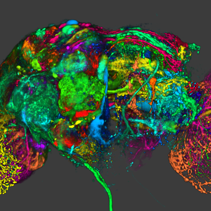
Visualization, sometimes referred to as visual data analysis, uses the graphical representation of data as a means of gaining understanding and insight into the data. Visualization research at SCI has focused on applications spanning computational fluid dynamics, medical imaging and analysis, biomedical data analysis, healthcare data analysis, weather data analysis, poetry, network and graph analysis, financial data analysis, etc.Research involves novel algorithm and technique development to building tools and systems that assist in the comprehension of massive amounts of (scientific) data. We also research the process of creating successful visualizations.
We strongly believe in the role of interactivity in visual data analysis. Therefore, much of our research is concerned with creating visualizations that are intuitive to interact with and also render at interactive rates.
Visualization at SCI includes the academic subfields of Scientific Visualization, Information Visualization and Visual Analytics.


Mike Kirby
Uncertainty Visualization

Alex Lex
Information Visualization
Centers and Labs:
- Visualization Design Lab (VDL)
- CEDMAV
- POWDER Display Wall
- Modeling, Display, and Understanding Uncertainty in Simulations for Policy Decision Making
- Topological Data Analysis for Large Network Visualization
Funded Research Projects:
Publications in Visualization:
  Characterizing Cancer Subtypes using Dual Analysis in Caleydo C. Turkay, A. Lex, M. Streit, H. Pfister,, H. Hauser. In IEEE Computer Graphics and Applications, Vol. 34, No. 2, pp. 38--47. March, 2014. ISSN: 0272-1716 DOI: 10.1109/MCG.2014.1 Dual analysis uses statistics to describe both the dimensions and rows of a high-dimensional dataset. Researchers have integrated it into StratomeX, a Caleydo view for cancer subtype analysis. In addition, significant-difference plots show the elements of a candidate subtype that differ significantly from other subtypes, thus letting analysts characterize subtypes. Analysts can also investigate how data samples relate to their assigned subtype and other groups. This approach lets them create well-defined subtypes based on statistical properties. Three case studies demonstrate the approach's utility, showing how it reproduced findings from a published subtype characterization. |
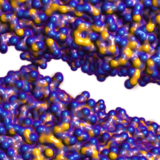
| Mu-8: Visualizing Differences between Proteins and their Families J. Mercer, B. Pandian, A. Lex, N. Bonneel,, H. Pfister. In BMC Proceedings, Vol. 8, No. Suppl 2, pp. S5. Aug, 2014. ISSN: 1753-6561 DOI: 10.1186/1753-6561-8-S2-S5 A complete understanding of the relationship between the amino acid sequence and resulting protein function remains an open problem in the biophysical sciences. Current approaches often rely on diagnosing functionally relevant mutations by determining whether an amino acid frequently occurs at a specific position within the protein family. However, these methods do not account for the biophysical properties and the 3D structure of the protein. We have developed an interactive visualization technique, Mu-8, that provides researchers with a holistic view of the differences of a selected protein with respect to a family of homologous proteins. Mu-8 helps to identify areas of the protein that exhibit: (1) significantly different bio-chemical characteristics, (2) relative conservation in the family, and (3) proximity to other regions that have suspect behavior in the folded protein. |
| Verifying Volume Rendering Using Discretization Error Analysis T. Etiene, D. Jonsson, T. Ropinski, C. Scheidegger, J.L.D. Comba, L. G. Nonato, R. M. Kirby, A. Ynnerman,, C. T. Silva. In IEEE TRANSACTIONS ON VISUALIZATION AND COMPUTER GRAPHICS, Vol. 20, No. 1, IEEE, pp. 140-154. January, 2014. We propose an approach for verification of volume rendering correctness based on an analysis of the volume rendering integral, the basis of most DVR algorithms. With respect to the most common discretization of this continuous model (Riemann summation), we make assumptions about the impact of parameter changes on the rendered results and derive convergence curves describing the expected behavior. Specifically, we progressively refine the number of samples along the ray, the grid size, and the pixel size, and evaluate how the errors observed during refinement compare against the expected approximation errors. We derive the theoretical foundations of our verification approach, explain how to realize it in practice, and discuss its limitations. We also report the errors identified by our approach when applied to two publicly available volume rendering packages. |
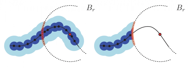
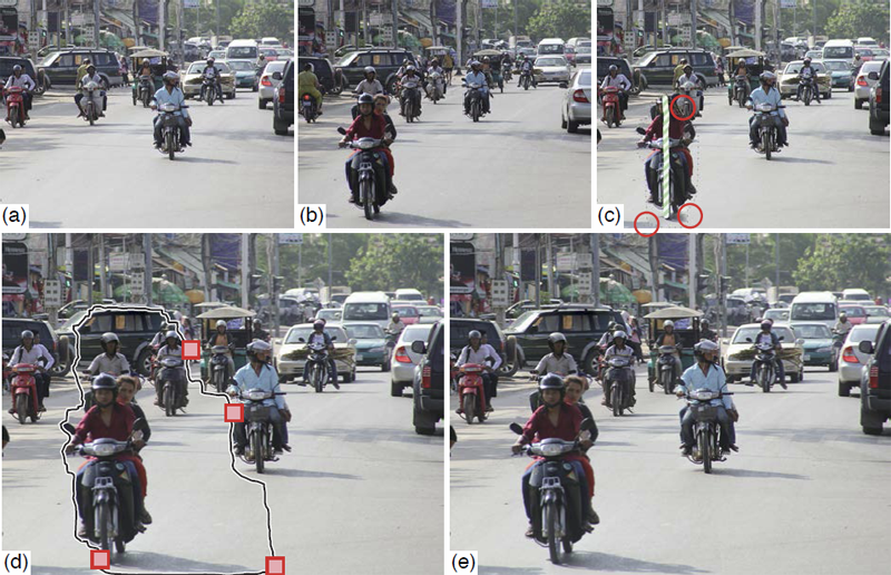
| Curve Boxplot: Generalization of Boxplot for Ensembles of Curves M. Mirzargar, R. Whitaker, R. M. Kirby. In IEEE Transactions on Visualization and Computer Graphics, Vol. 20, No. 12, IEEE, pp. 2654-63. December, 2014. In simulation science, computational scientists often study the behavior of their simulations by repeated solutions with variations in parameters and/or boundary values or initial conditions. Through such simulation ensembles, one can try to understand or quantify the variability or uncertainty in a solution as a function of the various inputs or model assumptions. In response to a growing interest in simulation ensembles, the visualization community has developed a suite of methods for allowing users to observe and understand the properties of these ensembles in an efficient and effective manner. An important aspect of visualizing simulations is the analysis of derived features, often represented as points, surfaces, or curves. In this paper, we present a novel, nonparametric method for summarizing ensembles of 2D and 3D curves. We propose an extension of a method from descriptive statistics, data depth, to curves. We also demonstrate a set of rendering and visualization strategies for showing rank statistics of an ensemble of curves, which is a generalization of traditional whisker plots or boxplots to multidimensional curves. Results are presented for applications in neuroimaging, hurricane forecasting and fluid dynamics |
|
RBF Volume Ray Casting on Multicore and Manycore CPUs A. Knoll, I. Wald, P. Navratil, A. Bowen, K. Reda, M. E. Papka, K. Gaither. In Computer Graphics Forum, Vol. 33, No. 3, Edited by H. Carr and P. Rheingans and H. Schumann, Wiley-Blackwell, pp. 71--80. June, 2014. DOI: 10.1111/cgf.12363 Modern supercomputers enable increasingly large N-body simulations using unstructured point data. The structures implied by these points can be reconstructed implicitly. Direct volume rendering of radial basis function (RBF) kernels in domain-space offers flexible classification and robust feature reconstruction, but achieving performant RBF volume rendering remains a challenge for existing methods on both CPUs and accelerators. In this paper, we present a fast CPU method for direct volume rendering of particle data with RBF kernels. We propose a novel two-pass algorithm: first sampling the RBF field using coherent bounding hierarchy traversal, then subsequently integrating samples along ray segments. Our approach performs interactively for a range of data sets from molecular dynamics and astrophysics up to 82 million particles. It does not rely on level of detail or subsampling, and offers better reconstruction quality than structured volume rendering of the same data, exhibiting comparable performance and requiring no additional preprocessing or memory footprint other than the BVH. Lastly, our technique enables multi-field, multi-material classification of particle data, providing better insight and analysis. |
|
Approximating Local Homology from Samples P. Skraba, Bei Wang. In Proceedings 25th Annual ACM-SIAM Symposium on Discrete Algorithms (SODA), pp. 174-192. 2014. Recently, multi-scale notions of local homology (a variant of persistent homology) have been used to study the local structure of spaces around a given point from a point cloud sample. Current reconstruction guarantees rely on constructing embedded complexes which become diffcult to construct in higher dimensions. We show that the persistence diagrams used for estimating local homology can be approximated using families of Vietoris-Rips complexes, whose simpler construction are robust in any dimension. To the best of our knowledge, our results, for the first time make applications based on local homology, such as stratification learning, feasible in high dimensions. |
|
Overview and State-of-the-Art of Uncertainty Visualization G.P. Bonneau, H.C. Hege, C.R. Johnson, M.M. Oliveira, K. Potter, P. Rheingans, T. Schultz. In Scientific Visualization: Uncertainty, Multifield, Biomedical, and Scalable Visualization, Edited by M. Chen and H. Hagen and C.D. Hansen and C.R. Johnson and A. Kauffman, Springer-Verlag, pp. 3--27. 2014. ISBN: 978-1-4471-6496-8 ISSN: 1612-3786 DOI: 10.1007/978-1-4471-6497-5_1 The goal of visualization is to effectively and accurately communicate data. Visualization research has often overlooked the errors and uncertainty which accompany the scientific process and describe key characteristics used to fully understand the data. The lack of these representations can be attributed, in part, to the inherent difficulty in defining, characterizing, and controlling this uncertainty, and in part, to the difficulty in including additional visual metaphors in a well designed, potent display. However, the exclusion of this information cripples the use of visualization as a decision making tool due to the fact that the display is no longer a true representation of the data. This systematic omission of uncertainty commands fundamental research within the visualization community to address, integrate, and expect uncertainty information. In this chapter, we outline sources and models of uncertainty, give an overview of the state-of-the-art, provide general guidelines, outline small exemplary applications, and finally, discuss open problems in uncertainty visualization. |
|
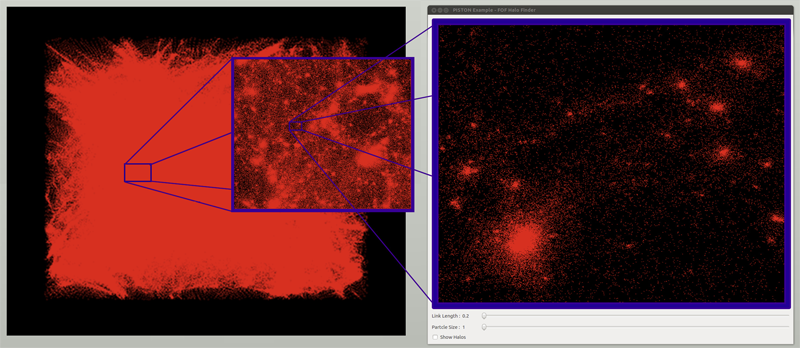
Data-Parallel Halo Finding with Variable Linking Lengths W. Widanagamaachchi, P.-T. Bremer, C. Sewell, L.-T. Lo; J. Ahrens, V. Pascucci. In Proceedings of the 2014 IEEE 4th Symposium on Large Data Analysis and Visualization (LDAV), pp. 27--34. November, 2014. State-of-the-art cosmological simulations regularly contain billions of particles, providing scientists the opportunity to study the evolution of the Universe in great detail. However, the rate at which these simulations generate data severely taxes existing analysis techniques. Therefore, developing new scalable alternatives is essential for continued scientific progress. Here, we present a dataparallel, friends-of-friends halo finding algorithm that provides unprecedented flexibility in the analysis by extracting multiple linking lengths. Even for a single linking length, it is as fast as the existing techniques, and is portable to multi-threaded many-core systems as well as co-processing resources. Our system is implemented using PISTON and is coupled to an interactive analysis environment used to study halos at different linking lengths and track their evolution over time. |
|
Towards Paint and Click: Unified Interactions for Image Boundaries SCI Technical Report, B. Summa, A.A. Gooch, G. Scorzelli, V. Pascucci. No. UUSCI-2014-004, SCI Institute, University of Utah, December, 2014. Image boundaries are a fundamental component of many interactive digital photography techniques, enabling applications such as segmentation, panoramas, and seamless image composition. Interactions for image boundaries often rely on two complimentary but separate approaches: editing via painting or clicking constraints. In this work, we provide a novel, unified approach for interactive editing of pairwise image boundaries that combines the ease of painting with the direct control of constraints. Rather than a sequential coupling, this new formulation allows full use of both interactions simultaneously, giving users unprecedented flexibility for fast boundary editing. To enable this new approach, we provide technical advancements. In particular, we detail a reformulation of image boundaries as a problem of finding cycles, expanding and correcting limitations of the previous work. Our new formulation provides boundary solutions for painted regions with performance on par with state-of-the-art specialized, paint-only techniques. In addition, we provide instantaneous exploration of the boundary solution space with user constraints. Furthermore, we show how to increase performance and decrease memory consumption through novel strategies and/or optional approximations. Finally, we provide examples of common graphics applications impacted by our new approach. |
| In-situ feature extraction of large scale combustion simulations using segmented merge trees A.G. Landge, V. Pascucci, A. Gyulassy, J.C. Bennett, H. Kolla, J. Chen, P.-T. Bremer. In Proceedings of the International Conference for High Performance Computing, Networking, Storage and Analysis (SC 2014), New Orleans, Louisana, IEEE Press, Piscataway, NJ, USA pp. 1020--1031. 2014. ISBN: 978-1-4799-5500-8 DOI: 10.1109/SC.2014.88 The ever increasing amount of data generated by scientific simulations coupled with system I/O constraints are fueling a need for in-situ analysis techniques. Of particular interest are approaches that produce reduced data representations while maintaining the ability to redefine, extract, and study features in a post-process to obtain scientific insights. |

|
Efficient I/O and storage of adaptive-resolution data S. Kumar, J. Edwards, P.-T. Bremer, A. Knoll, C. Christensen, V. Vishwanath, P. Carns, J.A. Schmidt, V. Pascucci. In Proceedings of the International Conference for High Performance Computing, Networking, Storage and Analysis, IEEE Press, pp. 413--423. 2014. DOI: 10.1109/SC.2014.39 We present an efficient, flexible, adaptive-resolution I/O framework that is suitable for both uniform and Adaptive Mesh Refinement (AMR) simulations. In an AMR setting, current solutions typically represent each resolution level as an independent grid which often results in inefficient storage and performance. Our technique coalesces domain data into a unified, multiresolution representation with fast, spatially aggregated I/O. Furthermore, our framework easily extends to importance-driven storage of uniform grids, for example, by storing regions of interest at full resolution and nonessential regions at lower resolution for visualization or analysis. Our framework, which is an extension of the PIDX framework, achieves state of the art disk usage and I/O performance regardless of resolution of the data, regions of interest, and the number of processes that generated the data. We demonstrate the scalability and efficiency of our framework using the Uintah and S3D large-scale combustion codes on the Mira and Edison supercomputers. |
|
Robust Detection of Singularities in Vector Fields H. Bhatia, A. Gyulassy, H. Wang, P.-T. Bremer, V. Pascucci . In Topological Methods in Data Analysis and Visualization III, Mathematics and Visualization, Springer International Publishing, pp. 3--18. March, 2014. DOI: 10.1007/978-3-319-04099-8_1 Recent advances in computational science enable the creation of massive datasets of ever increasing resolution and complexity. Dealing effectively with such data requires new analysis techniques that are provably robust and that generate reproducible results on any machine. In this context, combinatorial methods become particularly attractive, as they are not sensitive to numerical instabilities or the details of a particular implementation. We introduce a robust method for detecting singularities in vector fields. We establish, in combinatorial terms, necessary and sufficient conditions for the existence of a critical point in a cell of a simplicial mesh for a large class of interpolation functions. These conditions are entirely local and lead to a provably consistent and practical algorithm to identify cells containing singularities. |
Scientific Visualization: Uncertainty, Multifield, Biomedical, and Scalable Visualization, C.D. Hansen, M. Chen, C.R. Johnson, A.E. Kaufman, H. Hagen (Eds.). Mathematics and Visualization, Springer, 2014. ISBN: 978-1-4471-6496-8 |
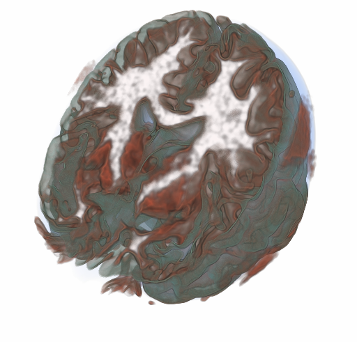
| Surface boxplots M.G. Genton, C.R. Johnson, K. Potter, G. Stenchikov, Y. Sun. In Stat Journal, Vol. 3, No. 1, pp. 1--11. 2014. In this paper, we introduce a surface boxplot as a tool for visualization and exploratory analysis of samples of images. First, we use the notion of volume depth to order the images viewed as surfaces. In particular, we define the median image. We use an exact and fast algorithm for the ranking of the images. This allows us to detect potential outlying images that often contain interesting features not present in most of the images. Second, we build a graphical tool to visualize the surface boxplot and its various characteristics. A graph and histogram of the volume depth values allow us to identify images of interest. The code is available in the supporting information of this paper. We apply our surface boxplot to a sample of brain images and to a sample of climate model outputs. |
|
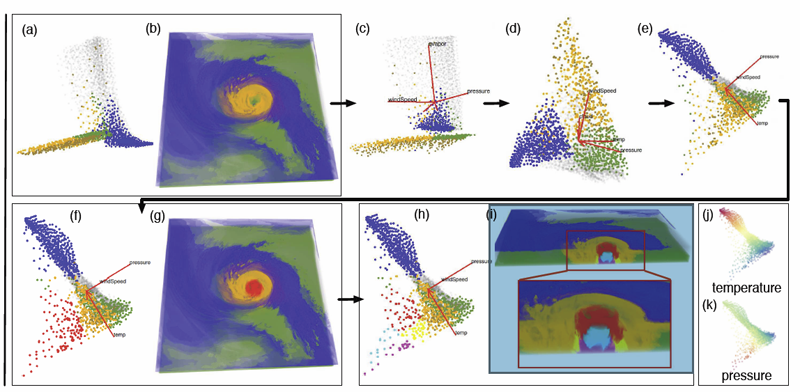
Multivariate Volume Visualization through Dynamic Projections Shusen Liu, Bei Wang, J.J. Thiagarajan, P.-T. Bremer, V. Pascucci. In Proceedings of the IEEE Symposium on Large Data Analysis and Visualization (LDAV), 2014. We propose a multivariate volume visualization framework that tightly couples dynamic projections with a high-dimensional transfer function design for interactive volume visualization. We assume that the complex, high-dimensional data in the attribute space can be well-represented through a collection of low-dimensional linear subspaces, and embed the data points in a variety of 2D views created as projections onto these subspaces. Through dynamic projections, we present animated transitions between different views to help the user navigate and explore the attribute space for effective transfer function design. Our framework not only provides a more intuitive understanding of the attribute space but also allows the design of the transfer function under multiple dynamic views, which is more flexible than being restricted to a single static view of the data. For large volumetric datasets, we maintain interactivity during the transfer function design via intelligent sampling and scalable clustering. Using examples in combustion and climate simulations, we demonstrate how our framework can be used to visualize interesting structures in the volumetric space. |
| Visual Exploration of High-Dimensional Data: Subspace Analysis through Dynamic Projections SCI Technical Report, Shusen Liu, Bei Wang, J.J. Thiagarajan, P.-T. Bremer, V. Pascucci. No. UUSCI-2014-003, SCI Institute, University of Utah, 2014. Understanding high-dimensional data is rapidly becoming a central challenge in many areas of science and engineering. Most current techniques either rely on manifold learning based techniques which typically create a single embedding of the data or on subspace selection to find subsets of the original attributes that highlight the structure. However, the former creates a single, difficult-to-interpret view and assumes the data to be drawn from a single manifold, while the latter is limited to axis-aligned projections with restrictive viewing angles. Instead, we introduce ideas based on subspace clustering that can faithfully represent more complex data than the axis-aligned projections, yet do not assume the data to lie on a single manifold. In particular, subspace clustering assumes that the data can be represented by a union of low-dimensional subspaces, which can subsequently be used for analysis and visualization. In this paper, we introduce new techniques to reliably estimate both the intrinsic dimension and the linear basis of a mixture of subspaces extracted through subspace clustering. We show that the resulting bases represent the high-dimensional structures more reliably than traditional approaches. Subsequently, we use the bases to define different “viewpoints”, i.e., different projections onto pairs of basis vectors, from which to visualize the data. While more intuitive than non-linear projections, interpreting linear subspaces in terms of the original dimensions can still be challenging. To address this problem, we present new, animated transitions between different views to help the user navigate and explore the high-dimensional space. More specifically, we introduce the view transition graph which contains nodes for each subspace viewpoint and edges for potential transition between views. The transition graph enables users to explore both the structure within a subspace and the relations between different subspaces, for better understanding of the data. Using a number of case studies on well-know reference datasets, we demonstrate that the interactive exploration through such dynamic projections provides additional insights not readily available from existing tools. Keywords: High-dimensional data, Subspace, Dynamic projection |
|
Design Activity Framework for Visualization Design S. McKenna, D. Mazur, J. Agutter, M.D. Meyer. In IEEE Transactions on Visualization and Computer Graphics (TVCG), 2014. An important aspect in visualization design is the connection between what a designer does and the decisions the designer makes. Existing design process models, however, do not explicitly link back to models for visualization design decisions. We bridge this gap by introducing the design activity framework, a process model that explicitly connects to the nested model, a well-known visualization design decision model. The framework includes four overlapping activities that characterize the design process, with each activity explicating outcomes related to the nested model. Additionally, we describe and characterize a list of exemplar methods and how they overlap among these activities. The design activity framework is the result of reflective discussions from a collaboration on a visualization redesign project, the details of which we describe to ground the framework in a real-world design process. Lastly, from this redesign project we provide several research outcomes in the domain of cybersecurity, including an extended data abstraction and rich opportunities for future visualization research. Keywords: Design, frameworks, process, cybersecurity, nested model, decisions, models, evaluation, visualization |

|
Information Visualization for Science and Policy: Engaging Users and Avoiding Bias G. McInerny, M. Chen, R. Freeman, D. Gavaghan, M.D. Meyer, F. Rowland, D. Spiegelhalter, M. Steganer, G. Tessarolo, J. Hortal. In Trends in Ecology & Evolution, Vol. 29, No. 3, pp. 148--157. 2014. DOI: 10.1016/j.tree.2014.01.003 Visualisations and graphics are fundamental to studying complex subject matter. However, beyond acknowledging this value, scientists and science-policy programmes rarely consider how visualisations can enable discovery, create engaging and robust reporting, or support online resources. Producing accessible and unbiased visualisations from complicated, uncertain data requires expertise and knowledge from science, policy, computing, and design. However, visualisation is rarely found in our scientific training, organisations, or collaborations. As new policy programmes develop [e.g., the Intergovernmental Platform on Biodiversity and Ecosystem Services (IPBES)], we need information visualisation to permeate increasingly both the work of scientists and science policy. The alternative is increased potential for missed discoveries, miscommunications, and, at worst, creating a bias towards the research that is easiest to display. |
|
Reflections on How Designers Design With Data A. Bigelow, S. Drucker, D. Fisher, M.D. Meyer. In Proceedings of the ACM International Conference on Advanced Visual Interfaces (AVI), Note: Awarded Best Paper!, 2014. In recent years many popular data visualizations have emerged that are created largely by designers whose main area of expertise is not computer science. Designers generate these visualizations using a handful of design tools and environments. To better inform the development of tools intended for designers working with data, we set out to understand designers' challenges and perspectives. We interviewed professional designers, conducted observations of designers working with data in the lab, and observed designers working with data in team settings in the wild. A set of patterns emerged from these observations from which we extract a number of themes that provide a new perspective on design considerations for visualization tool creators, as well as on known engineering problems. Keywords: Visualization, infographics, design practice |
|
The Nested Blocks and Guidelines Model M.D. Meyer, M. Sedlmair, P.S. Quinan, T. Munzner. In Journal of Information Visualization, Special Issue on Evaluation (BELIV), 2014. We propose the nested blocks and guidelines model (NBGM) for the design and validation of visualization systems. The NBGM extends the previously proposed four-level nested model by adding finer grained structure within each level, providing explicit mechanisms to capture and discuss design decision rationale. Blocks are the outcomes of the design process at a specific level, and guidelines discuss relationships between these blocks. Blocks at the algorithm and technique levels describe design choices, as do data blocks at the abstraction level, whereas task abstraction blocks and domain situation blocks are identified as the outcome of the designer's understanding of the requirements. In the NBGM, there are two types of guidelines: within-level guidelines provide comparisons for blocks within the same level, while between-level guidelines provide mappings between adjacent levels of design. We analyze several recent papers using the NBGM to provide concrete examples of how a researcher can use blocks and guidelines to describe and evaluate visualization research. We also discuss the NBGM with respect to other design models to clarify its role in visualization design. Using the NBGM, we pinpoint two implications for visualization evaluation. First, comparison of blocks at the domain level must occur implicitly downstream at the abstraction level; and second, comparison between blocks must take into account both upstream assumptions and downstream requirements. Finally, we use the model to analyze two open problems: the need for mid-level task taxonomies to fill in the task blocks at the abstraction level, as well as the need for more guidelines mapping between the algorithm and technique levels. |