

Visualization
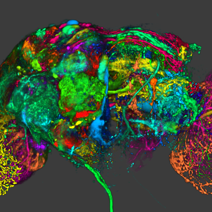
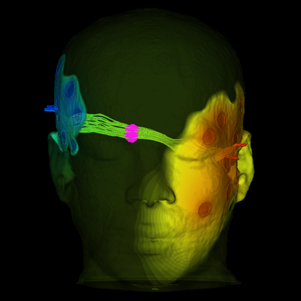
Visualization, sometimes referred to as visual data analysis, uses the graphical representation of data as a means of gaining understanding and insight into the data. Visualization research at SCI has focused on applications spanning computational fluid dynamics, medical imaging and analysis, biomedical data analysis, healthcare data analysis, weather data analysis, poetry, network and graph analysis, financial data analysis, etc.Research involves novel algorithm and technique development to building tools and systems that assist in the comprehension of massive amounts of (scientific) data. We also research the process of creating successful visualizations.
We strongly believe in the role of interactivity in visual data analysis. Therefore, much of our research is concerned with creating visualizations that are intuitive to interact with and also render at interactive rates.
Visualization at SCI includes the academic subfields of Scientific Visualization, Information Visualization and Visual Analytics.


Mike Kirby
Uncertainty Visualization

Alex Lex
Information Visualization
Centers and Labs:
- Visualization Design Lab (VDL)
- CEDMAV
- POWDER Display Wall
- Modeling, Display, and Understanding Uncertainty in Simulations for Policy Decision Making
- Topological Data Analysis for Large Network Visualization
Funded Research Projects:
Publications in Visualization:
  Advisory Committee for CyberInfrastructure Task Force on Software for Science and Engineering D. Keyes, V. Taylor, T. Hey, S. Feldman, G. Allen, P. Colella, P. Cummings, F. Darema, J. Dongarra, T. Dunning, M. Ellisman, I. Foster, W. Gropp, C.R. Johnson, C. Kamath, R. Madduri, M. Mascagni, S.G. Parker, P. Raghavan, A. Trefethen, S. Valcourt, A. Patra, F. Choudhury, C. Cooper, P. McCartney, M. Parashar, T. Russell, B. Schneider, J. Schopf, N. Sharp. Note: NSF Report, 2011. The Software for Science and Engineering (SSE) Task Force commenced in June 2009 with a charge that consisted of the following three elements: Identify specific needs and opportunities across the spectrum of scientific software infrastructure. Characterize the specific needs and analyze technical gaps and opportunities for NSF to meet those needs through individual and systemic approaches. Design responsive approaches. Develop initiatives and programs led (or co-led) by NSF to grow, develop, and sustain the software infrastructure needed to support NSF’s mission of transformative research and innovation leading to scientific leadership and technological competitiveness. Address issues of institutional barriers. Anticipate, analyze and address both institutional and exogenous barriers to NSF’s promotion of such an infrastructure.The SSE Task Force members participated in bi-weekly telecons to address the given charge. The telecons often included additional distinguished members of the scientific community beyond the task force membership engaged in software issues, as well as personnel from federal agencies outside of NSF who manage software programs. It was quickly acknowledged that a number of reports loosely and tightly related to SSE existed and should be leveraged. By September 2009, the task formed had formed three subcommittees focused on the following topics: (1) compute-intensive science, (2) data-intensive science, and (3) software evolution. |
|
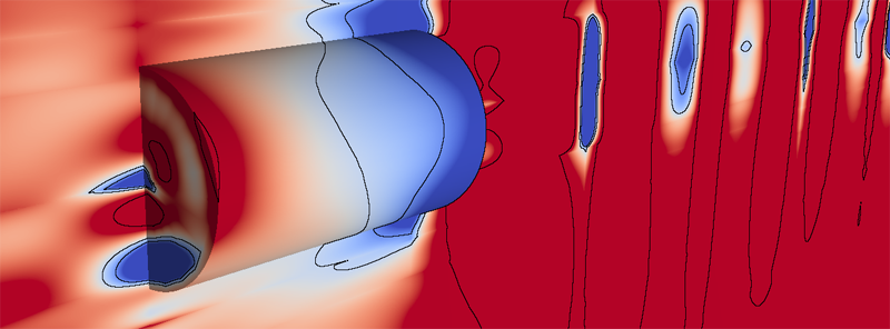
Visualization of Covariance and Cross-covariance Field C. Yang, D. Xiu, R.M. Kirby. In International Journal for Uncertainty Quantification, Vol. 3, No. 1, pp. 25--38. 2011. DOI: 10.1615/Int.J.UncertaintyQuantification.2011003369 We present a numerical technique to visualize covariance and cross-covariance fields of a stochastic simulation. The method is local in the sense that it demonstrates the covariance structure of the solution at a point with its neighboring locations. When coupled with an efficient stochastic simulation solver, our framework allows one to effectively concurrently visualize both the mean and (cross-)covariance information for two-dimensional (spatial) simulation results. Most importantly, the visualization provides the scientist a means to identify interesting correlation structure of the solution field. The mathematical setup is discussed, along with several examples to demonstrate the efficacy of this approach. Keywords: netl |
|
Consistent Approximation of Local Flow Behavior for 2D Vector Fields S. Jadhav, H. Bhatia, P.-T. Bremer, J.A. Levine, L.G. Nonato, V. Pascucci. In Mathematics and Visualization, Springer, pp. 141--159. Nov, 2011. DOI: 10.1007/978-3-642-23175-9 10 Typically, vector fields are stored as a set of sample vectors at discrete locations. Vector values at unsampled points are defined by interpolating some subset of the known sample values. In this work, we consider two-dimensional domains represented as triangular meshes with samples at all vertices, and vector values on the interior of each triangle are computed by piecewise linear interpolation. Many of the commonly used techniques for studying properties of the vector field require integration techniques that are prone to inconsistent results. Analysis based on such inconsistent results may lead to incorrect conclusions about the data. For example, vector field visualization techniques integrate the paths of massless particles (streamlines) in the flow or advect a texture using line integral convolution (LIC). Techniques like computation of the topological skeleton of a vector field, require integrating separatrices, which are streamlines that asymptotically bound regions where the flow behaves differently. Since these integrations may lead to compound numerical errors, the computed streamlines may intersect, violating some of their fundamental properties such as being pairwise disjoint. Detecting these computational artifacts to allow further analysis to proceed normally remains a significant challenge. |
| Direct Isosurface Visualization of Hex-Based High-Order Geometry and Attribute Representations T. Martin, E. Cohen, R.M. Kirby. In IEEE Transactions on Visualization and Computer Graphics (TVCG), Vol. PP, No. 99, pp. 1--14. 2011. ISSN: 1077-2626 DOI: 10.1109/TVCG.2011.103 In this paper, we present a novel isosurface visualization technique that guarantees the accuarate visualization of isosurfaces with complex attribute data defined on (un-)structured (curvi-)linear hexahedral grids. Isosurfaces of high-order hexahedralbased finite element solutions on both uniform grids (including MRI and CT scans) and more complex geometry represent a domain of interest that can be rendered using our algorithm. Additionally, our technique can be used to directly visualize solutions and attributes in isogeometric analysis, an area based on trivariate high-order NURBS (Non-Uniform Rational B-splines) geometry and attribute representations for the analysis. Furthermore, our technique can be used to visualize isosurfaces of algebraic functions. Our approach combines subdivision and numerical root-finding to form a robust and efficient isosurface visualization algorithm that does not miss surface features, while finding all intersections between a view frustum and desired isosurfaces. This allows the use of view-independent transparency in the rendering process. We demonstrate our technique through a straightforward CPU implementation on both complexstructured and complex-unstructured geometry with high-order simulation solutions, isosurfaces of medical data sets, and isosurfaces of algebraic functions. |
|
Topology Verfication for Isosurface Extraction T. Etiene, L.G. Nonato, C. Scheidegger, J. Tierny, T.J. Peters, V. Pascucci, R.M. Kirby, C.T. Silva. In IEEE Transactions on Visualization and Computer Graphics, pp. (accepted). 2011. The broad goals of verifiable visualization rely on correct algorithmic implementations. We extend a framework for verification of isosurfacing implementations to check topological properties. Specifically, we use stratified Morse theory and digital topology to design algorithms which verify topological invariants. Our extended framework reveals unexpected behavior and coding mistakes in popular publicly-available isosurface codes. |
|
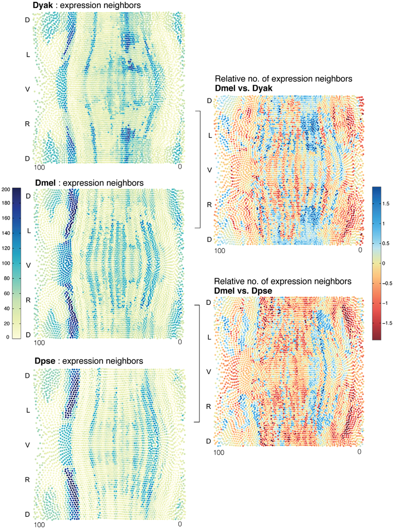
A Conservered Developmental Patterning Network Produces Quantitatively Different Output in Multiple Species of Drosophila C. Fowlkes, K. Eckenrode, M. Bragdon, M.D. Meyer, Z. Wunderlich, L. Simirenko, C. Luengo, S. Keranen, C. Henriquez, D. Knowles, M. Biggin, M. Eisen, A. DePace. In PLoS Genetics, Vol. 7, No. 10:e1002346, pp. 17 pages. October, 2011. Differences in the level, timing, or location of gene expression can contribute to alternative phenotypes at the molecular and organismal level. Understanding the origins of expression differences is complicated by the fact that organismal morphology and gene regulatory networks could potentially vary even between closely related species. To assess the scope of such changes, we used high-resolution imaging methods to measure mRNA expression in blastoderm embryos of Drosophila yakuba and Drosophila pseudoobscura and assembled these data into cellular resolution atlases, where expression levels for 13 genes in the segmentation network are averaged into species-specific, cellular resolution morphological frameworks. We demonstrate that the blastoderm embryos of these species differ in their morphology in terms of size, shape, and number of nuclei. We present an approach to compare cellular gene expression patterns between species, while accounting for varying embryo morphology, and apply it to our data and an equivalent dataset for Drosophila melanogaster. Our analysis reveals that all individual genes differ quantitatively in their spatio-temporal expression patterns between these species, primarily in terms of their relative position and dynamics. Despite many small quantitative differences, cellular gene expression profiles for the whole set of genes examined are largely similar. This suggests that cell types at this stage of development are conserved, though they can differ in their relative position by up to 3-4 cell widths and in their relative proportion between species by as much as 5-fold. Quantitative differences in the dynamics and relative level of a subset of genes between corresponding cell types may reflect altered regulatory functions between species. Our results emphasize that transcriptional networks can diverge over short evolutionary timescales and that even small changes can lead to distinct output in terms of the placement and number of equivalent cells. |

|
Multi-Resolution-Display System for Virtual Reality Setups J. Grueninger, H. Hoffman, U. Kloos, J. Krüger. In Proceedings of the 14th International Conference on Human-Computer Interaction, HCI International, Lecture Notes in Computer Science, Vol. 6779/2011, pp. 180--189. 2011. DOI: 10.1007/978-3-642-21716-6_19 Most large-area video projection systems offer only limited spacial resolution. Consequently, images of detailed scenery cannot be displayed at full fidelity. A possible but significantly more costly strategy is a tiled projection display. If this solution is not feasible then either aliasing occurs or some anti-aliasing method is used at the cost of reduced scene quality. In this paper we describe a novel cost effective multi-resolution display system. It allows users to select any part of a stereoscopic projection and view it in significantly higher resolution than possible with the standard projection alone. To achieve this, a pair of video projectors, which can be moved by stepper motors, project a high-resolution inset into a small portion of the low-resolution image. To avoid crosstalk between the low and high resolution projections, a mask is rendered into the low resolution scene to black out the area on the screen that is covered by the inlay. To demonstrate the effectiveness of our multi-resolution display setup it has been integrated into a number of real life scenarios: a virtual factory, an airplane cabin simulation, and a focus and context volume visualization application (see Figure 1). |
|
Visualization of Discrete Gradient Construction (Multimedia submission) Attila Gyulassy, J.A. Levine, V. Pascucci. In Proceedings of the 27th Symposium on Computational Geometry, Paris, France, ACM, pp. 289--290. June, 2011. DOI: 10.1145/1998196.1998241 This video presents a visualization of a recent algorithm to compute discrete gradient fields on regular cell complexes [3]. Discrete gradient fields are used in practical methods that robustly translate smooth Morse theory to combinatorial domains. We describe the stages of the algorithm, highlighting both its simplicity and generality. |
|
GPU-Based Interactive Cut-Surface Extraction From High-0rder Finite Element Fields B. Nelson, R. Haimes, R.M. Kirby. In IEEE Transactions on Visualization and Computer Graphics (IEEE Visualization Issue), Vol. 17, No. 12, pp. 1803--1811. 2011. We present a GPU-based ray-tracing system for the accurate and interactive visualization of cut-surfaces through 3D simulations of physical processes created from spectral/hp high-order finite element methods. When used by the numerical analyst to debug the solver, the ability for the imagery to precisely reflect the data is critical. In practice, the investigator interactively selects from a palette of visualization tools to construct a scene that can answer a query of the data. This is effective as long as the implicit contract of image quality between the individual and the visualization system is upheld. OpenGL rendering of scientific visualizations has worked remarkably well for exploratory visualization for most solver results. This is due to the consistency between the use of first-order representations in the simulation and the linear assumptions inherent in OpenGL (planar fragments and color-space interpolation). Unfortunately, the contract is broken when the solver discretization is of higher-order. There have been attempts to mitigate this through the use of spatial adaptation and/or texture mapping. These methods do a better job of approximating what the imagery should be but are not exact and tend to be view-dependent. This paper introduces new rendering mechanisms that specifically deal with the kinds of native data generated by high-order finite element solvers. The exploratory visualization tools are reassessed and cast in this system with the focus on image accuracy. This is accomplished in a GPU setting to ensure interactivity. |
| Flow Visualization with Quantified Spatial and Temporal Errors using Edge Maps H. Bhatia, S. Jadhav, P.-T. Bremer, G. Chen, J.A. Levine, L.G. Nonato, V. Pascucci. In IEEE Transactions on Visualization and Computer Graphics (TVCG), Vol. 18, No. 9, IEEE Society, pp. 1383--1396. 2011. DOI: 10.1109/TVCG.2011.265 |
| Asymmetric Tensor Field Visualization for Surfaces G. Chen, D. Palke, Z. Lin, H. Yeh, P. Vincent, R.S. Laramee, E. Zhang. In IEEE Transactions on Visualization and Computer Graphics, Vol. 17, No. 12, IEEE, pp. 1979-1988. Dec, 2011. DOI: 10.1109/tvcg.2011.170 |
| Combinatorial Vector Field Topology in 3 Dimensions W. Reich, Dominic Schneider, Christian Heine, Alexander Wiebel, Guoning Chen, Gerik Scheuermann. In Mathematical Methods in Biomedical Image Analysis (MMBIA) Proceedings IEEE MMBIA 2012, pp. 47--59. November, 2011. DOI: 10.1007/978-3-642-23175-9_4 In this paper, we present two combinatorial methods to process 3-D steady vector fields, which both use graph algorithms to extract features from the underlying vector field. Combinatorial approaches are known to be less sensitive to noise than extracting individual trajectories. Both of the methods are a straightforward extension of an existing 2-D technique to 3-D fields. We observed that the first technique can generate overly coarse results and therefore we present a second method that works using the same concepts but produces more detailed results. We evaluate our method on a CFD-simulation of a gas furnace chamber. Finally, we discuss several possibilities for categorizing the invariant sets with respect to the flow. |
| Automatic Stream Surface Seeding M. Edmunds, T. McLoughlin, R.S. Laramee, G. Chen, E. Zhang, N. Max. In EUROGRAPHICS 2011 Short Papers, pp. 53--56. 2011. |
| A wildland fire modeling and visualization environment, J. Mandel, J.D. Beezley, A. Kochanski, V.Y. Kondratenko, L. Zhang, E. Anderson, J. Daniels II, C.T. Silva, C.R. Johnson. In Proceedings of the Ninth Symposium on Fire and Forest Meteorology, pp. (published online). 2011. |
| Simple and Efficient Mesh Layout with Space-Filling Curves H.T. Vo, C.T. Silva, L.F. Scheidegger, V. Pascucci. In Journal of Graphics, GPU, and Game Tools, pp. 25--39. 2011. ISSN: 2151-237X |
| Feature-Based Statistical Analysis of Combustion Simulation Data J.C. Bennett, V. Krishnamoorthy, S. Liu, R.W. Grout, E.R. Hawkes, J.H. Chen, J. Shepherd, V. Pascucci, P.-T. Bremer. In IEEE Transactions on Visualization and Computer Graphics, Proceedings of the 2011 IEEE Visualization Conference, Vol. 17, No. 12, pp. 1822--1831. 2011. |
|
Branching and Circular Features in High Dimensional Data Bei Wang, B. Summa, V. Pascucci, M. Vejdemo-Johansson. In IEEE Transactions of Visualization and Computer Graphics (TVCG), Vol. 17, No. 12, pp. 1902--1911. 2011. DOI: 10.1109/TVCG.2011.177 PubMed ID: 22034307 Large observations and simulations in scientific research give rise to high-dimensional data sets that present many challenges and opportunities in data analysis and visualization. Researchers in application domains such as engineering, computational biology, climate study, imaging and motion capture are faced with the problem of how to discover compact representations of high dimensional data while preserving their intrinsic structure. In many applications, the original data is projected onto low-dimensional space via dimensionality reduction techniques prior to modeling. One problem with this approach is that the projection step in the process can fail to preserve structure in the data that is only apparent in high dimensions. Conversely, such techniques may create structural illusions in the projection, implying structure not present in the original high-dimensional data. Our solution is to utilize topological techniques to recover important structures in high-dimensional data that contains non-trivial topology. Specifically, we are interested in high-dimensional branching structures. We construct local circle-valued coordinate functions to represent such features. Subsequently, we perform dimensionality reduction on the data while ensuring such structures are visually preserved. Additionally, we study the effects of global circular structures on visualizations. Our results reveal never-before-seen structures on real-world data sets from a variety of applications. Keywords: Dimensionality reduction, circular coordinates, visualization, topological analysis |
| Combinatorial Laplacian Image Cloning A. Cuadros-Vargas, L.G. Nonato, V. Pascucci. In Proceedings of XXIV Sibgrapi – Conference on Graphics, Patterns and Images, pp. 236--241. 2011. DOI: 10.1109/SIBGRAPI.2011.7 Seamless image cloning has become one of the most important editing operation for photomontage. Recent coordinate-based methods have lessened considerably the computational cost of image cloning, thus enabling interactive applications. However, those techniques still bear severe limitations as to concavities and dynamic shape deformation. In this paper we present novel methodology for image cloning that turns out to be highly efficient in terms of computational times while still being more flexible than existing techniques. Our approach builds on combinatorial Laplacian and fast Cholesky factorization to ensure interactive image manipulation, handling holes, concavities, and dynamic deformations during the cloning process. The provided experimental results show that the proposed technique outperforms existing methods in requisites such as accuracy and flexibility. |
|
Experiences in Disseminating Educational Visualizations N. Andrysco, P. Rosen, V. Popescu, B. Benes, K.R. Gurney. In Lecture Notes in Computer Science (7th International Symposium on Visual Computing), Vol. 2, pp. 239--248. September, 2011. DOI: 10.1007/978-3-642-24031-7_24 Most visualizations produced in academia or industry have a specific niche audience that is well versed in either the often complicated visualization methods or the scientific domain of the data. Sometimes it is useful to produce visualizations that can communicate results to a broad audience that will not have the domain specific knowledge often needed to understand the results. In this work, we present our experiences in disseminating the results of two studies to national audience. The resulting visualizations and press releases allowed the studies’ researchers to educate a national, if not global, audience. |
| An Evaluation of 3-D Scene Exploration Using a Multiperspective Image Framework P. Rosen, V. Popescu. In The Visual Computer, Vol. 27, No. 6-8, Springer-Verlag New York, Inc., pp. 623--632. 2011. DOI: 10.1007/s00371-011-0599-2 PubMed ID: 22661796 PubMed Central ID: PMC3364594 Multiperspective images (MPIs) show more than what is visible from a single viewpoint and are a promising approach for alleviating the problem of occlusions. We present a comprehensive user study that investigates the effectiveness of MPIs for 3-D scene exploration. A total of 47 subjects performed searching, counting, and spatial orientation tasks using both conventional and multiperspective images. We use a flexible MPI framework that allows trading off disocclusion power for image simplicity. The framework also allows rendering MPI images at interactive rates, which enables investigating interactive navigation and dynamic 3-D scenes. The results of our experiments show that MPIs can greatly outperform conventional images. For searching, subjects performed on average 28% faster using an MPI. For counting, accuracy was on average 91% using MPIs as compared to 42% for conventional images. Keywords: Interactive 3-D scene exploration, Navigation, Occlusions, User study, Visual interfaces |