

Visualization
Visualization, sometimes referred to as visual data analysis, uses the graphical representation of data as a means of gaining understanding and insight into the data. Visualization research at SCI has focused on applications spanning computational fluid dynamics, medical imaging and analysis, biomedical data analysis, healthcare data analysis, weather data analysis, poetry, network and graph analysis, financial data analysis, etc.Research involves novel algorithm and technique development to building tools and systems that assist in the comprehension of massive amounts of (scientific) data. We also research the process of creating successful visualizations.
We strongly believe in the role of interactivity in visual data analysis. Therefore, much of our research is concerned with creating visualizations that are intuitive to interact with and also render at interactive rates.
Visualization at SCI includes the academic subfields of Scientific Visualization, Information Visualization and Visual Analytics.


Mike Kirby
Uncertainty Visualization

Alex Lex
Information Visualization
Centers and Labs:
- Visualization Design Lab (VDL)
- CEDMAV
- POWDER Display Wall
- Modeling, Display, and Understanding Uncertainty in Simulations for Policy Decision Making
- Topological Data Analysis for Large Network Visualization
Funded Research Projects:
Publications in Visualization:
|
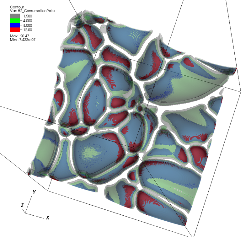
  Uncertainty Visualization in HARDI based on Ensembles of ODFs F. Jiao, J.M. Phillips, Y. Gur, C.R. Johnson. In Proceedings of 2013 IEEE Pacific Visualization Symposium, pp. 193--200. 2013. PubMed ID: 24466504 PubMed Central ID: PMC3898522 In this paper, we propose a new and accurate technique for uncertainty analysis and uncertainty visualization based on fiber orientation distribution function (ODF) glyphs, associated with high angular resolution diffusion imaging (HARDI). Our visualization applies volume rendering techniques to an ensemble of 3D ODF glyphs, which we call SIP functions of diffusion shapes, to capture their variability due to underlying uncertainty. This rendering elucidates the complex heteroscedastic structural variation in these shapes. Furthermore, we quantify the extent of this variation by measuring the fraction of the volume of these shapes, which is consistent across all noise levels, the certain volume ratio. Our uncertainty analysis and visualization framework is then applied to synthetic data, as well as to HARDI human-brain data, to study the impact of various image acquisition parameters and background noise levels on the diffusion shapes. |
| Characterization and modeling of PIDX parallel I/O for performance optimization S. Kumar, A. Saha, V. Vishwanath, P. Carns, J.A. Schmidt, G. Scorzelli, H. Kolla, R. Grout, R. Latham, R. Ross, M.E. Papka, J. Chen, V. Pascucci. In Proceedings of SC13: International Conference for High Performance Computing, Networking, Storage and Analysis, pp. 67. 2013. Parallel I/O library performance can vary greatly in response to user-tunable parameter values such as aggregator count, file count, and aggregation strategy. Unfortunately, manual selection of these values is time consuming and dependent on characteristics of the target machine, the underlying file system, and the dataset itself. Some characteristics, such as the amount of memory per core, can also impose hard constraints on the range of viable parameter values. In this work we address these problems by using machine learning techniques to model the performance of the PIDX parallel I/O library and select appropriate tunable parameter values. We characterize both the network and I/O phases of PIDX on a Cray XE6 as well as an IBM Blue Gene/P system. We use the results of this study to develop a machine learning model for parameter space exploration and performance prediction. Keywords: I/O, Network Characterization, Performance Modeling |
|
Comprehensible Presentation of Topological Information G.H. Weber, K. Beketayev, P.-T. Bremer, B. Hamann, M. Haranczyk, M. Hlawitschka, V. Pascucci. No. LBNL-5693E, Lawrence Berkeley National Laboratory, 2013. Topological information has proven very valuable in the analysis of scientific data. An important challenge that remains is presenting this highly abstract information in a way that it is comprehensible even if one does not have an in-depth background in topology. Furthermore, it is often desirable to combine the structural insight gained by topological analysis with complementary information, such as geometric information. We present an overview over methods that use metaphors to make topological information more accessible to non-expert users, and we demonstrate their applicability to a range of scientific data sets. With the increasingly complex output of exascale simulations, the importance of having effective means of providing a comprehensible, abstract overview over data will grow. The techniques that we present will serve as an important foundation for this purpose. |
|
Topology analysis of time-dependent multi-fluid data using the Reeb graph F. Chen, H. Obermaier, H. Hagen, B. Hamann, J. Tierny, V. Pascucci. In Computer Aided Geometric Design, Vol. 30, No. 6, pp. 557--566. 2013. DOI: 10.1016/j.cagd.2012.03.019 Liquid–liquid extraction is a typical multi-fluid problem in chemical engineering where two types of immiscible fluids are mixed together. Mixing of two-phase fluids results in a time-varying fluid density distribution, quantitatively indicating the presence of liquid phases. For engineers who design extraction devices, it is crucial to understand the density distribution of each fluid, particularly flow regions that have a high concentration of the dispersed phase. The propagation of regions of high density can be studied by examining the topology of isosurfaces of the density data. We present a topology-based approach to track the splitting and merging events of these regions using the Reeb graphs. Time is used as the third dimension in addition to two-dimensional (2D) point-based simulation data. Due to low time resolution of the input data set, a physics-based interpolation scheme is required in order to improve the accuracy of the proposed topology tracking method. The model used for interpolation produces a smooth time-dependent density field by applying Lagrangian-based advection to the given simulated point cloud data, conforming to the physical laws of flow evolution. Using the Reeb graph, the spatial and temporal locations of bifurcation and merging events can be readily identified supporting in-depth analysis of the extraction process. Keywords: Multi-phase fluid, Level set, Topology method, Point-based multi-fluid simulation |
|
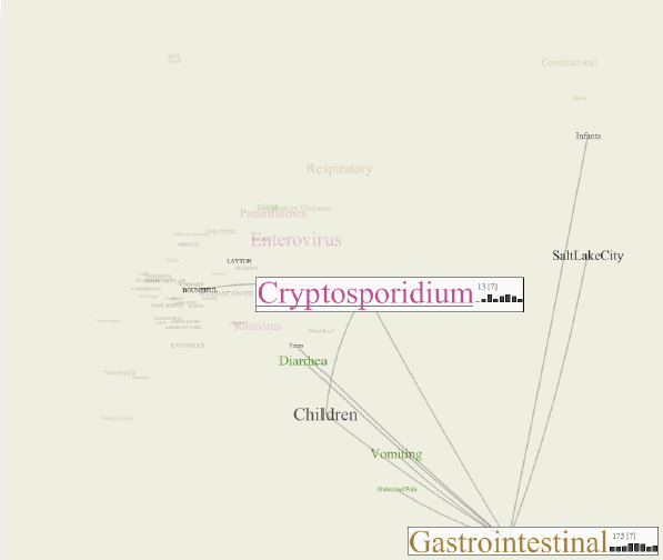
The CommonGround visual paradigm for biosurveillance Y. Livnat, E. Jurrus, A.V. Gundlapalli, P. Gestland. In Proceedings of the 2013 IEEE International Conference on Intelligence and Security Informatics (ISI), pp. 352--357. 2013. ISBN: 978-1-4673-6214-6 DOI: 10.1109/ISI.2013.6578857 Biosurveillance is a critical area in the intelligence community for real-time detection of disease outbreaks. Identifying epidemics enables analysts to detect and monitor disease outbreak that might be spread from natural causes or from possible biological warfare attacks. Containing these events and disseminating alerts requires the ability to rapidly find, classify and track harmful biological signatures. In this paper, we describe a novel visual paradigm to conduct biosurveillance using an Infectious Disease Weather Map. Our system provides a visual common ground in which users can view, explore and discover emerging concepts and correlations such as symptoms, syndromes, pathogens and geographic locations. Keywords: biosurveillance, visualization, interactive exploration, situational awareness |
|
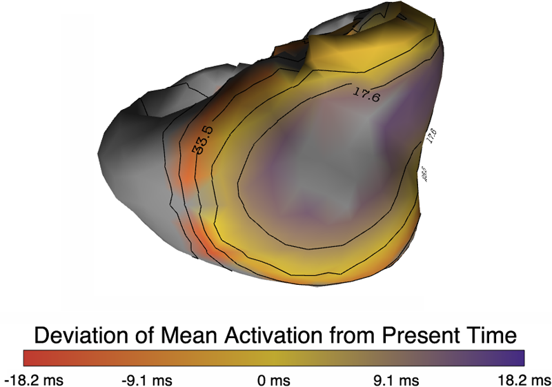
Uncertainty Visualization in Forward and Inverse Cardiac Models B. Burton, B. Erem, K. Potter, P. Rosen, C.R. Johnson, D. Brooks, R.S. Macleod. In Computing in Cardiology CinC, pp. 57--60. 2013. ISSN: 2325-8861 Quantification and visualization of uncertainty in cardiac forward and inverse problems with complex geometries is subject to various challenges. Specific to visualization is the observation that occlusion and clutter obscure important regions of interest, making visual assessment difficult. In order to overcome these limitations in uncertainty visualization, we have developed and implemented a collection of novel approaches. To highlight the utility of these techniques, we evaluated the uncertainty associated with two examples of modeling myocardial activity. In one case we studied cardiac potentials during the repolarization phase as a function of variability in tissue conductivities of the ischemic heart (forward case). In a second case, we evaluated uncertainty in reconstructed activation times on the epicardium resulting from variation in the control parameter of Tikhonov regularization (inverse case). To overcome difficulties associated with uncertainty visualization, we implemented linked-view windows and interactive animation to the two respective cases. Through dimensionality reduction and superimposed mean and standard deviation measures over time, we were able to display key features in large ensembles of data and highlight regions of interest where larger uncertainties exist. |
|
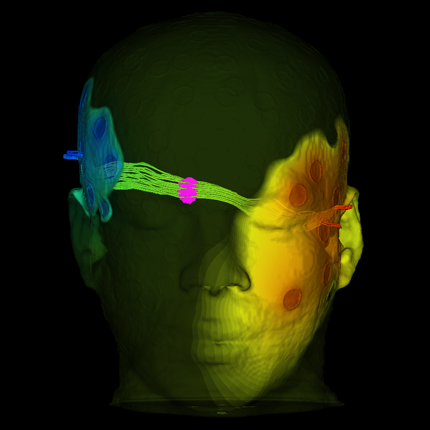
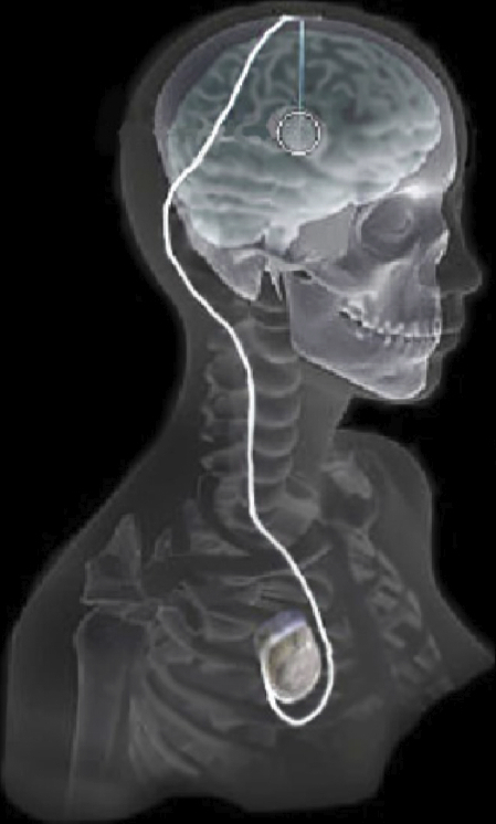
Evaluation of Interactive Visualization on Mobile Computing Platforms for Selection of Deep Brain Stimulation Parameters C. Butson, G. Tamm, S. Jain, T. Fogal, J. Krüger. In IEEE Transactions on Visualization and Computer Graphics, Vol. 19, No. 1, pp. 108--117. January, 2013. DOI: 10.1109/TVCG.2012.92 PubMed ID: 22450824 In recent years there has been significant growth in the use of patient-specific models to predict the effects of neuromodulation therapies such as deep brain stimulation (DBS). However, translating these models from a research environment to the everyday clinical workflow has been a challenge, primarily due to the complexity of the models and the expertise required in specialized visualization software. In this paper, we deploy the interactive visualization system ImageVis3D Mobile , which has been designed for mobile computing devices such as the iPhone or iPad, in an evaluation environment to visualize models of Parkinson’s disease patients who received DBS therapy. Selection of DBS settings is a significant clinical challenge that requires repeated revisions to achieve optimal therapeutic response, and is often performed without any visual representation of the stimulation system in the patient. We used ImageVis3D Mobile to provide models to movement disorders clinicians and asked them to use the software to determine: 1) which of the four DBS electrode contacts they would select for therapy; and 2) what stimulation settings they would choose. We compared the stimulation protocol chosen from the software versus the stimulation protocol that was chosen via clinical practice (independently of the study). Lastly, we compared the amount of time required to reach these settings using the software versus the time required through standard practice. We found that the stimulation settings chosen using ImageVis3D Mobile were similar to those used in standard of care, but were selected in drastically less time. We show how our visualization system, available directly at the point of care on a device familiar to the clinician, can be used to guide clinical decision making for selection of DBS settings. In our view, the positive impact of the system could also translate to areas other than DBS. Keywords: Biomedical and Medical Visualization, Mobile and Ubiquitous Visualization, Computational Model, Clinical Decision Making, Parkinson’s Disease, SciDAC, ImageVis3D |
|
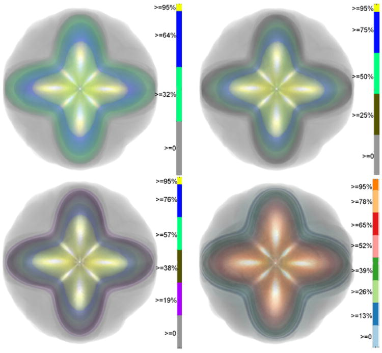
Contour Boxplots: A Method for Characterizing Uncertainty in Feature Sets from Simulation Ensembles R.T. Whitaker, M. Mirzargar, R.M. Kirby. In IEEE Transactions on Visualization and Computer Graphics, Vol. 19, No. 12, pp. 2713--2722. December, 2013. DOI: 10.1109/TVCG.2013.143 PubMed ID: 24051838 Ensembles of numerical simulations are used in a variety of applications, such as meteorology or computational solid mechanics, in order to quantify the uncertainty or possible error in a model or simulation. Deriving robust statistics and visualizing the variability of an ensemble is a challenging task and is usually accomplished through direct visualization of ensemble members or by providing aggregate representations such as an average or pointwise probabilities. In many cases, the interesting quantities in a simulation are not dense fields, but are sets of features that are often represented as thresholds on physical or derived quantities. In this paper, we introduce a generalization of boxplots, called contour boxplots, for visualization and exploration of ensembles of contours or level sets of functions. Conventional boxplots have been widely used as an exploratory or communicative tool for data analysis, and they typically show the median, mean, confidence intervals, and outliers of a population. The proposed contour boxplots are a generalization of functional boxplots, which build on the notion of data depth. Data depth approximates the extent to which a particular sample is centrally located within its density function. This produces a center-outward ordering that gives rise to the statistical quantities that are essential to boxplots. Here we present a generalization of functional data depth to contours and demonstrate methods for displaying the resulting boxplots for two-dimensional simulation data in weather forecasting and computational fluid dynamics. |
|
ManyVis: Multiple Applications in an Integrated Visualization Environment A. Rungta, B. Summa, D. Demir, P.-T. Bremer, V. Pascucci. In IEEE Transactions on Visualization and Computer Graphics (TVCG), Vol. 19, No. 12, pp. 2878--2885. December, 2013. As the visualization field matures, an increasing number of general toolkits are developed to cover a broad range of applications. However, no general tool can incorporate the latest capabilities for all possible applications, nor can the user interfaces and workflows be easily adjusted to accommodate all user communities. As a result, users will often chose either substandard solutions presented in familiar, customized tools or assemble a patchwork of individual applications glued through ad-hoc scripts and extensive, manual intervention. Instead, we need the ability to easily and rapidly assemble the best-in-task tools into custom interfaces and workflows to optimally serve any given application community. Unfortunately, creating such meta-applications at the API or SDK level is difficult, time consuming, and often infeasible due to the sheer variety of data models, design philosophies, limits in functionality, and the use of closed commercial systems. In this paper, we present the ManyVis framework which enables custom solutions to be built both rapidly and simply by allowing coordination and communication across existing unrelated applications. ManyVis allows users to combine software tools with complementary characteristics into one virtual application driven by a single, custom-designed interface. |
|
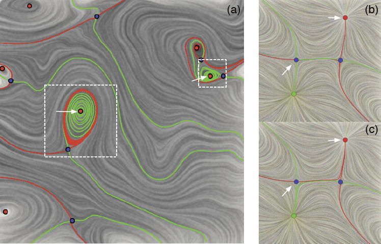
2D Vector Field Simplification Based on Robustness SCI Technical Report, P. Skraba, Bei Wang, G. Chen, P. Rosen. No. UUSCI-2013-004, SCI Institute, University of Utah, 2013. Vector field simplification aims to reduce the complexity of the flow by removing features in order of their relevance and importance, to reveal prominent behavior and obtain a compact representation for interpretation. Most existing simplification techniques based on the topological skeleton successively remove pairs of critical points connected by separatrices using distance or area-based relevance measures. These methods rely on the stable extraction of the topological skeleton, which can be difficult due to instability in numerical integration, especially when processing highly rotational flows. Further, the distance and area-based metrics are used to determine the cancellation ordering of features from a geometric point of view. Specifically, these metrics do not consider the flow magnitude, which is an important physical property of the flow. In this paper, we propose a novel simplification scheme derived from the recently introduced topological notion of robustness, which provides a complementary flow structure hierarchy to the traditional topological skeleton-based approach. Robustness enables the pruning of sets of critical points according to a quantitative measure of their stability, that is, the minimum amount of vector field perturbation required to remove them within a local neighborhood. This leads to a natural hierarchical simplification scheme with more physical consideration than purely topological-skeleton-based methods. Such a simplification does not depend on the topological skeleton of the vector field and therefore can handle more general situations (e.g. centers and pairs not connected by separatrices). We also provide a novel simplification algorithm based on degree theory with fewer restrictions and so can handle more general boundary conditions. We provide an implementation under the piecewise-linear setting and apply it to both synthetic and real-world datasets. |
|
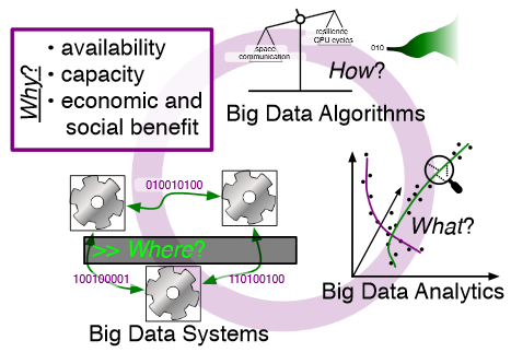
Rethinking Abstractions for Big Data: Why, Where, How, and What M. Hall, R.M. Kirby, F. Li, M.D. Meyer, V. Pascucci, J.M. Phillips, R. Ricci, J. Van der Merwe, S. Venkatasubramanian. In Cornell University Library, 2013. Big data refers to large and complex data sets that, under existing approaches, exceed the capacity and capability of current compute platforms, systems software, analytical tools and human understanding [7]. Numerous lessons on the scalability of big data can already be found in asymptotic analysis of algorithms and from the high-performance computing (HPC) and applications communities. However, scale is only one aspect of current big data trends; fundamentally, current and emerging problems in big data are a result of unprecedented complexity |in the structure of the data and how to analyze it, in dealing with unreliability and redundancy, in addressing the human factors of comprehending complex data sets, in formulating meaningful analyses, and in managing the dense, power-hungry data centers that house big data. The computer science solution to complexity is finding the right abstractions, those that hide as much triviality as possible while revealing the essence of the problem that is being addressed. The "big data challenge" has disrupted computer science by stressing to the very limits the familiar abstractions which define the relevant subfields in data analysis, data management and the underlying parallel systems. Efficient processing of big data has shifted systems towards increasingly heterogeneous and specialized units, with resilience and energy becoming important considerations. The design and analysis of algorithms must now incorporate emerging costs in communicating data driven by IO costs, distributed data, and the growing energy cost of these operations. Data analysis representations as structural patterns and visualizations surpass human visual bandwidth, structures studied at small scale are rare at large scale, and large-scale high-dimensional phenomena cannot be reproduced at small scale. As a result, not enough of these challenges are revealed by isolating abstractions in a traditional soft-ware stack or standard algorithmic and analytical techniques, and attempts to address complexity either oversimplify or require low-level management of details. The authors believe that the abstractions for big data need to be rethought, and this reorganization needs to evolve and be sustained through continued cross-disciplinary collaboration. In what follows, we first consider the question of why big data and why now. We then describe the where (big data systems), the how (big data algorithms), and the what (big data analytics) challenges that we believe are central and must be addressed as the research community develops these new abstractions. We equate the biggest challenges that span these areas of big data with big mythological creatures, namely cyclops, that should be conquered. |
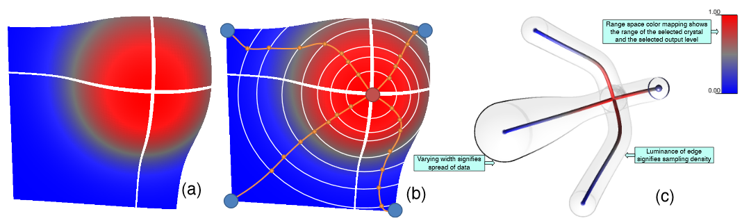
| Adaptive Sampling with Topological Scores D. Maljovec, Bei Wang, A. Kupresanin, G. Johannesson, V. Pascucci, P.-T. Bremer. In Int. J. Uncertainty Quantification, Vol. 3, No. 2, Begell House, pp. 119--141. 2013. DOI: 10.1615/int.j.uncertaintyquantification.2012003955 Understanding and describing expensive black box functions such as physical simulations is a common problem in many application areas. One example is the recent interest in uncertainty quantification with the goal of discovering the relationship between a potentially large number of input parameters and the output of a simulation. Typically, the simulation of interest is expensive to evaluate and thus the sampling of the parameter space is necessarily small. As a result choosing a "good" set of samples at which to evaluate is crucial to glean as much information as possible from the fewest samples. While space-filling sampling designs such as Latin hypercubes provide a good initial cover of the entire domain, more detailed studies typically rely on adaptive sampling: Given an initial set of samples, these techniques construct a surrogate model and use it to evaluate a scoring function which aims to predict the expected gain from evaluating a potential new sample. There exist a large number of different surrogate models as well as different scoring functions each with their own advantages and disadvantages. In this paper we present an extensive comparative study of adaptive sampling using four popular regression models combined with six traditional scoring functions compared against a space-filling design. Furthermore, for a single high-dimensional output function, we introduce a new class of scoring functions based on global topological rather than local geometric information. The new scoring functions are competitive in terms of the root mean squared prediction error but are expected to better recover the global topological structure. Our experiments suggest that the most common point of failure of adaptive sampling schemes are ill-suited regression models. Nevertheless, even given well-fitted surrogate models many scoring functions fail to outperform a space-filling design. |

|
Exploration of High-Dimensional Scalar Function for Nuclear Reactor Safety Analysis and Visualization D. Maljovec, Bei Wang, V. Pascucci, P.-T. Bremer, M.Pernice, D. Mandelli, R. Nourgaliev. In Proceedings of the 2013 International Conference on Mathematics and Computational Methods Applied to Nuclear Science & Engineering (M&C), pp. 712-723. 2013. The next generation of methodologies for nuclear reactor Probabilistic Risk Assessment (PRA) explicitly accounts for the time element in modeling the probabilistic system evolution and uses numerical simulation tools to account for possible dependencies between failure events. The Monte-Carlo (MC) and the Dynamic Event Tree (DET) approaches belong to this new class of dynamic PRA methodologies. A challenge of dynamic PRA algorithms is the large amount of data they produce which may be difficult to visualize and analyze in order to extract useful information. We present a software tool that is designed to address these goals. We model a large-scale nuclear simulation dataset as a high-dimensional scalar function defined over a discrete sample of the domain. First, we provide structural analysis of such a function at multiple scales and provide insight into the relationship between the input parameters and the output. Second, we enable exploratory analysis for users, where we help the users to differentiate features from noise through multi-scale analysis on an interactive platform, based on domain knowledge and data characterization. Our analysis is performed by exploiting the topological and geometric properties of the domain, building statistical models based on its topological segmentations and providing interactive visual interfaces to facilitate such explorations. We provide a user's guide to our software tool by highlighting its analysis and visualization capabilities, along with a use case involving data from a nuclear reactor safety simulation. Keywords: high-dimensional data analysis, computational topology, nuclear reactor safety analysis, visualization |
|
Adaptive Sampling Algorithms for Probabilistic Risk Assessment of Nuclear Simulations D. Maljovec, Bei Wang, D. Mandelli, P.-T. Bremer, V. Pascucci. In Proceedings of the 2013 International Topical Meeting on Probabilistic Safety Assessment and Analysis (PSA 2013), Note: First runner-up for Best Student Paper Award, 2013. Nuclear simulations are often computationally expensive, time-consuming, and high-dimensional with respect to the number of input parameters. Thus exploring the space of all possible simulation outcomes is infeasible using finite computing resources. During simulation-based probabilistic risk analysis, it is important to discover the relationship between a potentially large number of input parameters and the output of a simulation using as few simulation trials as possible. This is a typical context for performing adaptive sampling where a few observations are obtained from the simulation, a surrogate model is built to represent the simulation space, and new samples are selected based on the model constructed. The surrogate model is then updated based on the simulation results of the sampled points. In this way, we attempt to gain the most information possible with a small number of carefully selected sampled points, limiting the number of expensive trials needed to understand features of the simulation space. We analyze the specific use case of identifying the limit surface, i.e., the boundaries in the simulation space between system failure and system success. In this study, we explore several techniques for adaptively sampling the parameter space in order to reconstruct the limit surface. We focus on several adaptive sampling schemes. First, we seek to learn a global model of the entire simulation space using prediction models or neighborhood graphs and extract the limit surface as an iso-surface of the global model. Second, we estimate the limit surface by sampling in the neighborhood of the current estimate based on topological segmentations obtained locally. Our techniques draw inspirations from topological structure known as the Morse-Smale complex. We highlight the advantages and disadvantages of using a global prediction model versus local topological view of the simulation space, comparing several different strategies for adaptive sampling in both contexts. One of the most interesting models we propose attempt to marry the two by obtaining a coarse global representation using prediction models, and a detailed local representation based on topology. Our methods are validated on several analytical test functions as well as a small nuclear simulation dataset modeled after a simplified Pressurized Water Reactor. Keywords: high-dimensional data analysis, computational topology, nuclear reactor safety analysis, visualization |
|
Analyze Dynamic Probabilistic Risk Assessment Data through Clustering D. Maljovec, Bei Wang, D. Mandelli, P.-T. Bremer, V. Pascucci. In Proceedings of the 2013 International Topical Meeting on Probabilistic Safety Assessment and Analysis (PSA 2013), 2013. We investigate the use of a topology-based clustering technique on the data generated by dynamic event tree methodologies. The clustering technique we utilizes focuses on a domain-partitioning algorithm based on topological structures known as the Morse-Smale complex, which partitions the data points into clusters based on their uniform gradient flow behavior. We perform both end state analysis and transient analysis to classify the set of nuclear scenarios. We demonstrate our methodology on a dataset generated for a sodium-cooled fast reactor during an aircraft crash scenario. The simulation tracks the temperature of the reactor as well as the time for a recovery team to fix the passive cooling system. Combined with clustering results obtained previously through mean shift methodology, we present the user with complementary views of the data that help illuminate key features that may be otherwise hidden using a single methodology. By clustering the data, the number of relevant test cases to be selected for further analysis can be drastically reduced by selecting a representative from each cluster. Identifying the similarities of simulations within a cluster can also aid in the drawing of important conclusions with respect to safety analysis. |
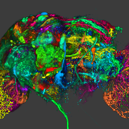
| Fluorender, An Interactive Tool for Confocal Microscopy Data Visualization and Analysis Y. Wan. Note: Ph.D. Thesis, School of Computing, University of Utah, June, 2013. Confocal microscopy has become a popular imaging technique in biology research in recent years. It is often used to study three-dimensional (3D) structures of biological samples. Confocal data are commonly multi-channel, with each channel resulting from a different fluorescent staining. This technique also results finely detailed structures in 3D, such as neuron fibers. Despite the plethora of volume rendering techniques that have been available for many years, there is a demand from biologists for a flexible tool that allows interactive visualization and analysis of multi-channel confocal data. Together with biologists, we have designed and developed FluoRender. It incorporates volume rendering techniques such as a two-dimensional (2D) transfer function and multi-channel intermixing. Rendering results can be enhanced through tone-mappings and overlays. To facilitate analyses of confocal data, FluoRender provides interactive operations for extracting complex structures. Furthermore, we developed the Synthetic Brainbow technique, which takes advantage of the asynchronous behavior in Graphics Processing Unit (GPU) framebuffer loops and generates random colorizations for different structures in single-channel confocal data. The results from our Synthetic Brainbows, when applied to a sequence of developing cells, can then be used for tracking the movements of these cells. Finally, we present an application of FluoRender in the workflow of constructing anatomical atlases. Keywords: confocal microscopy, visualization, software |
|
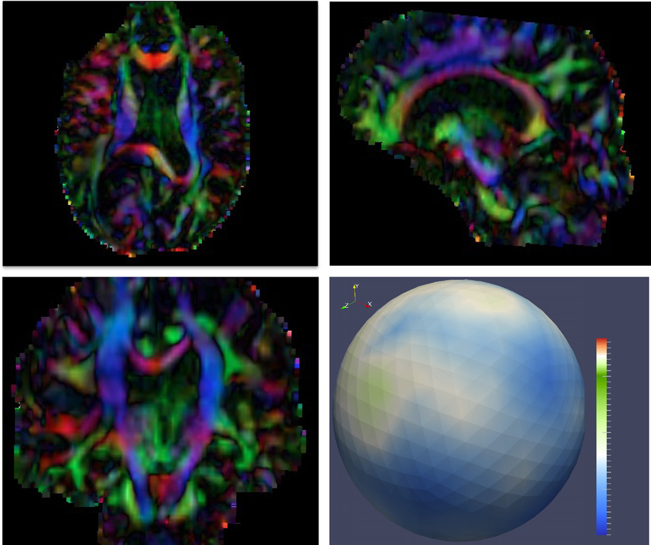
Diffusion imaging quality control via entropy of principal direction distribution, M. Farzinfar, I. Oguz, R.G. Smith, A.R. Verde, C. Dietrich, A. Gupta, M.L. Escolar, J. Piven, S. Pujol, C. Vachet, S. Gouttard, G. Gerig, S. Dager, R.C. McKinstry, S. Paterson, A.C. Evans, M.A. Styner. In NeuroImage, Vol. 82, pp. 1--12. 2013. ISSN: 1053-8119 DOI: 10.1016/j.neuroimage.2013.05.022 Diffusion MR imaging has received increasing attention in the neuroimaging community, as it yields new insights into the microstructural organization of white matter that are not available with conventional MRI techniques. While the technology has enormous potential, diffusion MRI suffers from a unique and complex set of image quality problems, limiting the sensitivity of studies and reducing the accuracy of findings. Furthermore, the acquisition time for diffusion MRI is longer than conventional MRI due to the need for multiple acquisitions to obtain directionally encoded Diffusion Weighted Images (DWI). This leads to increased motion artifacts, reduced signal-to-noise ratio (SNR), and increased proneness to a wide variety of artifacts, including eddy-current and motion artifacts, “venetian blind” artifacts, as well as slice-wise and gradient-wise inconsistencies. Such artifacts mandate stringent Quality Control (QC) schemes in the processing of diffusion MRI data. Most existing QC procedures are conducted in the DWI domain and/or on a voxel level, but our own experiments show that these methods often do not fully detect and eliminate certain types of artifacts, often only visible when investigating groups of DWI's or a derived diffusion model, such as the most-employed diffusion tensor imaging (DTI). Here, we propose a novel regional QC measure in the DTI domain that employs the entropy of the regional distribution of the principal directions (PD). The PD entropy quantifies the scattering and spread of the principal diffusion directions and is invariant to the patient's position in the scanner. High entropy value indicates that the PDs are distributed relatively uniformly, while low entropy value indicates the presence of clusters in the PD distribution. The novel QC measure is intended to complement the existing set of QC procedures by detecting and correcting residual artifacts. Such residual artifacts cause directional bias in the measured PD and here called dominant direction artifacts. Experiments show that our automatic method can reliably detect and potentially correct such artifacts, especially the ones caused by the vibrations of the scanner table during the scan. The results further indicate the usefulness of this method for general quality assessment in DTI studies. Keywords: Diffusion magnetic resonance imaging, Diffusion tensor imaging, Quality assessment, Entropy |
|
The Helmholtz-Hodge Decomposition - A Survey H. Bhatia, G. Norgard, V. Pascucci, P.-T. Bremer. In IEEE Transactions on Visualization and Computer Graphics (TVCG), Vol. 19, No. 8, Note: Selected as Spotlight paper for August 2013 issue, pp. 1386--1404. 2013. DOI: 10.1109/TVCG.2012.316 The Helmholtz-Hodge Decomposition (HHD) describes the decomposition of a flow field into its divergence-free and curl-free components. Many researchers in various communities like weather modeling, oceanology, geophysics, and computer graphics are interested in understanding the properties of flow representing physical phenomena such as incompressibility and vorticity. The HHD has proven to be an important tool in the analysis of fluids, making it one of the fundamental theorems in fluid dynamics. The recent advances in the area of flow analysis have led to the application of the HHD in a number of research communities such as flow visualization, topological analysis, imaging, and robotics. However, because the initial body of work, primarily in the physics communities, research on the topic has become fragmented with different communities working largely in isolation often repeating and sometimes contradicting each others results. |
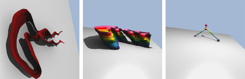
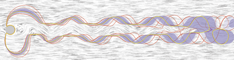
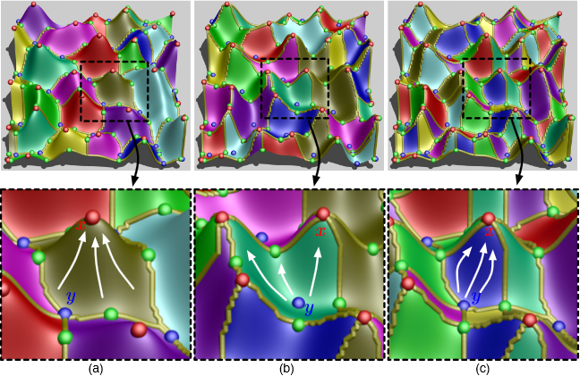
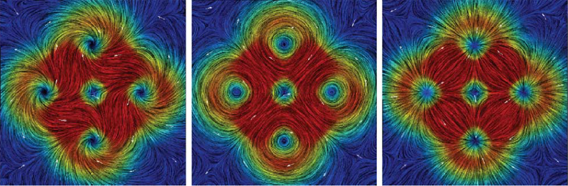
| Visualizing Robustness of Critical Points for 2D Time-Varying Vector Fields, Bei Wang, P. Rosen, P. Skraba, H. Bhatia, V. Pascucci. In Computer Graphics Forum, Vol. 32, No. 3, Wiley-Blackwell, pp. 221--230. jun, 2013. DOI: 10.1111/cgf.12109 Analyzing critical points and their temporal evolutions plays a crucial role in understanding the behavior of vector fields. A key challenge is to quantify the stability of critical points: more stable points may represent more important phenomena or vice versa. The topological notion of robustness is a tool which allows us to quantify rigorously the stability of each critical point. Intuitively, the robustness of a critical point is the minimum amount of perturbation necessary to cancel it within a local neighborhood, measured under an appropriate metric. In this paper, we introduce a new analysis and visualization framework which enables interactive exploration of robustness of critical points for both stationary and time-varying 2D vector fields. This framework allows the end-users, for the first time, to investigate how the stability of a critical point evolves over time. We show that this depends heavily on the global properties of the vector field and that structural changes can correspond to interesting behavior. We demonstrate the practicality of our theories and techniques on several datasets involving combustion and oceanic eddy simulations and obtain some key insights regarding their stable and unstable features. |
|
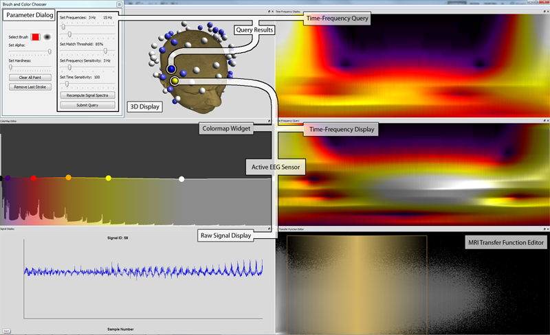
Discovering and Visualizing Patterns in EEG Data E.W. Anderson, C. Chong, G.A. Preston, C.T. Silva. In Proceedings of the 2013 IEEE Pacific Visualization Symposium (PacificVis), pp. 105--112. 2013. Brain activity data is often collected through the use of electroencephalography (EEG). In this data acquisition modality, the electric fields generated by neurons are measured at the scalp. Although this technology is capable of measuring activity from a group of neurons, recent efforts provide evidence that these small neuronal collections communicate with other, distant assemblies in the brain's cortex. These collaborative neural assemblies are often found by examining the EEG record to find shared activity patterns. In this paper, we present a system that focuses on extracting and visualizing potential neural activity patterns directly from EEG data. Using our system, neuroscientists may investigate the spectral dynamics of signals generated by individual electrodes or groups of sensors. Additionally, users may interactively generate queries which are processed to reveal which areas of the brain may exhibit common activation patterns across time and frequency. The utility of this system is highlighted in a case study in which it is used to analyze EEG data collected during a working memory experiment. |