CS-5630/6630 | Visualization | Fall 2014

INSTRUCTOR: Miriah Meyer
TIME: T/Th 9:10-10:30am
PLACE: L102 WEB
OFFICE HRS: T 1-3pm, WEB 4887

TA: Alex Bigelow
OFFICE HRS: W 3-5pm, WEB 3760

TA: Hitesh Raju
OFFICE HRS:Th 12-2pm, MEB 3115 #5

The goal of this course is to introduce students to the principles, methods, and techniques for effective visual analysis of data. Students will explore many aspects of visualization, including techniques for both spatial (eg. gridded data from simulations and scanning devices) and nonspatial data (eg. graphs, text, high-dimensional tabular data). The course begins with an overview of principles from perception and design, continues with a framework for discussing, critiquing, and analyzing visualizations, and then focuses on visualization techniques and methods for a broad range of data types. Students will acquire hands-on experience using cutting edge visualization systems as well as programming interactive visual analysis tools.

schedule

week date topic date topic homework
1 8/26 Introduction 8/28 Design principles Design critiques
2 9/2 Perception 9/4 Data types & Intro to Tableau Data exploration | out Th | due in 1.5 weeks
3 9/9 Visual encodings 9/11 Color
4 9/16 Intro to Processing 9/18 Processing lab day Time series | out T | due in 2 weeks
5 9/23 Tasks & interaction 9/25 Views
6 9/30 Focus+context 10/2 Filtering & aggregation
7 10/7 Exam 1: foundations 10/9 Tabular Parallel coordinates | out Th | due in 3 weeks
8 10/14 fall break 10/16 fall break
9 10/21 Trees & graphs 10/23 Text & sets
10 10/28 Maps 10/30 Grids
11 11/4 Isosurfaces 11/6 3d graphics scalar data | out T | due in 2.5 weeks
12 11/11 Volume rendering 11/13 Transfer functions
13 11/18 Vector fields 11/20 Visualization models transfer functions | out Th | due in 3.5 weeks
14 11/25 Tensor fields 11/27 Thanksgiving
15 12/2 Design studies 12/4 Molecular animation
16 12/9 D3 + other tools 12/11 Exam 2: techniques

syllabus

prerequisites

The prerequisites for this class are some linear algebra and calculus, as well as some programming experience. If you are unsure please come talk with me. Having taken CS-5610: Computer Graphics, or its equivalent at another university, is very helpful but not required. Grad students from other departments with the appropriate background are welcome!

required textbooks

Visualization Analysis and Design (advanced version of e-book), Tamara Munzner, AK Peters, (hardcopy appearing in Oct 2014).

recommended textbooks

Visual Thinking for Design, Colin Ware, Morgan Kaufman, 2008.

Learning Processing, Daniel Shiffman, Morgan Kaufmann, 2008. (free e-book through the Marriott Library)

Getting Started with Processing, Casey Reas and Ben Fry, O'Reilly Media, 2010.

Processing: A Programming Handbook for Visual Designers and Artists, Casey Reas and Ben Fry, MIT Press, 2007. (free e-book through the Marriott Library)

grading

Grades in this course will be determined by:

  • 70% assignments
    • 5% design critique
    • 10% data exploration
    • 10% time series
    • 15% parallel coordinates
    • 15% scalar data
    • 15% transfer function design
  • 25% exams
    • 12.5% exam 1
    • 12.5% exam 2
  • 5% participation

There will be no final examination in this course. The weighting of the assignments may change as the semester goes on. Final letter grades will be determined based on a grading curve. Last year's ranges are here -- note that this is not necessarily (and most likely not exactly) what the ranges will be this year, but I've put it up for reference.

late policy

For each day that an assignment is turned in late I will deduct 10% off the total possible points. That is, one-day late is 10% off, two-days is 20%, etc. For example, if you turn in an assignment 3 days late, the max number of points (out of 100) that you can receive is 70.

class websites - design critique & class forum | forum for posting design critiques as well as for class discussions
- design critique sign-up | for scheduling the weekly critiques
cheating policy You are required to complete all of the assignments on your own -- this includes the coding and write-up. In some assignments we indicate parts where you are free to use libraries or source-code that you find, but you MUST cite your sources both in the code and in the write-up. Otherwise, the code must be your own. You are welcome to discuss topics with your classmates, but you may not share implementation details.

School of Computing Policy Statement on Academic Misconduct

assignments

critique

Rolling due dates throughout semester -- see the sign-up page for your week to post.

Critiques are due on Thursdays and discussions are due by the following Sunday.

In this course you will learn about basic visualization design principles and guidelines. The goal of this assignment is to apply your knowledge to visualizations you find. Each week several students will post a design critique on our bulletin board. You are responsible to post one design critique during the semester and to actively participate in a discussion of a new critique each week.

more details...

For online discussions, please read the following:

For your critique, find an interesting visualization from one of the following types of sources:

  • textbook
  • science magazine (Nature, Science, Scientific American, ...)
  • magazine or newspaper (Newsweek, The Economist, NY Times, USA Today, ...)
You may not use papers or textbooks on visualization. Go to original sources used by practitioners and researchers. For this assignment, please do not use examples pulled from the web except from sites in the above categories.

Once you have selected your visualization, explain the data being shown (type and semantics) and the visual encodings used -- put into words what the visualization is trying to show. Next, critique the visualization: what works and what doesn't? Is the visualization clear or is it misleading? Do you like it (or not), and why? What could be improved? Compose your explanation and critique in 3-4 paragraphs and post your text and visualization in a new thread. Please format your thread title like this:

  • Week 4: (insert title of the visualization you're critiquing)

Each week you are required to actively participate in one of the new threads for that week (except for the week that you are posting a critique). Your comments should be thoughtful; a single sentence saying "I like it" is not enough! Do you agree with the critique? If so, why (or, why not)? Did the critique miss anything? Did you learn something new? Please be constructive, not critical. Your peers will be discussing your critique as well!

Grading
We will check that the group thread has been created by midnight each Thursday -- the late policy applies to critiques as well. Your grade will be based on how well you describe and critique the visualization you post based on the language and concepts we have covered in class. Additionally, we will check that each class member has commented on a new thread before midnight each Sunday. If you posted a critique for the week you do not need to comment on another critique. However, you should participate in the discussion on your thread; don't leave a good discussion hanging, especially if there are questions! Your bulletin board activity each week will be part of the participation component of your final grade.

data exploration

Due on Tuesday, Sept 16th at midnight

A variety of digital tools have been designed to help users visually explore data sets and confirm or disconfirm hypotheses about the data. The task in this assignment is to use an existing visualization tool to formulate and answer a series of specific questions about a data set of your choice. After answering the questions, you should create a final visualization that is designed to communicate your findings. You should maintain a (digital) notebook that documents all the questions you asked and the steps you performed from start to finish. The goal of this assignment is not to develop a new visualization tool, but to better understand the process of using visualizations to perform exploratory data analysis.

more details...

Visualization Tool
For this assignment you will be using Tableau, a commercial database visualization tool that supports many different ways to interact with data. One goal of this assignment is to provide you with the skill to learn and evaluate the effectiveness of tools like Tableau.

(For students wishing to install Tableau on their personal computer...) We have a class license available here (OS X and Windows are supported). The license will last for one year.

(For students wishing to use Tableau in a computer lab...) Tableau has also been installed in the Engman Lab (WEB L210) on the ten closest computers to the Help Desk: LAB5-82 through LAB5-91. When you open Tableau, it will ask you to simply register your email. To access this lab, you will want to create an account and register your U-Card through the CoE user tools.

You can find a wealth of information for Tableau online:

Tableau's data visualization software is provided through the Tableau for Teaching program.

Data Sets
Now that you have a visualization tool, you need data to explore! We have provided the following two data sets and encourage you to use one of them in order to focus more of your time on exploring and analyzing the data. That said, you are welcome to use a different data set if you prefer; please contact the course staff if you are unsure about your choice. Please note the data set you have chosen in your notebook.

movie data: This data set contains information on a large sample of movies. The data includes the movie budget and revenue from different sources as well as ratings from RottenTomatoes and IMDB.

Download: csv file
Source: Jeff Heer

flight data: FAA data describing every commercial flight during the month of December 2009. For detailed descriptions of each data column in the attached file, please see www.transtats.bts.gov. You are also welcome to download your own version of the file (which might include columns or time spans that were left out from this data set) directly from www.transtats.bts.gov.

Download: csv file
Source: www.transtats.bts.gov

Many other sources for data sets can be found on the resources page.

Formulate a Question
Before exploring the data, pose an initial question that you would like to answer. For example: is there a relationship between melting point and atomic number? Are the brightness and color of stars correlated? Are there different patterns of nucleotides in different regions of human DNA?

Next, assess the fitness of the data for answering your question. Inspect the data -- it is invariably helpful to first look at the raw data values. Does the data seem appropriate for answering your question? If not, you may need to find a new initial question. Next, does the data need to be reformatted or cleaned before you analyze it? Perform any steps necessary to clean the data prior to visual analysis.

Write down the initial question clearly in your notebook, and describe any data wrangling you had to perform.

Data Exploration and Analysis
After you have an initial question and a data set, construct a visualization in Tableau that provides a potential answer to your question. As you construct the visualization, you will find that your question evolves -- often it will become more specific. Keep track of this evolution and further questions that occur to you along the way in your notebook. Also, keep copies of any intermediate visualizations you generate, and please include in your notebook several images of the more important visualizations that helped you refine your question.

NOTE: We are interested in seeing the evolution of your thoughts and investigation. We are not interested in just a final answer! Please document your discovery progress.

Once you have answered all the questions to your satisfaction, think of a way to present the data and the answers as clearly as possible. Include an image of your final visualization in your notebook, along with a caption and a paragraph description of how it answers the question you posed. Think of the figure, the caption, and the paragraph as material you might include in a research paper.

Submission Details
This assignment must be submitted as a PDF file via Canvas.

Grading
You will be graded on how well you address the following:

  1. 05 pts: Data source specified
  2. 15 pts: Initial question and description of any necessary data wrangling
  3. 60 pts: Description of whether / how / why / when the question evolves, along with screenshots
  4. 20 pts: Final image with caption and description
Please format your notebook so these are easy to find; effectively communicating information to humans is an essential part of this course! If we can't find something in a reasonable amount of time, you will not recieve credit for it. Here's an example of the kind of thing we're looking for.

time series

Due on Tuesday, Sept 30th at midnight

Time series data show up all over the place: in finance, medicine, climatology, history, and on and on. In this assignment you will develop an interactive viewer for looking at time series that explores several different visual representations. The main goal is to get your feet wet with the Processing programming environment, specifically the functionality for: drawing basic primitives; handling mouse and keyboard events; and working with text.

more details...

In this assignment, you will be implementing the code described in Chapter 4 of Ben Fry's book: Visualizing Data; we have provided you with a copy of the chapter. Please note that some of the scanned figures are distorted; thus, your visualization may look slightly different than what you see, which is okay! For each of the steps below, include a screenshot of your visualization and answer the questions in a (digital) notebook (similar to the DATA EXPLORATION assignment). You will be submitting this notebook and the final version of your code for the assignment.

Before reading the chapter, download and install Processing, and explore the examples online. We highly recommend you go through some of the tutorials, in particular the first four at the Beginner level.

Complete the following steps. Feel free to make changes to the design of the visualization as you see fit, and, if you do, be sure to justify those changes in your notebook.

  1. Download timeSeries.zip and extract it. This will be your project directory; to add code, simply open timeSeries.pde in Processing. No need to download additional files, just start programming!
  2. Read pages 54-72, and implement the code described in the book. Change the numerical labels on the x- and y-axes to use the Georgia font, and all of the text titles to use the Verdana font. Choose a font size that seems most appropriate to you. Change the y-axis title to run along the axis, i.e. rotate it by 90-degrees (hint: look under the Transform section of the reference page). Make any other changes you feel are appropriate. What did you change and why?
  3. Read pages 73-82, and implement the code described in the book. Allow the user to select which representation to render the data using the keyboard. Specifically, let 1 select dots; 2 select connected dots; 3 select line chart; 4 select filled chart. (hint: look under the Input section of the reference page). Use the Georgia font for the highlight tags on mouse rollover. What representation do you think is the most appropriate, and why?
  4. Read pages 83-93, and implement the code described in the book. You may skip the Better Tab Images section if you want. For the interpolation, a new Integrator class has been provided for you. Is this tool an effective way to look at time series data? Why or why not? What is missing? How would you change the tool to support looking at time series with many time points (like > 1000)?
  5. Next, add an additional tab for a summary view of all the time series data displayed at once. Choose a method for displaying the time series data that you feel is most effective for displaying multiple series. You do not need to support mouseover in this view, but you can if you wish! Why did you choose this visualization method?
  6. For 6630 students only. A common statistical technique for time series data (and scatterplots in general) is finding a regression curve. The simplest form of regression is linear regression. You will be using linear regression to get an equation of a line and mapping this onto each time series plot. To get the equation of the line, you are welcome to pre-compute this in any statistical software (e.g. Excel, R, etc.), use an existing library in Processing or Java, or implement the algorithm in your code. In your visualization, overlay a regression line on each of the individual time series plots. Is there any representation of the time series data where a regression line is less effective? Why?

Recommended Books

Submission Details
In addition to your PDF notebook, you will be submitting your final Processing code for this assignment. Please ZIP up your entire project directory (code and data) to include in your submission. We expect to be able to run your visualization as is. Make sure that your file paths are relative!!! Both the PDF and ZIP archive should be submitted via Canvas.

Grading
You will be graded on how well you address the following:

  1. 20 pts: When unzipped, project runs without errors or modifications on our part
  2. 05 pts: Axes and rollovers use the Georgia font, text titles use Verdana
  3. 05 pts: Rotated y-axis label
  4. 10 pts: Keyboard selection for different chart types
  5. 10 pts: Justification of best chart type
  6. 10 pts: Analysis of tool
  7. 15 pts: Additional summary tab
  8. 10 pts: Justification of summary chart
  9. 10 pts:* Regression line
  10. 05 pts:* Analysis of regression line inclusion
*These are only required for CS 6630 students. For CS 5630 students, your final point total will be scaled to a range of [0,100].

Please format your notebook so these are easy to find; don't forget the appropriate screenshots! If we can't find something in a reasonable amount of time, you will not recieve credit for it.

parallel coordinates

Due on Thursday, Oct 30th at midnight

Exploring multidimensional data is a fundamental challenge in visualization. In this assignment you will implement a widely used visual representation: parallel coordinates. The goal of the assignment is two-fold. First, you will gain experience designing and implementing a variety of interaction mechanisms to support data exploration. And second, you will evaluate the effectiveness of parallel coordinates on a variety of multidimensional data sets. This assignment promotes sketching out some ideas on paper before coding interaction and furthers your understanding and experience programming in Processing.

more details...

First, you will want to understand what parallel coordinates are. Please read the following short discussions:

Next, play around with this nice example written by Jason Davies in the D3.js language. Different data can be seen in the veterans and nutrient contents examples by Kai Chang. In these examples, note that you can filter along an axis and rearrange axes. Think about what you like in the designs and what you would want to do differently. There are many different ways to encode, layout, and interact with data in a parallel coordinates plot -- these examples are just one way to do this. There is no "right" answer!

Data Wrangling
To start, download the cars data set, provided below. Inspect the data -- it does not come in the .csv file format that you worked with in the TIME SERIES assignment. The data needs to be cleaned and processed to get it into Processing. You are welcome to re-use the FloatTable.pde file reader from the previous assignment to import the data.

Basic Visualization
Before writing code, pull out a piece of paper. Create a paper prototype of what you envision the visualization will look like. Consider the basic items that you will render: like axes, data, title, labels, tick marks, etc. Think about how you plan to handle overlapping lines (e.g. use transparency). Scan or take a picture of your paper prototype and put it in your notebook.

Next, create a Processing sketch for the assignment based on your paper prototype. Get the cars data set imported (feel free to use FloatTable.pde), and write a basic renderer to create a static parallel coordinates plot. In your sketch, be sure to label everything you can: titles, tick marks, ranges, etc. In your notebook, include a screenshot of this static version of your visualization. Were you able to include everything that you had thought of in your paper prototype? Please record some of your thoughts on this sketching and coding process in your notebook.

Interactivity
Now, for the fun part! Parallel coordinates are hardly useful without interactivity. Instead of worrying about how to code interaction, first set the computer aside and pull out another piece of paper. Think about how you want to interact with the axes and the data. How would you design these interactions to make them effective? At a minimum, you must support the following basic interactions:

  • filter the data across multiple attributes
  • reorder / rearrange the axes
  • invert the axes

For each of these interactions (and any more you want), draw a series of story boards, i.e. a sequence of sketches that illustrate the steps behind an interaction in the visualization. Be sure to show any interface elements that the user will interact with. This just needs to be enough to give you an idea of what you want to write in the code. Then, create a digital copy of your story boards, and add each of the story boards to your notebook with a brief description of what is occurring in each story board.

Next, implement your ideas!

In your notebook, include a screenshot of your interactive visualization, describe how your interactivity works, and justify your design decisions using concepts we have covered in the class. Does your design work? What could be improved, given more time, and how? Did you come up with any interactivity mechanisms to support tasks other than those described above?

Clustering (for 6630 students only | extra credit for 5630 students)
It is often useful to aggregate multidimensional data into clusters of similar data points. A very simple method for aggregation is k-means clustering. For this portion of the assignment you must use k-means clustering to aggregate data, and develop a way to show the clusters in your visualization.

You may use existing k-mean clustering algorithms to create your clusters, or be adventurous and implement it yourself (it is straight-forward to do). Experiment with the number of clusters you create and find a number that does a good job in creating meaningful clusters. We would recommend doing this experimentation in your visualization once you implement a visual representation for the clusters.

The most obvious way to show clusters is to assign each cluster a color (hue) and render the data (lines) in the appropriate color according to their cluster membership. When encoding categorical data with color, however, remember that we can only distinguish a limited number of colors -- how many can we actually distinguish? Design your visual encoding accordingly. You are free to develop a different way to encode the clusters if you would like. However you encode the clusters, allow the user to choose to show the clusters, or not. Include a screenshot of your visualization with the cluster encoding in your notebook along with a description of your encoding method.

extra credit: A way to accommodate a limited color palette is by creating an interactive color legend. An example is shown in the image on the right. This legend allows the user to apply a color to a specific group, or have a default color of gray. This visualization widget thus serves dual purpose: it works as a legend to inform the user about the encoding, and it also lets the user dynamically set the color of each group. Implement your own interactive color legend.

Data Exploration
Explore at least two data sets (one of which should be the cars data set) in your parallel coordinates tool. What interesting features can you find? For each data set, document several features that you find, and include both a description and a screenshot of each in your notebook.

Lastly, critique your parallel coordinate visualization in your notebook. What do you think of parallel coordinates as a visualization representation? Do you find it easy or hard to use? Could you have found those same features without interactivity? What are the limits of parallel coordinates for data other than quantitative data, and how might you visualize that?

Data Sets
We have provided the following two data sets and encourage you to use both of them in order to get started quickly and therefore have more time to explore the data and develop your visualization tool -- we recommend you develop your visualization using the cars data set. You are welcome to use a different second data set, if you prefer.

cars: This data set contains information on 406 different cars from the 1983 ASA Data Exposition data set.

Download: repository
Source: American Statistical Association

cameras: This data set contains information about 1000+ digital cameras and 13 different attributes.

Download: tsv file
Source: the ScatterDice project

Many other data sets can be obtained from XmdvTool or R data sets.

Submission Details
As before, you must submit your PDF notebook and ZIP archive of your data and code via Canvas. We should be able to run your code as is.

Grading
You will be graded on how well you address the following:

  1. 10 pts: When unzipped, project runs without errors or modifications on our part
  2. 05 pts: What did you have to do to import the cars data set?
  3. 05 pts: Paper prototype of basic visualization
  4. 20 pts: Implemented basic visualization
  5. 05 pts: Storyboards and descriptions of interactivity
  6. 25 pts: Implemented interactive visualization
  7. 05 pts: Analysis of design
  8. 10 pts:* Implementation and description of clustering encoding
  9. 10 pts:† Implementation of interactive color legend
  10. 05 pts: Data exploration findings
  11. 10 pts: Critique of technique
*These are only required for CS 6630 students, or may be done for extra credit by CS 5630 students. For CS 5630 students, your final point total will be scaled to a range of [0,100] (not including extra credit).
†This is extra credit for everyone.

Please format your notebook so these are easy to find. If we can't find something in a reasonable amount of time, you will not recieve credit for it.

scalar data

Due on Thursday, Nov 20th at midnight

Scalar data defined over a grid is an incredibly common data type, showing up in medical applications, computational science, and many other places. The purpose of this assignment is to give you experience with several different ways to visualize scalar data. For this assignment you will create visualizations of several data sets, all of which are mappings of ℝ2→ℝ.

more details...

Data Reader

FIGURE 1
This time around, you will be writing your own data reader in Processing to generate an image. To start off, you will be using two data sets: test.nrrd and brain.nrrd. Note that this data uses the NRRD file format. You can find the definition of the NRRD file format as well as several different example NRRD files online.

It is important to understand what is represented in the header and how this connects to the format of the data below the header. In particular, the dimension component describes that we have a regular 2-D grid. Also, the sizes component gives us the width and height of this grid, respectively. Lastly, the encoding component tells us that we have data written as text (human-readable).

FIGURE 2

After the header, each row of our data represents a single point in the grid. For this assignment, each row contains one scalar value. The grid iterates through the x-axis first, then the y-axis.

With the NRRD format in mind, write your data reader in Processing that will store the data in your sketch. Storing the data in a 2-D array is recommended. For more on 2-D arrays, see the corresponding Processing tutorial. Be sure that you also read in the important values from the header, particularly the sizes components, to set the two dimensions of your data array. You should only be reading in data during the setup() function, not within your draw() loop. Some functions to consider: loadStrings(), for(), split(), and float().

Once you have imported the data into your sketch, create a grayscale image using the same dimensions as the data grid for both of the datasets. See the examples in FIGURE 1 and 2 -- NOTE that FIGURE 1 has been zoomed in from an 8x8 image so that you can see the results. For drawing each data point, we recommend using either rect(), point(), or PImage(). Be mindful of your fill() and stroke() values in your draw loop. You may wish to add a mouse or key command to save your sketch as an image: save().

In your digital notebook, add in your grayscale images, and be sure to answer the following:

  • Was it easy to import the data?
  • What problems did you have?

Applying a Color Map

FIGURE 3
Time to apply some color! First, choose an appropriate color map from ColorBrewer or another source. Interpret this color map into a continuous space; do not use a binned color map. One way to do this is to use two or three colors that are starting, middle, and ending values for your color map. You will need a function that will take a scalar value and then map it to a color along your new continuous colormap.

Now, for each scalar value, map or convert these data values into colors using your color map. This assigns a color to each pixel of your image. This should produce a continuous color image for your data, and look something like FIGURE 3. Some functions to consider: map(), lerpColor().

In your digital notebook, add your color mapped image, and be sure to answer:

  • Where did you get your color map?
  • What makes it an appropriate color map for this data?

You may want to experiment with several colormaps. If you do, make sure to include screenshots of your work!

Interpolating the Grid
Next, we will make our image larger by changing the size of our Processing sketch. Instead of using the sizes of our grid, we will fix the height of our sketch to 800 pixels. Keep the same aspect ratio for the grid (preserve the ratio of width to height).

After creating a larger sketch, map your original data grid values into the appropriate pixel values to fill the screen. This will result in an image that looks pixelated, as in FIGURE 1. Do this for both datasets.

Keep in mind that Processing expects integers in its size() function, but division with integers can result in rounding issues in programming languages. You can always convert or cast your data from floating point numbers into integers for this function.

FIGURE 4

To smooth out our image, we will perform bilinear interpolation of the data. This process first maps every pixel on our screen into the data grid, and determines its location in floating point. This position will lie between four values of that grid. We find an interpolated value using these four grid points and the ratios of distances to them. Be mindful of the pixels on the edges of the image. Finally, this interpolated color value is looked up in the color map. Create an image for both datasets using bilinear interpoloation (again, with the images having a width of 800 pixels and appropriate aspect ratio). In FIGURE 4 we have a zoomed in region from the brain dataset showing the difference between nearest-neighbor (left) and bilinear interpolation (right). In FIGURE 5 you can see the results of smoothing the test image. Include in your notebook a zoomed in region of the brain dataset that shows something similar (but of any region of the image). You can create these zoomed in images in an image view tool, or in your Processing tool.

In your digital notebook, add the interpolated brain images, as well as the comparison to nearest neighbor, and be sure to answer:

  • What, if anything, makes interpolation of your data tricky?
  • Do you notice anything odd about the data? Do any values stick out?

Note that in the next part of the assignment you will be using a different technique to visualize this data (isocontours). You will need to switch between these two modes use keystrokes. This is an FYI for planning how you structure this part of the assignment!

Isocontours using Marching Squares

FIGURE 5
Isocontours are another technique for exploring scalar data sets. In 2D, these are simply a set of isolines overlaid on your image. For generating isocontours, you will be implementing the marching squares algorithm. This algorithm generates isolines along the different cells of our data grid. Before you get started with this part of the assignment, you will want to read these few pages which include a step-by-step description of the algorithm.

Write your own marching squares algorithm to generate and draw isocontours. Allow the user to switch between our color-mapped image and the isocontours using the 'c' key. For the isocontours mode, you must draw all the isocontours at a single isovalue. To draw isolines in Processing, you can use beginShape()/endShape() or line().

FIGURE 6

Note that, you should still keep your display of a fixed height of 800 pixels. However, you should isocontour on the original data and then scale up the position of the isocontours appropriately. This is not equivalent to isocontouring the bilinearly interpolated data!

To help with debugging focus first on the test dataset. This data set is just random noise, but at an isovalue of 32700 it hits all 16 cases of marching squares. See the sample image in FIGURE 5 for the properly generated isocontours.

Next, with your working marching squares algorithm, test different isovalues on the brain data set. See what values of the data highlight different portions of the image. Take note of potentially interesting or uninteresting ranges of this data set. We have provided another sample image at isovalue 176 in FIGURE 6. Feel free to play around with interactions to set or change isovalues. This can allow you to more easily explore the data set, but it is not required.

In your digital notebook, be sure to add an image of the test data set at the same isovalue as in FIGURE 5. Additionally, add several images of interesting isovalues you found in the brain data set. Be sure to also answer:

  • Are there any problems with your marching squares algorithm?
  • What is an interesting isovalue on the brain data set? Why?
  • Compared to a color map, are there any tasks that isocontours seem more effective for? Why or why not? Which technique do you think is better?

Data Exploration
Now that you have explored the brain data set, let's look at a new scalar grid! We are providing a height field data set, showing the elevation around Mt. Hood: mtHood.nrrd.

FIGURE 7

First, test your color map technique. You can see a sample image in FIGURE 7. Play around with your colormaps for this data set and choose a colormap that you think is most appropriate.

Next, explore different isocontours. Try to find interesting values and patterns that you maybe could not see in the color map. Compare how these contours look versus the contours you saw in the brain data set.

In your digital notebook, include a couple images showing your color map and changes for the mtHood data set, along with a couple images for isocontours. Additionally, answer the following:

  • How did you adjust your color map for the mtHood data set?
  • Did the isocontours in the mtHood dataset differ from the brain data set? Why?
  • For the brain and mtHood data sets, were either color maps or isocontours more effective for either one of these data sets? Why?

Extra Credit 1: Higher Order Interpolation
Instead of using bilinear interpolation in both your colormapping and isocontouring techniques, implement bicubic interpolation. This is a different interpolation function for reconstructing data values between grid vertices. Obtain images using both techniques and compare them. Feel free to try out different sizes of images to compare the two interpolation methods. Allow the user to switch between bilinear and bicubic interpolation methods using the 'i' key. Include sample images of both bilinear and bicubic in your digital notebook, and answer the following:

  • What does bicubic interpolation change in the output image?
  • Does bicubic interpolation make a difference when we have a larger image?
  • Are there any features that bicubic interpolation is better for?

Extra Credit 2: Efficient Coding
The complete marching squares algorithm can be written in just three lines of "real" code. For those of you optimization-lovers out there, can you figure this out? Hint: the three lines of Processing code will go between beginShape() and endShape() calls. Include your nifty code snippet in your digital notebook.

Data Sets
We have provided the following three data sets for this assignment. They all use the NRRD file format.

brain.nrrd: This data set contains scalar values measured from a 2D slice of a brain.

test.nrrd: This data set is a randomly-generated 2D grid of noise. source: Gordon Kindlmann

mtHood.nrrd: This data set contains scalar values measured from a 2D spatial grid which represents a height field around Mount Hood in Oregon.

Recommended Resources

Submission Details
As before, you must submit your PDF notebook and ZIP archive of your data and code via Canvas. We should be able to run your code as is.

Grading
You will be graded on how well you address the following:

  1. 10 pts: When unzipped, project runs without errors or modifications on our part
  2. 05 pts: Data Reader images and discussion
  3. 20 pts: Color Map image and discussion
  4. 25 pts: Interpolation images and discussion
  5. 30 pts: Isocontour images and discussion
  6. 10 pts: Data Exploration images and discussion
  7. 10 pts:* Extra Credit 1
  8. 20 pts:* Extra Credit 2
*These are extra credit for everyone.

Please format your notebook so these are easy to find. If we can't find something in a reasonable amount of time, you will not recieve credit for it.

transfer function design

Due on Tuesday, Dec 16th at midnight

The need to visualize 3D volumes is a ubiquitous problem is medicine, engineering, and the computational sciences. These volumes are often complex and contain a wide range of scalar values that represent things like different tissue types, pressure fields, and temperatures. In this assignment you'll gain experience with one of the most challenging aspects of volume render: transfer function design.

more details...

Understanding Transfer Functions

To begin this assignment, you will explore a volume rendering tool: ImageVis3D. They also have several sample volumes for you to download. Download one or more of these sample volumes, and load them 
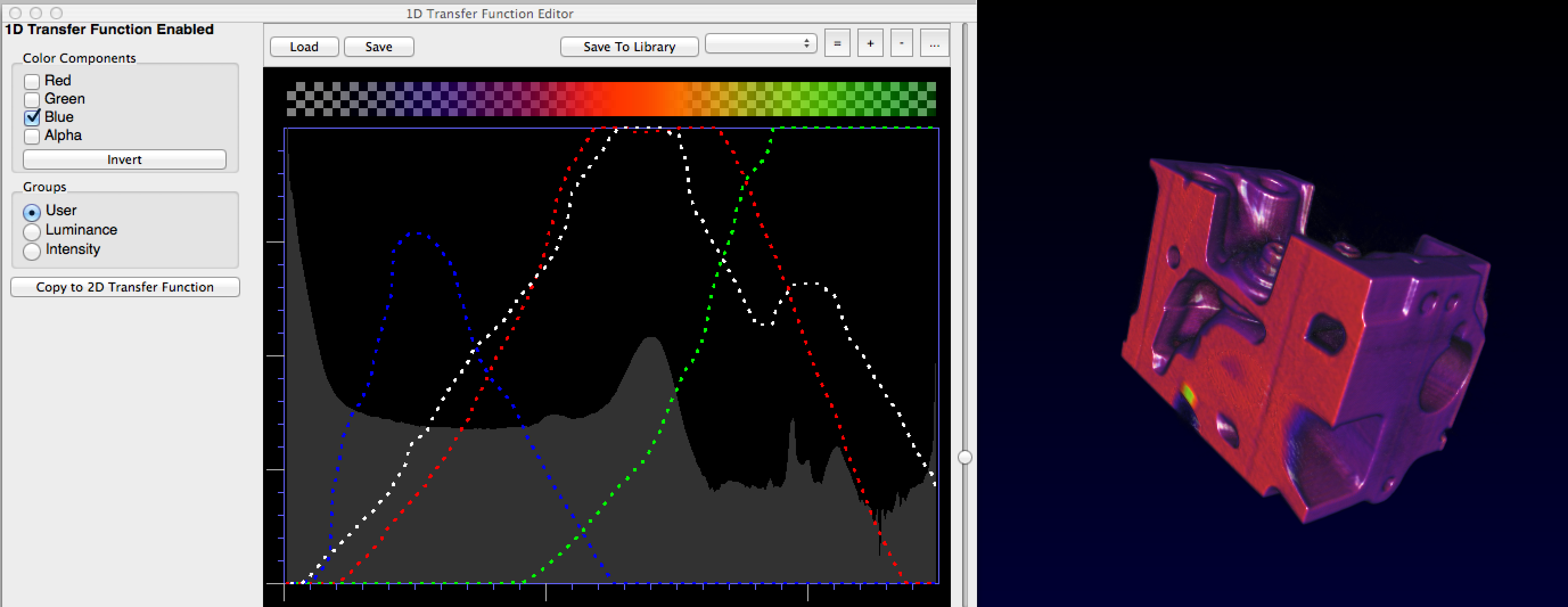
into ImageVis3D. Then, in "Workspace", click on the "1D transfer function editor." Now, you will explore this editor to create your own custom transfer functions for your selected volume. Try and make a decent image; notice that this is not easy to do! Pay attention to the critical alpha channel, as this allows you to effectively hide different portions of the volume.

In your write-up, include the data set you chose to explore and several images of different stages of your exploration. Then, answer the following:

  • What did you like about the transfer function editor?
  • What is difficult about this editor / widget?
  • How would you improve the 1D transfer function editor?

Running the Volume Renderer

A challenging concept for volume rendering is transfer function design. As such, we are providing you with a volume renderer, courtesy of Dr. Christoph Garth at the University of Kaiserslautern. You can find the code for the assignment here. You will be modifying a single file ( Controls.java ), which will update the control panel window.

First, test the volume renderer as it is. You will need to download the assignment code as well as the latest version of Processing -- NOTE: this assignment requires you to be running Processing 2.1! If you have a slower computer, you may wish to go to the Engman lab as the volume renderer will rely on a fairly modern GPU; the computers in the Engman lab run the code well (see the data exploration assignment). 
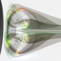
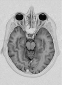
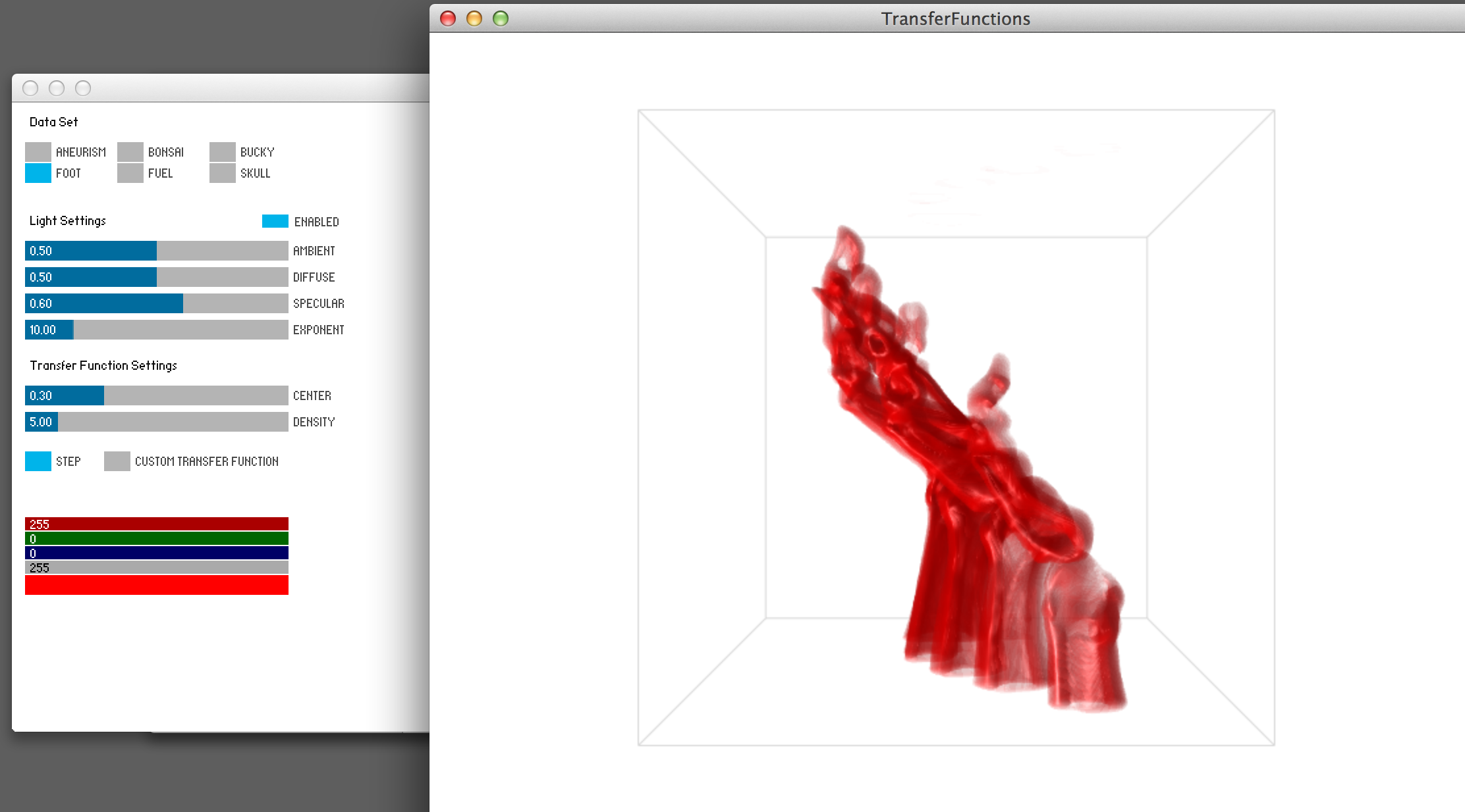
Load this program up in Processing and run it. You should successfully get a screen as on the right.

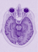
Volume Visualization and Control Panel
In the volume rendering window, you can move the dataset around using the left and right mouse keys + dragging. This style of panning and zooming interaction is nearly universal for volume visualization tools.

After running the program, explore the current GUI for the control panel. The control panel widgets are generated using the controlP5 library, a Processing widget library that many use for buttons, sliders, etc. Explore this interface. You can choose different data sets and details about each will be printed in the Processing console. You can edit lighting settings, or disable them completely. Different settings for lighting often play a critical role in effective 3D images.

The last set of options in the control panel deals with transfer functions. The center and density variables tweak the parameters to a step function, which is the default transfer function mode. There is also a color picker below that, but please note that the alpha channel is not used. Choose one of the data sets provided and tweak the step transfer function and lighting settings, in order to produce an effective rendering of your volume. Attach a screenshot of both the control panel and the volume, and then answer the following:

  • What were you able to find from your volume data set?
  • What is useful about the step function?
  • What makes this particular function limited?
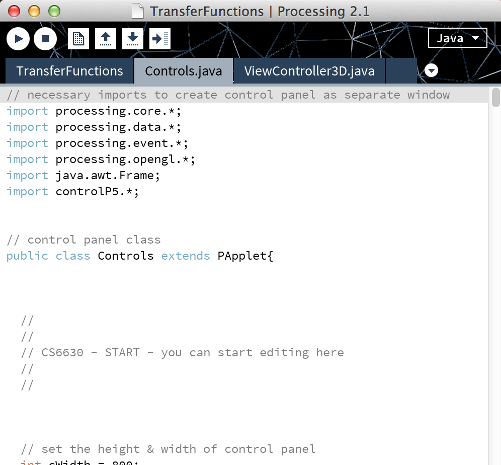
Code Structure
The main Processing sketch ( TransferFunctions.pde ) has very little code because it calls two other files: one for rendering the volume ( VolumeRenderer.java ) and another for creating a control panel ( Controls.java ). For this assignment, you will only be required to edit the control panel, and you are welcome to treat the rest of the code as a black-box that just works. For those more experienced with Java, OpenGL, and GLSL, you are welcome to explore more, if you wish, but be sure you complete the assignment. If you have any difficulties, feel free to contact a TA.

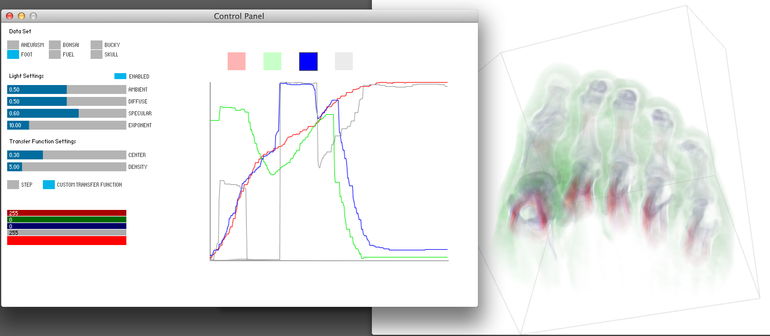
Designing Your Own Transfer Function Widget
The main purpose of this assignment is for you to design your own 1D transfer function widget. But first, you should take a step away from the code and go back to pencil and paper. Think about different ways to represent and encode a 1D transfer function. What controls will the user have access to? What user interactions will exist to make it a useful widget? You may also wish to consider the extra credit, at the end of the assignment. Try out multiple ideas, sketch two or three possible widgets that are significantly different. Scan each of your sketches into your digital notebook and explain how the interactivity works in each.

Note that most transfer function widgets give the users some context about the distribution of scalar values in the volume, ie. they often show histograms of the scalar values. These histograms can help a user to select appropriate colors and alpha values by targetting the most (or sometimes least) prevalant values. You may want to consider "scenting" your transfer function widget with a histogram.

Pick one to implement. You will be creating your widget so that it shows up on the empty, right-hand side of the Control Panel window. You will implement this widget using Processing code, and below we describe in detail where this code goes and what aspects of the existing data structures your widget must modify. The end result of your code will be to take the user input from your widget and use it to fill in the specific data structures in the code that specify the transfer function values (for both color and alpha).

Your widget code will go in Controls.java. In the implementation details below we give details on how to use the code we have provided you. Include a screenshot of your interactive widget in your digital notebook and answer the following:

  • Which of your different sketches was implemented in the code? How does it work? Why did you choose this idea?

Finding Good Transfer Functions

With your interactive widget, explore two of the included data sets, and create a good transfer function for each of them. See if you can find anything interesting or unique within your data sets. Include screenshots of your widget and the volume for each of the two data sets, and then answer the following:

  • Did you find anything interesting in the data sets?
  • What are the strengths and weaknesses of your design?
  • What would you change to make your widget more effective?
  • What are the pros and cons for volume rendering as a technique? What are the challenges?

Extra Credit
Design a 1D transfer function widget that uses a better perceptual color space for creating more effective transfer functions. You are welcome to use HSV or HSL, if you wish, but feel free to explore better color spaces, like Lab or HCL. What are the benefits of using a more perceptually uniform color space in creating transfer functions? What are the limitations or drawbacks of this approach?

If you choose to do this extra credit, you do not need to design your widget using RGBA -- you can start with this more advanced color space and complete the assignment with it.

Implementation Details
To aid with designing your widget, we have provided certain data structures for you to use. Again, be sure you are only editing in Controls.java, see right. Also, we have placed comments in that file, with the tag CS6630, to help you know where you should edit in-between. Unless you know what you are doing, we do not recommend editing code outside of there.

We have provided two variables, cWidth and cHeight, that will set the height and width of the control panel. The default elements of the control panel are set later in the file, but you should not need to edit them. The GUI of the control panel already gives you a button to switch between two transfer function modes. The second mode (custom transfer function) is the one you will use for your own widget.

We are also providing you with the volume data. First, an integer, gridSize, stores the number of data values on each edge of our 3D grid (which is uniform in all three dimensions). Also, data[x][y][z] is a 3D integer array that stores the scalar values of the volume, which have a range between 0 and 255. We also provide the min and max values for the current data set.

To define the transfer functions used by the volume renderer, your widget will need let the user set the color and alpha for each scalar value in the volume, and then fill in four different integer arrays with those values. These four arrays (red, green, blue, and alpha) each have a size of 256, which represents the scalar values 0-255. At each array element you'll need to set the appropriate color channel value for that scalar value. For example, if I want the scalar value of 10 to be transparent red, I'd set red[9]=255, green[9]=blue[9]=0, and alpha[9]=150. The color channel array values should be between 0 and 255. Thus, to find the color for the scalar value of 255, the volume renderer will check the following: red[255], green[255], blue[255], and alpha[255]. Please note that we have white backgrounds, so if all the RGB values are 0, then you are using the color black. However, the alpha channel is set so that values of 0 are transparent and values of 255 are solid. By default, the RGBA arrays are all transparent white.

If you are scenting your transfer function widget with a histogram of the scalar field values, then be aware that some of the data sets will be dominated by a single value -- this is quite common in volumes. These dominate values are most often uninteresting, such as the background or noise. You are free to "process" your histogram or display it in such a way that will minimize these dominate values. Please make sure to explain what you do in your notebook.

Like in Processing, the code has a setup() method. Do not remove or change the ordering of the initial setup calls. But, you are welcome to add more to the setup if you wish. We also have a draw() method, where the bulk of your widget will likely be written. Please note that there is a special function, updateTransferFunction(), which will pass your RGBA arrays in their current form and update the volume renderer with that data, if you are set to the proper transfer function mode (custom transfer function). You do not need to call this every draw cycle, but you must have a clear way to call this function in your widget in order to update the volume renderer with the user's transfer function.

Since you are writing in a Java file, there may be some quirks with using Processing commands. For example, to create a color, Java officially recognizes them as an int (not color!). Also, if you wish to write your own methods, you must be sure to specify them as public or private, like the setup() and draw() methods. You can do this for Processing methods that work like normal, like mouseClicked() or mouseDragged(). There may be more quirks, and, if you have trouble, feel free to contact the TAs.

Submission Details
As before, you must submit your PDF notebook and ZIP archive of your data and code via Canvas. We should be able to run your code as is.

Grading
You will be graded on how well you address the following:

  1. 10 pts: When unzipped, project runs without errors or modifications on our part
  2. 15 pts: Exploration with ImageVis3D: images and discussion
  3. 10 pts: Exploration with initial tool: images and discussion
  4. 15 pts: Custom widget sketches and discussion
  5. 40 pts: Custom widget implementation (functionality,usability, and creativity)
  6. 10 pts: Exploration with custom widget: images and discussion
  7. 10 pts:* Extra Credit 1
*This is extra credit for everyone.

Please format your notebook so these are easy to find. If we can't find something in a reasonable amount of time, you will not recieve credit for it.

exams

The exams will pull from both the lecture content and the required readings. The first exam will cover the foundational material from weeks 1-6, and the second exam will cover the technique material from weeks 7-15. You are allowed one 8.5 x 11 piece of paper of notes for each exam. NO COMPUTERS ARE ALLOWED DURING THE EXAMS.

lectures

L1. INTRODUCTION | TUES AUG. 26

recommended - A Tour through the Visualization Zoo. Jeffrey Heer, Michael Bostock, Vadim Ogievetsky. Communications of the ACM, 53(6), pp. 59-67, Jun 2010.
- The Value of Visualization. Jarke van Wijk. Proceedings of the IEEE Visualization Conference, pp. 79-86, 2005.
slides L01-intro.pdf

L2. DESIGN | THURS AUG. 28

required - Visualization Analysis and Design, Ch. 1 What's Vis, and Why Do It? Tamara Munzner.
- Visualization Analysis and Design, Ch. 6.10 Function First, Form Next Tamara Munzner.
- 99% Details. Podcast from 99% Invisible, Sep 2010.
recommended - Design Principles for Visual Communication. Maneesh Agrawala, Wilmot Li, Floraine Berthouzoz. Communications of the ACM, 54(4), pp. 60-69, Apr 2011.
- Design of data figures. Bang Wong. Nature Methods 7, pp. 665, Sept 2010.
- Negative space. Bang Wong. Nature Methods 8, pp. 5, Jan 2011.
- A User Study of Visualization Effectiveness Using EEG and Cognitive Load. E. W. Anderson, K. C. Potter, L. E. Matzen2, J. F. Shepherd, G. A. Preston, C. T. Silva. Computer Graphics Forum, Volume 30, Issue 3, pages 791Ð800, June 2011.
- Useful Junk? The Effects of Visual Embellishment on Comprehension and Memorability of Charts. Scott Bateman, Regan L. Mandryk, Carl Gutwin, Aaron Genest, David McDine, Christopher Brooks. Proceedings of CHI '10, pp. 2573-2582, Apr 2010.
- Want to make a chart memorable? Add junk. Critique of Bateman's argument by Robert Kosara, 2011.
- What Makes a Visualization Memorable? Borkin MA, Vo AA, Bylinskii Z, Isola P, Sunkavalli S, Oliva A, Pfister H. IEEE Transactions on Visualization and Computer Graphics (Proceedings of InfoVis 2013). 2013.
- Unseen and Unaware: Implications of Recent Research on Failures of Visual Awareness for HumanÐComputer Interface Design. Alexander Varakin, Daniel T. Levin, Roger Fidler. Human-Computer Interaction, 19(4), pp. 389-422, Nov 2009.
- The Visual Display of Quantitative Information. Edward Tufte. 2001.
slides L02-design.pdf

L3. PERCEPTION | TUES SEPT. 2

required - Visual Thinking for Design, Ch. 1 & 2, Visual Queries & What We Can Easily See. Colin Ware.
recommended - Perception in visualization. Chris Healey.
- Gestalt and composition. In Course #13, SIGGRAPH 2002. Fredo Durand.
- High-Speed Visual Estimation Using Preattentive Processing. C. Healey, K. Booth, and J. Enns. ACM Transactions on Computer Human Interaction 3(2), pp. 107-135, 1996.
- Visual Perception from a Computer Graphics Perspective. W. Thompson, R. Fleming, S. Creem-Regehr, J. Stefanucci. CRC Press, 2011.
- Gestalt principles (part 1). Bang Wong. Nature Methods 7, pp. 863, Nov 2010.
- Gestalt principles (part 2). Bang Wong. Nature Methods 7, pp. 941, Dec 2010.
- National Geographic: Test Your Brain Episode 1 - Pay Attention.
- National Geographic: Test Your Brain Episode 2 - Perception.
- National Geographic: Test Your Brain Episode 3 - Memory.
slides L03-perception.pdf

L4. DATA TYPES & INTRO TO TABLEAU | TUES SEPT. 4

required - Visualization Analysis and Design, Ch. 2 What: Data Abstraction Tamara Munzner.
recommended - Polaris: A System for Query, Analysis and Visualization of Multi-dimensional Relational Databases (extended paper). Chris Stolte, Diane Tang and Pat Hanrahan. IEEE Transactions on Visualization and Computer Graphics, Vol. 8, No. 1, January 2002.
- What Does the User Want to See? What do the Data Want to Be? A. Johannes Pretorius and Jarke J. Van Wijk. Information Visualization 8: 153, 2009.
- Levels of Measurement. Wikipedia.
- On the Theory of Scales of Measurement. S. S. Stevens. Science, 103(2684), pp. 677-680, June 1946.
slides L04-data.pdf

L5. VISUAL ENCODINGS | TUES SEPT. 9

required - Visualization Analysis and Design, Ch. 5 Marks and Channels, Tamara Munzner.
- Visualization Analysis and Design, Ch. 6.3-6.6, and 6.9 Rules of Thumb, Tamara Munzner.
- Visualization Analysis and Design, Ch. 10.4 Mapping Other Channels, Tamara Munzner.
recommended - Graphical Perception: Theory, Experimentation and the Application to the Development of Graphical Models. William S. Cleveland, Robert McGill, J. Am. Stat. Assoc. 79:387, pp. 531-554, 1984.
- Automating the Design of Graphical Presentations of Relational Information. Jock Mackinlay. ACM TOG 5(2), 1986.
- The Structure of the Information Visualization Design Space. Stuart Card and Jock Mackinlay. Proceedings of InfoVis, 1997.
- Crowdsourcing Graphical Perception: Using Mechanical Turk to Assess Visualization Design. Jeffrey Heer, Michael Bostock. ACM Human Factors in Computing Systems (CHI), 203Ð212, 2010.
- Animation: Can It Facilitate? Barbara Tversky, Julie Morrison, Mireille Betrancourt. International Journal of Human Computer Studies 57:4, pp 247-262, 2002.
- Animated Transitions in Statistical Data Graphics. Jeffrey Heer and George G. Robertson. IEEE TVCG (Proc. InfoVis 2007) 13(6): 1240-1247, 2007.
- The Eyeballing Game.
slides L05-visual-encoding.pdf

L6. COLOR | THURS SEPT. 11

required - Visualization Analysis and Design, Ch. 10.2-10.3 Color Theory and Colormaps, Tamara Munzner.
- Visual Thinking for Design, Ch. 4 Color. Colin Ware.
recommended - Rainbow Color Map (Still) Considered Harmful. D. Borland and R. Taylor. Computer Graphics and Applications, 27(2), pp. 14-17, 2007.
- How Not to Lie with Visualization. Bernice E. Rogowitz and Lloyd Treinish. Computers in Physics, 10, n.3, pp. 268-274, May/June 1996.
- Face-based Luminance Matching for Perceptual Colormap Generation. Gordon Kindlmann, Sarah Creem, Erik Reinhard. In Proceedings of IEEE Visualization, pages 299Ð306, October 2002.
- Color Use Guidelines for Mapping and Visualization. Cynthia A. Brewer. Proceedings of the Section on Statistical Graphics, American Statistical Association, Alexandria VA. pp. 55-60. 1999.
- Selecting Semantically-Resonant Colors for Data Visualization. Sharon Lin, Julie Fortuna, Chinmay Kulkarni, Maureen Stone, Jeffrey Heer. Computer Graphics Forum (Proc. EuroVis), 2013.
- Perceptually Driven Visibility Optimization for Categorical Data Visualization. Sungkil Lee, Mike Sips, Hans-Peter Seidel. IEEE Transactions on Visualization and Computer Graphics, Vol. 19, No. 10, October 2013.
- Color Naming Models for Color Selection, Image Editing and Palette Design. Jeffrey Heer, Maureen Stone. ACM Human Factors in Computing Systems (CHI), 2012.
- Choosing Colors for Data Visualization. M. Stone, 2006.
- Representing Colors as Three Numbers. M. Stone. IEEE CG&A, July/Aug 2005.
- Using Color Effectively in Computer Graphics. Joan R. Truckenbrod. SIGGRAPH, 1981.
- Color coding. Bang Wong. Nature Methods 7, pp. 573, Aug 2010.
- Color blindness. Bang Wong. Nature Methods 8, pp. 441, May 2011.
- Colors. RadioLab, Season 10, Episode 13.
resources - Color Brewer 2.0
- Color Overview & Tools
- HCL Color Picker
- MudCube Color Scheme (can simulate color deficiency)
- Color Converter (across multiple color spaces)
- More color resources, from Bruce Lindbloom.
slides L06-color.pdf

L7. INTRO TO PROCESSING | TUES SEPT. 16

required - Getting Started with Processing
- Processing Overview
- Drawing in Processing
recommended - Learning Processing, Ch. 1-3 (Lesson 1), Daniel Shiffman, Morgan Kaufmann, 2008.
resources - Download Processing
- Processing Tutorials
- Processing Examples
slides L07-processing.pdf

PROCESSING LAB DAY | THURS SEPT. 18

exercises - Processing exercises, c/o Dr. Josh Levine
- data.txt for Processing exercise #2

L8. TASKS & INTERACTION | TUES SEPT. 23

required - Visualization Analysis and Design, Ch. 3 Why: Task Abstraction, Tamara Munzner.
- Visualization Analysis and Design, Ch. 11 Manipulate View, Tamara Munzner.
- Visualization Analysis and Design, Ch. 6.8 Responsiveness Is Required, Tamara Munzner.
recommended - Low-Level Components of Analytic Activity in Information Visualization. Robert Amar, James Eagan, and John Stasko. Proceedings of InfoVis, 2005.
- A Multi-Level Typology of Abstract Visualization Tasks. Matthew Brehmer and Tamara Munzner. IEEE Transactions on Visualization and Computer Graphics (TVCG), 19(12), p. 2376--2385, 2013.
- A Design Space of Visualization Tasks. Hans-Jorg Schulz, Thomas Nocke, Magnus Heitzler, and Heidrun Schumann. IEEE Transactions on Visualization and Computer Graphics (TVCG), 19(12), p. 2376--2385, 2013.
- Toward a Deeper Understanding of the Role of Interaction in Information Visualization. J.S. Yi, Y.A. Kang, J.T. Stasko and J.A. Jacko, IEEE Transactions on Visualization and Computer Graphics, Vol. 13, No. 6, Nov/Dec 2007, pp. 1224-1231.
- Fluid interaction for information visualization. N. Elmqvist, A. Vande Moere, H-C. Jetter, D. Cernea, H. Reiterer, and TJ Jankun-Kelly, Information Visualization, Vol. 10, No. 4, Oct. 2011, pp. 327-340.
- Interactive Dynamics for Visual Analysis. Heer & Shneiderman. Queue 10, 2, Pages 30 (February 2012).
- Pad++: A Zooming Graphical Interface for Exploring Alternate Interface Physics Ben Bederson, and James D Hollan, Proc UIST 94.
- Space-Scale Diagrams: Understanding Multiscale Interfaces George Furnas and Ben Bederson, Proc SIGCHI '95.
- Smooth and efficient zooming and panning. Jarke J. van Wijk and Wim A.A. Nuij. INFOVIS'03 Proceedings of the Ninth annual IEEE conference on Information visualization.
- Animated Transitions in Statistical Data Graphics. Jeffrey Heer and George G. Robertson. IEEE TVCG (Proc. InfoVis 2007) 13(6): 1240-1247, 2007.
slides L08-tasks-interaction.pdf

L9. VIEWS | THURS SEPT. 25

required - Visualization Analysis and Design, Ch. 12 Facet Into Multiple Views, Tamara Munzner.
- Visualization Analysis and Design, Ch. 6.7 Overview First, Zoom and Filter, Details on Demand, Tamara Munzner.
recommended - Cognitive costs of zooming versus using multiple windows. Matthew D. Plumlee and Colin Ware. ACM Trans. Applied Perception (TAP) 13(2):1-31, 2006.
- Guidelines for Using Multiple Views in Information Visualization. M. Wang, A. Woodruff, A. Kuchinsky. Proceedings of the working conference on Advanced visual interfaces (AVI '00), 2000.
- State of the Art: Coordinated & Multiple Views in Exploratory Visualization. J. Roberts. Proc. Conference on Coordinated & Multiple Views in Exploratory Visualization (CMV) 2007.
- Interactive Coordinated Multiple-View Visualization of Biomechanical Motion Data. Daniel F. Keefe, Marcus Ewert, William Ribarsky, Remco Chang. IEEE Trans. Visualization and Computer Graphics (Proc. Vis 2009), 15(6):1383-1390, 2009.
- The Eyes Have It: A Task by Data Type Taxonomy for Information Visualizations. Ben Shneiderman. Proceedings of the IEEE Conference on Visual Languages, 1996.
- The visual design and control of the trellis display. R. Becker, W. Cleveland, M. Shyu. Journal of Computational and Graphical Statistics, 5(2), 1996.
- Configuring Hierarchical Layouts to Address Research Questions. A. Slingsby, J. Dykes, J. Wood. IEEE Transactions on Visualization and Computer Graphics 15 (6), Nov-Dec 2009.
- Product Plots. H. Wickham, H. Hofmann. IEEE Transactions on Visualization and Computer Graphics (Proc. InfoVis '11), 2011.
- Taxonomy-Based Glyph Design Ñ with a Case Study on Visualizing Workflows of Biological Experiments. Eamonn Maguire, Philippe Rocca-Serra, Susanna-Assunta Sansone, Jim Davies, and Min Chen. IEEE TRANSACTIONS ON VISUALIZATION AND COMPUTER GRAPHICS, VOL. 18, NO. 12, DECEMBER 2012.
slides L09-views.pdf

L10. FOCUS+CONTEXT | TUES SEPT. 30

required - Visualization Analysis and Design, Ch. 14 Embed: Focus + Context, Tamara Munzner.
recommended - A review of overview+detail, zooming, and focus+context interfaces. Andy Cockburn, Amy Karlson, and Benjamin B. Bederson. ACM Computing Surveys 41(1), 2008.
- A fisheye follow-up: further reflections on focus + context George Furnas, CHI '06, Proceedings of the SIGCHI conference on Human Factors in computing systems.
- SpaceTree: Supporting Exploration in Large Node Link Tree, Design Evolution and Empirical Evaluation Catherine Plaisant, Jesse Grosjean, and Ben B. Bederson. Proc. InfoVis 2002.
- Degree-of-interest trees: a component of an attention-reactive user interface. S. Card and D. Nation, Proceedings of the Working Conference on Advanced Visual Interfaces (AVI 02), 2002.
slides L10-focus+context.pdf

L11. FILTERING AND AGGREGATION | THURS OCT. 2

required - Visualization Analysis and Design, Ch. 13 Reduce Items and Attributes, Tamara Munzner.
recommended - Empirical Guidance on Scatterplot and Dimension Reduction Technique Choices. Michael Sedlmair, Tamara Munzner, and Melanie Tory. IEEE Trans. Visualization and Computer Graphics (Proc. InfoVis 2013) 19(12): 2634-2643, 2013.
- Glimmer: Multilevel MDS on the GPU. Stephen Ingram, Tamara Munzner and Marc Olano. IEEE TVCG, 15(2):249-261, Mar/Apr 2009.
- Visual Exploration of High Dimensional Scalar Functions. Samuel Gerber, Peer-Timo Bremer, Valerio Pascucci, Ross Whitaker, IEEE Transactions on Visualization and Computer Graphics, Proceedings of VIS 2010.
- DimStiller: Workflows for dimensional analysis and reduction. Stephen Ingram, Tamara Munzner, Veronika Irvine, Melanie Tory, Steven Bergner, and Torsten Moeller. IEEE Conference on Visual Analytics Software and Technologies (VAST) 2010, p 3-10.
- Interactive Dimensionality Reduction Through User-defined Combinations of Quality Metrics. Sara Johansson and Jimmy Johansson. IEEE Trans. Visualization and Computer Graphics (Proc. InfoVis 09) 15(6):993-1000, 2009.
slides L11-filtering-aggregation.pdf

L12. TABLES | THURS OCT. 9

required - Visualization Analysis and Design, Ch. 7 Tables, Tamara Munzner.
recommended - Arc Length-based Aspect Ratio Selection. Justin Talbot, John Gerth, and Pat Hanrahan. IEEE TVCG (Proceedings of InfoVis), 2011.
- An Empirical Model of Slope Ratio Comparisons. Justin Talbot, John Gerth, and Pat Hanrahan. IEEE TVCG (Proceedings of InfoVis), 2012.
- An Extension of WilkinsonÕs Algorithm for Positioning Tick Labels on Axes. Justin Talbot, Sharon Lin, and Pat Hanrahan. IEEE TVCG 16(6), 2010.
- Multi-Scale Banking to 45 Degrees Jeffrey Heer, Maneesh Agrawala. Proc. InfoVis 2006, published as IEEE Transactions on Visualization and Computer Graphics (TVCG), 12(5), Sep/Oct 2006, pages 701-708.
- LineUp: Visual Analysis of Multi-Attribute Rankings. Samuel Gratzl, Alexander Lex, Nils Gehlenborg, Hanspeter Pfister and Marc Streit. IEEE Transactions on Visualization and Computer Graphics (InfoVis '13), 2013.
- VisDB: A System for Visualizing Large Databases. Daniel A. Keim, Hans-Peter Kriegel. Proceedings of ACM SIGMOD 1995.
- Interactively Exploring Hierarchical Clustering Results. Jinwook Seo and Ben Shneiderman. IEEE Computer, Volume 35, Number 7, pp. 80-86, July 2002.
- Stacked Graphs Ð Geometry & Aesthetics. Byron & Wattenberg. Proceedings of InfoVis 2008.
- Metric-Based Network Exploration and Multiscale Scatterplot Yves Chiricota, Fabien Jourdan, Guy Melancon. Proc. InfoVis 04, pages 135-142.
- Hierarchical Parallel Coordinates for Exploration of Large Datasets Ying-Huey Fua, Matthew O. Ward, and Elke A. Rundensteiner, IEEE Visualization '99.
- Sizing the Horizon: The Effects of Chart Size and Layering on the Graphical Perception of Time Series Visualizations. Jeffrey Heer, Nicholas Kong, and Maneesh Agrawala. ACM Human Factors in Computing Systems (CHI), 2009. pp. 1303 - 1312.
- Parallel sets: visual analysis of categorical data Fabien Bendix, Robert Kosara, and Helwig Hauser. Proc. InfoVis 2005, p 133-140.
slides L12-tabular.pdf

L13. TREES AND GRAPHS | TUES OCT. 21

required - Visualization Analysis and Design, Ch. 9 Arrange Networks and Trees, Tamara Munzner.
- A Visual Bibliography of Tree Visualization, Hans-Jorg Schulz, InfoVis 2010 Best Poster.
recommended - Graph Visualisation in Information Visualisation: a Survey Ivan Herman, Guy Melancon, M. Scott Marshall. IEEE Transactions on Visualization and Computer Graphics, 6(1), pp. 24-44, 2000.
- A survey of multiple tree visualisation. Martin Graham and Jessie Kennedy. Information Visualization, vol. 9 no. 4, 235-252, 2010.
- Visual Exploration of Multivariate Graphs. Martin Wattenberg, Proc. CHI 2006.
- ABySS-Explorer: Visualizing genome sequence assemblies. Cydney B. Nielsen, Shaun D. Jackman, Inanc Birol, Steven J.M. Jones. IEEE Transactions on Visualization and Computer Graphics (Proc InfoVis 2009) 15(6):881-8, 2009.
- Task taxonomy for graph visualization.B. Lee, C. Plaisant, C. Sims Parr, J.-D. Fekete, N. Henry, Proc. of BELIV '06, April '06, pp. 1-5.
- Online Dynamic Graph Drawing Yaniv Frishman and Ayellet Tal. Proc EuroVis 2007, 75-82.
- Cushion Treemaps Jack J. van Wijk and Huub van de Wetering, Proc InfoVis 1999, pp 73-78.
- Map of the market.
- Visualization of large tree structures.
- Planarity game.
- Force-directed layout in Protovis.
slides L13-trees-graphs.pdf

L14. TEXT AND SETS | THURS OCT. 23

required - Search User Interfaces - Chapter 11, Information Visualization for Text Analysis. Marti A. Hearst, 2009.
- Visualizing Sets and Set-typed Data: State-of-the-Art and Future Challenges. Alsallakh, Bilal and Micallef, Luana and Aigner, Wolfgang and Hauser, Helwig and Miksch, Silvia and Rodgers, Peter, Eurographics Conference on Visualization (EuroVis), June 2014.
recommended - ThemeRiver: Visualizing Theme Changes over Time. Susan Havre, Beth Hetzler, Lucy Nowell. IEEE Information Visualization Symposium, 2000.
- The Word Tree, an Interactive Visual Concordance. Martin Wattenberg, Fernanda Viegas. IEEE Trans. Visualization and Computer Graphics, 2008.
- Jigsaw: Supporting Investigative Analysis through Interactive Visualization. John Stasko, Carsten Gorg, Zhicheng Liu. Information Visualization, 2008.
- DocuBurst: Visualizing Document Content using Language Structure. Christopher Collins, Sheelagh Carpendale, Gerald Penn. IEEE Eurographics VGTC Symposium, 2009.
- Mapping Text with Phrase Nets. Frank van Ham, Martin Wattenberg, Fernanda Viegas. IEEE Trans. Visualization and Computer Graphics, 2009.
- Arc Diagrams: Visualizing Structure in Strings. Martin Wattenberg. IEEE Information Visualization Symposium, 2002.
- Rule-based Visual Mappings - with a Case Study on Poetry Visualization. Alfie Abdul-Rahman, Julie Lein, Katharine Coles, Emmon Maguire, Miriah Meyer, Martine Wynne, Chris Johnson, Anne Trefethen, and Min Chen. Computer Graphics Forum (Proceedings of EuroVis 2013), 32(3), 2013.
- Wordle. Jonathan Feinberg. Beautiful Visualization, O'Reilly Media, 2010.
- Bubble Sets: Revealing Set Relations with Isocontours over Existing Visualizations. C. Collins, G. Penn, S. Carpendale. IEEE Trans. Visualization and Computer Graphics, 2009.
- Untangling Euler Diagrams. Nathalie Henry Riche, Tim Dwyer. IEEE Trans. Visualization and Computer Graphics, 2010.
- Design Study of LineSets, a Novel Set Visualization Technique. B. Alper, N.H. Riche, G. Ramos, M. Czerwinski. IEEE Trans. Visualization and Computer Graphics, 2011.
- KelpFusion: A Hybrid Set Visualization Technique. W. Meulemans, N.H. Riche, B. Speckmann, B. Alper, T. Dwyer. IEEE Trans. Visualization and Computer Graphics, 2013.
slides L14-text-sets.pdf

L15. MAPS | TUES OCT. 28

required - Visualization Analysis and Design, Ch. 8.1-8.3 Arrange Spatial Data, Tamara Munzner.
recommended - The Evolution of Thematic Cartography/A Research Methodology and Historical Review. Alan M. MacEachren. The Canadian Cartographer 16:1 (1979), 17-33.
- Unfolding the Earth: Myriahedral Projections. Jarke J. van Wijk, The Cartographic Journal, Vol. 45, No. 1, pp.32-42, February 2008.
- Diffusion-based method for producing density-equalizing maps. Michael T. Gastner and M. E. J. Newman, PNAS 101(20), 2004.
- Necklace Maps. Bettina Speckmann and Kevin Verbeek, Proceedings of InfoVis, 2010.
- Map Projections
- Cartogram Central
- Myriahedral Projections
slides L15-maps.pdf

L16. GRIDS | THURS OCT. 30

required - Mathematical Principles for Scientific Computing and Visualization, Chapter 13 Facets. Gerald Farin and Dianne Hansford. A K Peters/CRC Press, 2008.
recommended - A Survey of Grid Generation Methodologies and Scientific Visualization Efforts. Bernd Hamann, Robert J. Moorhead In G. M. Nielson, Hans Hagen, H. Muller , eds. Scientific Visualization: Overviews, Methodologies, and Techniques IEEE Computer Society Press, Los Alamitos, 1997.
- Sections 10.1-10.3: Unstructured Mesh Generation. Jonathan Richard Shewchuk. In Combinatorial Scientific Computing (Uwe Naumann and Olaf Schenk, editors), Chapter 10, pages 257-297, CRC Press, January 2012.
- Fast, Memory-Efficient Cell Location in Unstructured Grids for Visualization. Christoph Garth, Kenneth I. Joy: IEEE Trans. Vis. Comput. Graph. 16(6): 1541-1550, 2010.
- Streaming Simplification of Tetrahedral Meshes. Huy T. Vo, Steven P. Callahan, Peter Lindstrom, Valerio Pascucci, Cláudio T. Silva. IEEE Trans. Vis. Comput. Graph. 13(1): 145-155, 2007.
slides L16-grids.pdf

L17. ISOSURFACES | TUES NOV. 4

required - Visualization Analysis and Design, Ch. 8.4.1 Arrange Spatial Data, Tamara Munzner.
- Marching Cubes: A High Resolution 3D Surface Construction Algorithm. William E. Lorensen and Harvey E. Cline, Computer Graphics (Proceedings of SIGGRAPH 87), 21 (4), pp. 163-169 (July 1987, Anaheim, California).
recommended - Data structures for soft objects. Geoff Wyvill, Craig McPheeters, Brian Wyvill. The Visual Computer 2(4): 227-234 (1986).
- The Asymptotic Decider: Resolving the Ambiguity in Marching Cubes, Gregory M. Nielson, Bernd Hamann. IEEE Visualization 1991: 83-93.
- Topology Verification for Isosurface Extraction, Tiago Etiene, Luis Gustavo Nonato, Carlos Eduardo Scheidegger, Julien Tierny, Thomas J. Peters, Valerio Pascucci, Robert M. Kirby, Cl‡udio T. Silva. IEEE Trans. Vis. Comput. Graph. 18(6): 952-965 (2012).
- Topology, Accuracy, and Quality of Isosurface Meshes Using Dynamic Particles, Miriah D. Meyer, Robert M. Kirby, Ross T. Whitaker. IEEE Trans. Vis. Comput. Graph. 13(6): 1704-1711 (2007).
- On the Fractal Dimension of Isosurfaces. Marc Khoury, Rephael Wenger. IEEE Trans. Vis. Comput. Graph. 16(6): 1198-1205 (2010).
- A Near Optimal Isosurface Extraction Algorithm Using the Span Space. Yarden Livnat, Han-Wei Shen, Christopher R. Johnson. IEEE Trans. Vis. Comput. Graph. 2(1): 73-84 (1996).
- Isosurfaces: Geometry, Topology, and Algorithms. Rephael Wenger. A K Peters/CRC Press 2013.
slides L17-isosurfaces.pdf

L18. 3D GRAPHICS | THURS NOV. 6

required - Mathematical Principles for Scientific Computing and Visualization, Chapter 16 Background. Gerald Farin and Dianne Hansford. A K Peters/CRC Press, 2008.
recommended - Light reflection functions for simulation of clouds and dusty surfaces. James F. Blinn. SIGGRAPH 16(3): 21-29, 1982.
- Compositing digital images. Thomas Porter and Tom Duff. SIGGRAPH 18(3): 253-259, 1984.
- The rendering equation. James T. Kajiya. SIGGRAPH 20(4): 143-150, 1986.
- Example-based Volume Illustrations. Aidong Lu, David S. Ebert. Proceedings of IEEE Visualization, pp. 655-662, 2005.
- Volume Illustration: Nonphotorealistic Rendering of Volume Models. Penny Rheingans, David S. Ebert. IEEE Trans. Vis. Comput. Graph. 7(3): 253-264 (2001).
- History of computer graphics.
- Short overview on Wikipedia.
- Short history of the U in graphics.
- History of the Utah Teapot.
sildes L18-graphics.pdf

L19. VOLUME RENDERING | TUES NOV. 11

required - Visualization Analysis and Design, Ch. 8.4.2 Arrange Spatial Data, Tamara Munzner.
recommended - Real-Time Volume Graphics, Chapters 1, 3, 7, and 9, Klaus Engel, Markus Hadwiger, Joe Kniss, Christof Rezk-Salama, Daniel Weiskopf, A K Peters, 2006
- Real-Time Volume Graphics (course notes), Klaus Engel, Markus Hadwiger, Joe Kniss, Aaron Lefohn, Christof Rezk-Salama and Daniel Weiskopf. Original SIGGRAPH 2004 course. Also, slides from newer coursenotes from EG 2006.
- A rendering algorithm for visualizing 3D scalar fields. Paolo Sabella. SIGGRAPH 1988: 51-58.
- Display of Surfaces from Volume Data, Marc Levoy, IEEE Computer Graphics and Applications, 8(3), 29-37, 1988
- Volume rendering, Robert A. Drebin, Loren C. Carpenter, Pat Hanrahan. SIGGRAPH Computer Graphics, Vol. 22, No. 4, August, 1988, pages 51-58.
- Footprint Evaluation for Volume Rendering, Lee Westover. ACM SIGGRAPH Computer Graphics, vol. 24, no. 4, pp. 367-376, 1990.
- Fast Volume Rendering Using a Shear-Warp Factorization of the Viewing Transformation. Lacroute, P. and Levoy, M. in Proceedings of ACM SIGGRAPH 1994. pages 451-458
- A Model for Volume Lighting and Modeling. Joe Kniss, Simon Premoze, Charles Hansen, Peter Shirley, Allen McPherson, IEEE Transactions on Visualization and Computer Graphics (TVCG), Vol. 9, No. 2, April 2003.
- A Survey of GPU-Based Volume Rendering of Unstructured Grids. Cláudio T. Silva, João Luiz Dihl Comba, Steven P. Callahan, Fábio F. Bernardon. RITA 12(2): 9-30 (2005).
- Hierarchical Exploration of Volumes Using Multilevel Segmentation of the Intensity-Gradient Histograms, Cheuk Yiu Ip, Amitabh Varshney, Joseph JaJa, IEEE VisWeek, 2012. -- Check out the video.
slides L19-volume-rendering.pdf

L20. TRANSFER FUNCTION DESIGN | THURS NOV. 13

guest Dr. Josh Levine, assistant professor, School of Computing, Clemson University.
required - The Transfer Function Bake-Off. Hanspeter Pfister, William E. Lorensen, Chandrajit L. Bajaj, Gordon L. Kindlmann, William J. Schroeder, Lisa Sobierajski Avila, Ken Martin, Raghu Machiraju, Jinho Lee. IEEE Computer Graphics and Applications 21(3): 16-22 (2001).
- Semi-Automatic Generation of Transfer Functions for Direct Volume Rendering, Gordon Kindlmann, James Durkin, IEEE 1998 Symposium on Volume Visualization, pages 79-86.
recommended - The contour spectrum., Chandrajit L. Bajaj, Valerio Pascucci, Daniel Schikore. IEEE Visualization 1997: 167-174
- Interactive Volume Rendering Using Multi-Dimensional Transfer Functions and Direct Manipulation Widgets, Joe Kniss, Gordon Kindlmann, Charles Hansen, IEEE Visualization 2001, pages 255-262.
- Curvature-Based Transfer Functions for Direct Volume Rendering: Methods and Applications, Gordon Kindlmann, Ross Whitaker, Tolga Tasdizen, Torsten Mšller, IEEE Visualization 2003.
- Gaussian Transfer Functions for Multi-Field Volume Visualization. Joe Kniss, Simon Premoze, Milan Ikits, Aaron E. Lefohn, Charles D. Hansen, Emil Praun. IEEE Visualization, pp. 497-504, 2003.
- Statistically Quantitative Volume Visualization. Joe Michael Kniss, Robert L. Van Uitert Jr., Abraham Stephens, Guo-Shi Li, Tolga Tasdizen, Charles D. Hansen. IEEE Visualization, pp. 287-294, 2005.
- Local Histograms for Design of Transfer Functions in Direct Volume Rendering, Claes Lundstršm, Patric Ljung, Anders Ynnerman. IEEE Trans. Vis. Comput. Graph. 12(6): 1570-1579 2006.
slides L20-transfer-functions.pdf

L21. VECTOR FIELDS | TUES NOV. 18

guest Dr. Josh Levine, assistant professor, School of Computing, Clemson University.
required - Visualization Analysis and Design, Ch. 8.5 Arrange Spatial Data, Tamara Munzner.
- Flow Visualization. Stephen Kline (National Committee for Fluid Mechanics Films). 35 min running time. Check out the Film Notes as well.
recommended - Over Two Decades of Integration-Based Geometric Flow Visualization. Tony McLouglin, Robert S. Laramee, Ronald Peikert, Frits H. Post and Min Chen. Computer Graphics Forum, Vol. 29, No. 6, 2010, pages 1807-1829.
- Image-guided streamline placement. G. Turk and D. Banks. In Proceedings of ACM SIGGRAPH, pages 453-460, 1996.
- Creating evenly-spaced streamlines of arbitrary density. B. Jobard and W. Lefer. In Visualization in Scientific Computing, pages 43-56, 1997.
- Imaged Based Streamline Generation and Rendering. Liya Li and Han-Wei Shen. IEEE Transactions on Visualization and Computer Graphics, Vol 13, No. 3, pages 630-640, 2007.
- Streak Lines as Tangent Curves of a Derived Vector Field. Tino Weinkauf, Holger Theisel. IEEE Trans. Vis. Comput. Graph. 16(6): 1225-1234 (2010).
- Farthest Point Seeding for Efficient Placement of Streamlines. Abdelkrim Mebarki, Pierre Alliez, Olivier Devillers. IEEE Visualization 2005: 61.
- The State of the Art in Flow Visualisation: Feature Extraction and Tracking. Frits H. Post, Benjamin Vrolijk, Helwig Hauser, Robert S. Laramee, Helmut Doleisch. Comput. Graph. Forum 22(4): 775-792 (2003).
slides L21-vector-fields.pdf

L22. VISUALIZATION MODELS | THURS NOV. 20

required - Visualization Analysis and Design, Ch. 4 Analysis: Four Levels for Validation, Tamara Munzner.
recommended - Software Design Patterns for Information Visualization. Jeffrey Heer, Maneesh Agrawala, IEEE Trans. Visualization & Comp. Graphics (Proc. InfoVis), 12(5), 853Ð860, 2006.
- A Nested Model for Visualization Design and Validation, Tamara Munzner, IEEE TVCG (Proc. InfoVis 2009), 15(6):921-928, 2009.
- The Nested Blocks and Guidelines Model, Miriah Meyer, Michael Sedlmair, P. Samuel Quinan, and Tamara Munzner, Journal of Information Visualization, 2013.
- Strategies for Evaluating Information Visualization Tools: Multi-dimensional In-depth Long-term Case Studies,Ben Shneiderman, Catherine Plaisant. BELIV '06 Proceedings of the 2006 AVI workshop on BEyond time and errors: novel evaluation methods for information visualization.
- Design Study Methodology: Reflections from the Trenches and the Stacks. Michael Sedlmair, Miriah Meyer, Tamara Munzner. IEEE Transactions on Visualization and Computer Graphics (Proceedings of InfoVis 2012), 18(12): 2431-2440, 2012.
- Wicked problems in design thinking. Richard Buchanan. Design Issues , Vol. 8, No. 2 (Spring, 1992), pp. 5-21.
sildes L22-vis-models.pdf

L23. TENSORS | TUES NOV. 25

guest Dr. Josh Levine, assistant professor, School of Computing, Clemson University.
required - Visualization Analysis and Design, Ch. 8.6 Arrange Spatial Data, Tamara Munzner.
- Comparing 2D Vector Field Visualization Methods: A User Study. David H. Laidlaw, Robert M. Kirby, Cullen D. Jackson, J. Scott Davidson, Timothy S. Miller, Marco da Silva, William H. Warren, Michael J. Tarr. IEEE Trans. Vis. Comput. Graph. 11(1): 59-70 (2005).
recommended - Imaging vector fields using line integral convolution. B. Cabral and C. Leedom. in Proceedings of SIGGRAPH, pages 263-270, 1993.
- Image based flow visualization. J. van Wijk. in Proceedings of ACM SIGGRAPH, pages 745-754, 2002.
- The State of the Art in Flow Visualization: Dense and Texture-Based Techniques. Robert S. Laramee, Helwig Hauser, Helmut Doleisch, Benjamin Vrolijk, Frits H. Post, and Daniel Weiskopf. in Computer Graphics Forum (CGF), Vol. 23, No. 2, 2004, pages 203-221.
- Strategies for Direct Volume Rendering of Diffusion Tensor Fields, Gordon Kindlmann, David Weinstein, David Hart, IEEE Transactions on Visualization and Computer Graphics, 6(2):124-138, April-June 2000.
- Diffusion Tensor Visualization with Glyph Packing, Gordon Kindlmann C. F. Westin, TVCG, vol.12, no.5, pp.1329-1336, Sept.-Oct. 2006.
- An Introduction to Visualization of Diffusion Tensor Imaging and Its Applications. A. Vilanova, S. Zhang, G. Kindlmann, D. Laidlaw. In J Weickert and H Hagen, editors, Visualization and Processing of Tensor Fields, pages 121-153. Springer Verlag, 2006.
- HyperLic. Xiaoqiang Zheng and Alex Pang. IEEE Visualization 2003.
- Anisotropic Noise Samples for Tensor Field Visualization. Feng, L., Hotz, I., Hamann, B., Joy, K.I. IEEE Transactions on Visualization and Computer Graphics, 2008, Vol. 14, pp. 342-354.
slides L23-tensors.pdf

L24. DESIGN STUDIES | TUES DEC. 2

required - Design Study Methodology: Reflections from the Trenches and the Stacks. Michael Sedlmair, Miriah Meyer, Tamara Munzner. IEEE Transactions on Visualization and Computer Graphics (Proceedings of InfoVis 2012), 18(12): 2431-2440, 2012.
recommended - MizBee: A Multiscale Synteny Browser. Miriah Meyer, Tamara Munzner, and Hanspeter Pfister. IEEE Trans. Visualization and Computer Graphics 15(6):897-904 (Proc. InfoVis 09), 2009.
- Variant View: Visualizing Sequence Variants in their Gene Context. Joel A. Ferstay, Cydney B. Nielsen , Tamara Munzner. IEEE Transactions on Visualization and Computer Graphics (TVCG) Proceedings of IEEE Conference on Information Visualization, Atlanta, GA, USA. 2013.
- SoccerStories: A Kick-off for Soccer Visual Analysis. Charles Perin, Romain Vuillemot, Jean-Daniel Fekete. Proceedings of the IEEE Transactions on Visualization and Computer Graphics (InfoVis'13), 2013.
- ABySS-Explorer: Visualizing genome sequence assemblies. Cydney B. Nielsen, Shaun D. Jackman, Inanc Birol, Steven J.M. Jones. IEEE Transactions on Visualization and Computer Graphics (Proc InfoVis 2009) 15(6):881-8, 2009.
- Interactive Coordinated Multiple-View Visualization of Biomechanical Motion Data. Daniel F. Keefe, Marcus Ewert, William Ribarsky, Remco Chang. IEEE Trans. Visualization and Computer Graphics (Proc. Vis 2009), 15(6):1383-1390, 2009.
- Facilitating Discourse Analysis with Interactive Visualization. Jian Zhao, Chevalier, F., Collins, C., Balakrishnan, R. IEEE Transactions on Visualization and Computer Graphics, 18(12), 2012.
sildes L24-design-studies.pdf

L25. MOLECULAR ANIMATION | THURS DEC. 4

guest Dr. Janet Iwasa, research assistant professor, Department of Biochemistry, U of Utah School of Medicine.
required - Animating the model figure. Janet Iwasa. Trends in Cell Biology, 2010, vol. 20, no12, pp. 699-704.
recommended - Crafting a career in molecular animation. Janet Iwasa. Mol Biol Cell. 2014 Oct 1;25(19):2891-3, 2014.
- How animations can help scientists test a hypothesis. Janet's TED talk, 2014.
sildes L25-molecular-animation.pdf

L26. D3 + OTHER TOOLS | TUES DEC. 9

recommended - Khan Academy introduction to HTML and CSS.
- W3School intro to Javascript.
- D3 homepage.

slides L26-tools.pdf