Even though the images are TIFF, you can get at the data by just skipping the first 8024 bytes. This tell unu to skip 8024 bytes into 1400.tif, and then downsample by a factor of 10, using the Catmull-Rom kernel, and save the result out to PNG format (web-compatible):
unu make -i 1400.tif -t uchar -s 3 4900 3900 -bs 8024 -e raw \
  | unu resample -s = x0.1 x0.1 -k cubic:0,0.5 -o 1400-small.png
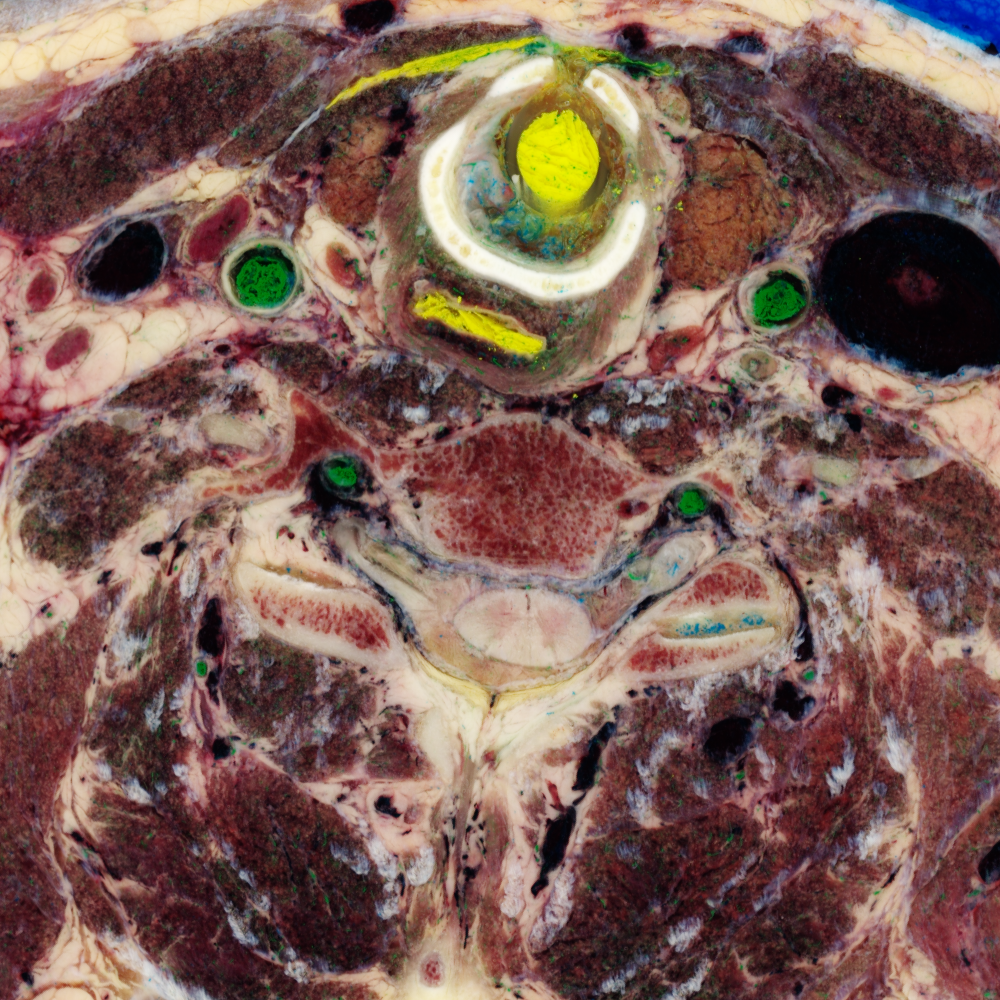
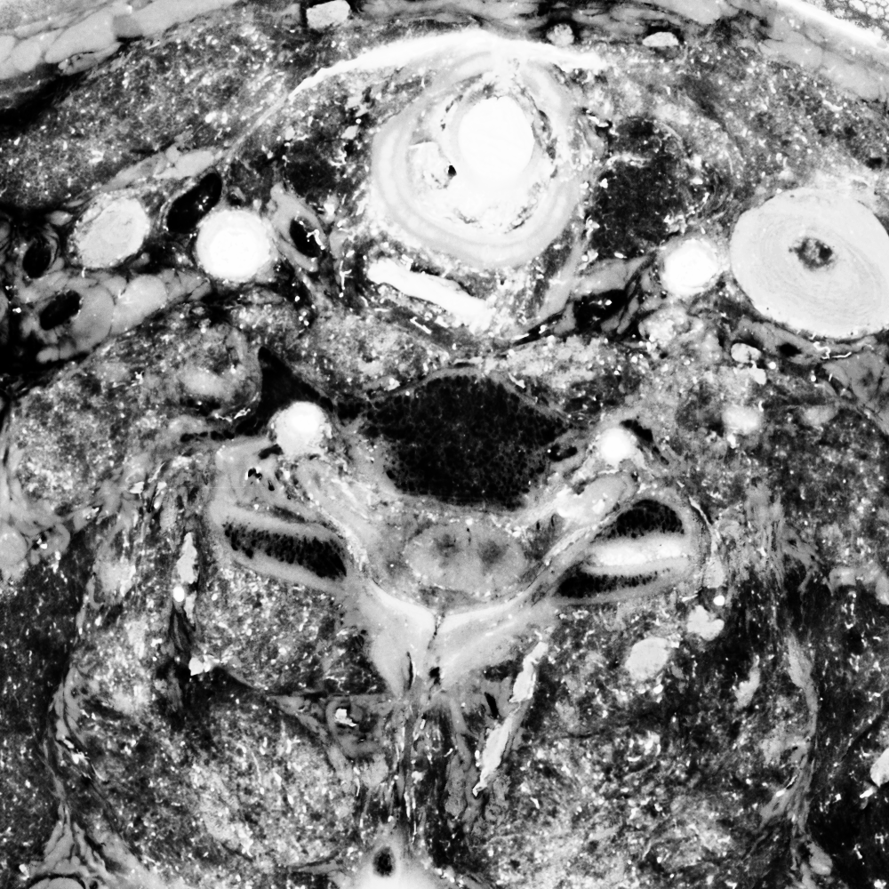
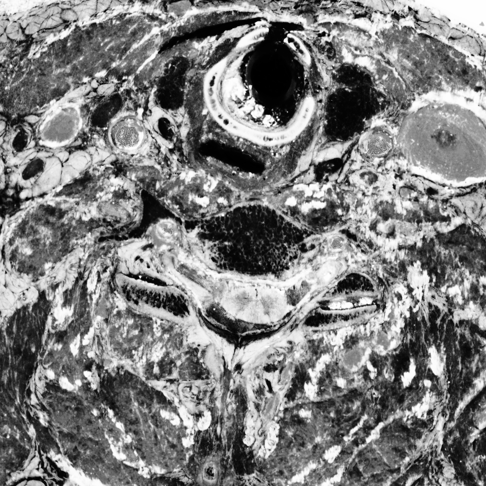
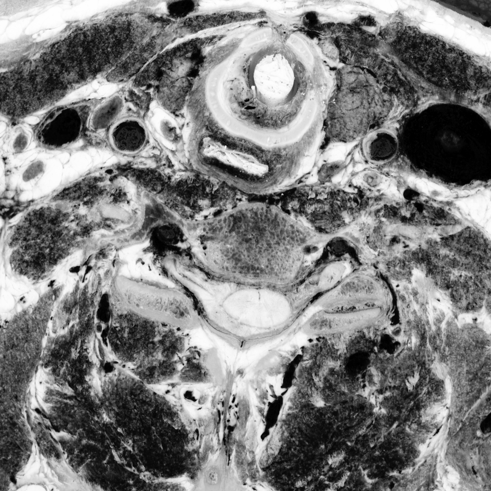
In each slice, we crop out a 1000x1000 region in the center of the thorax, and save these out as PPM images, and join them together into a volume:
foreach SLC ( `echo *.tif` )
  echo $SLC
  unu make -i $SLC -t uchar -s 3 4900 3900 -bs 8024 -e raw \
    | unu crop -min 0 2350 1400 -max 2 m+999 m+999 -o crop2/${SLC:r}.ppm
end
unu join -i crop2/*.ppm -a 3 -o rgb-crop2.nhdr
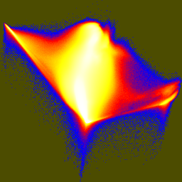
This can then be summation projected along the different axes to get a sense of how the data is behaving:
unu project -i rgb-crop2.nhdr -a 1 -m sum | unu quantize -b 8 -o xsum.png
unu project -i rgb-crop2.nhdr -a 2 -m sum | unu quantize -b 8 -o ysum.png
unu project -i rgb-crop2.nhdr -a 3 -m sum | unu quantize -b 8 -o zsum.png
The amount of inter-slice brightness change means that there is a significant amount of banding visible in the X and Y axis sums. Here's the result of zooming up by a factor of three along Z to see individual slices better:
unu resample -i xsum.png -s = = x3 -k box -o xsum3z.png
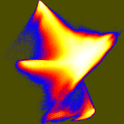
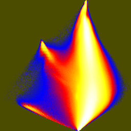
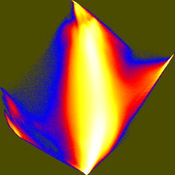
Pair-wise image differences help show what's changing, for instance between slices 1432, 1433, 1434, 1435, and 1436, which straddles one of the large brightness changes. These can be shown either as RGB difference images, or the L2 norm of the RGB difference can be colormapped. The domains of the quantizing and colormapping are held fixed between images to ensure comparability:
unu 2op - crop2/1432.ppm  crop2/1433.ppm -t int \
  | unu resample -s = x0.2 x0.2 \
  | unu quantize -b 8 -min -100 -max 100 -o diff32-33.png
unu 2op - crop2/1433.ppm  crop2/1434.ppm -t int \
  | unu resample -s = x0.2 x0.2 \
  | unu quantize -b 8 -min -100 -max 100 -o diff33-34.png
unu 2op - crop2/1434.ppm  crop2/1435.ppm -t int \
  | unu resample -s = x0.2 x0.2 \
  | unu quantize -b 8 -min -100 -max 100 -o diff34-35.png
unu 2op - crop2/1435.ppm  crop2/1436.ppm -t int \
  | unu resample -s = x0.2 x0.2 \
  | unu quantize -b 8 -min -100 -max 100 -o diff35-36.png

unu 2op - crop2/1432.ppm  crop2/1433.ppm -t int \
  | unu project -a 0 -m L2 | unu rmap -m bbody.txt -min 0 -max 100 \
  | unu resample -s = x0.2 x0.2 | unu quantize -b 8 -o diff32-33cm.png
unu 2op - crop2/1433.ppm  crop2/1434.ppm -t int \
  | unu project -a 0 -m L2 | unu rmap -m bbody.txt -min 0 -max 100 \
  | unu resample -s = x0.2 x0.2 | unu quantize -b 8 -o diff33-34cm.png
unu 2op - crop2/1434.ppm  crop2/1435.ppm -t int \
  | unu project -a 0 -m L2 | unu rmap -m bbody.txt -min 0 -max 100 \
  | unu resample -s = x0.2 x0.2 | unu quantize -b 8 -o diff34-35cm.png
unu 2op - crop2/1435.ppm  crop2/1436.ppm -t int \
  | unu project -a 0 -m L2 | unu rmap -m bbody.txt -min 0 -max 100 \
  | unu resample -s = x0.2 x0.2 | unu quantize -b 8 -o diff35-36cm.png
| 
| 
| 
|
| diff32-33.png | diff33-34.png | diff34-35.png | diff35-36.png |
| 
| 
| 
|
| diff32-33cm.png | diff33-34cm.png | diff34-35cm.png | diff35-36cm.png |
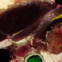
One slice with particular problems is 1476:
unu crop -i crop2/1475.ppm -min 0 130 10 -max 2 m+255 m+255 -o 1475-cropsq.png
unu crop -i crop2/1476.ppm -min 0 130 10 -max 2 m+255 m+255 -o 1476-cropsq.png
unu crop -i crop2/1477.ppm -min 0 130 10 -max 2 m+255 m+255 -o 1477-cropsq.png
| 
| 
|
| 1475-cropsq.png | 1476-cropsq.png | 1477-cropsq.png |
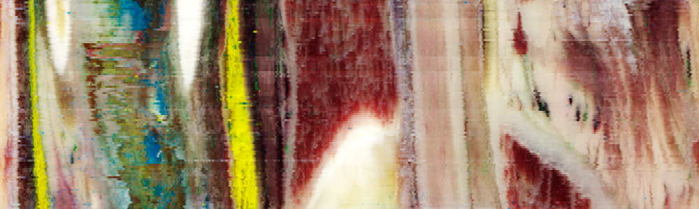
The changes between slices are particularly visible if we look at just one slice through X and then zoom up:
unu slice -i rgb-crop2.nhdr -a 1 -p 500 \
  | unu resample -s = = x3 -k box -o x500.png
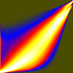
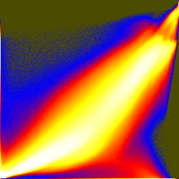
Joint histograms show how the different RGB components vary together or not. These are histogram equalized and then colormapped in order to show low bin counts better:
unu dice -i rgb-crop2.nhdr -a 0 -o crop2/col
unu jhisto -i crop2/col0.nrrd crop2/col1.nrrd -b 256 256 -t float \
  | unu gamma -g 10 | unu heq -b 2046 -s 1 | unu rmap -m cmap.txt \
  | unu flip -a 2 | unu quantize -b 8 -o rgb-jhist-01.png
unu jhisto -i crop2/col0.nrrd crop2/col2.nrrd -b 256 256 -t float \
  | unu gamma -g 10 | unu heq -b 2046 -s 1 | unu rmap -m cmap.txt \
  | unu flip -a 2 | unu quantize -b 8 -o rgb-jhist-02.png
unu jhisto -i crop2/col1.nrrd crop2/col2.nrrd -b 256 256 -t float \
  | unu gamma -g 10 | unu heq -b 2046 -s 1 | unu rmap -m cmap.txt \
  | unu flip -a 2 | unu quantize -b 8 -o rgb-jhist-12.png
| 
| 
|
| rgb-jhist-01.png | rgb-jhist-02.png | rgb-jhist-12.png |
Principal component analysis will probably be useful in trying to visualize exactly what information the RGB data gives us, other than over-all brightness. I wrote a little program to generate the covariance matrix for this chunk of data:
This generates the covariance matrix:pca/covar -i rgb-crop2.nhdr -w 1 1 1 -o covar.txt
which can be processed in matlab:1.4225677 1.1413215 0.97987062 1.1413215 0.96461695 0.81653774 0.97987062 0.81653774 0.73735553
>> x = dlmread('covar.txt');
>> [v,d] = eig(x);
>> dlmwrite('pcd.txt',v')
>> v

v =

    0.5231    0.6030    0.6023
   -0.7869    0.0702    0.6131
    0.3274   -0.7946    0.5112
pca/xform -i rgb-crop2.nhdr -m pcd.txt -q -o pca-crop2.nhdr
unu dice -i pca-crop2.nhdr -a 0 -o crop2/pca
unu jhisto -i crop2/pca0.nrrd crop2/pca1.nrrd -b 256 256 -t float \
  | unu gamma -g 10 | unu heq -b 2046 -s 1 | unu rmap -m cmap.txt \
  | unu flip -a 2 | unu quantize -b 8 -o pca-jhist-01.png
unu jhisto -i crop2/pca0.nrrd crop2/pca2.nrrd -b 256 256 -t float \
  | unu gamma -g 10 | unu heq -b 2046 -s 1 | unu rmap -m cmap.txt \
  | unu flip -a 2 | unu quantize -b 8 -o pca-jhist-02.png
unu jhisto -i crop2/pca1.nrrd crop2/pca2.nrrd -b 256 256 -t float \
  | unu gamma -g 10 | unu heq -b 2046 -s 1 | unu rmap -m cmap.txt \
  | unu flip -a 2 | unu quantize -b 8 -o pca-jhist-12.png
| 
| 
|
| pca-jhist-01.png | pca-jhist-02.png | pca-jhist-12.png |
The first joint histogram projects out the direction of maximum variation, and shows the distribution along the two non-brightness directions. In the second and third histograms, the principal axis is vertical.
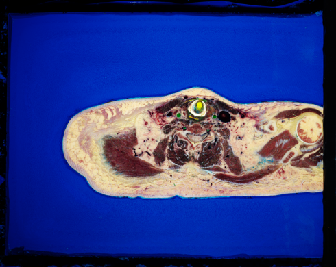
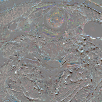
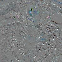
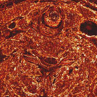
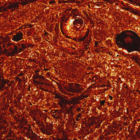
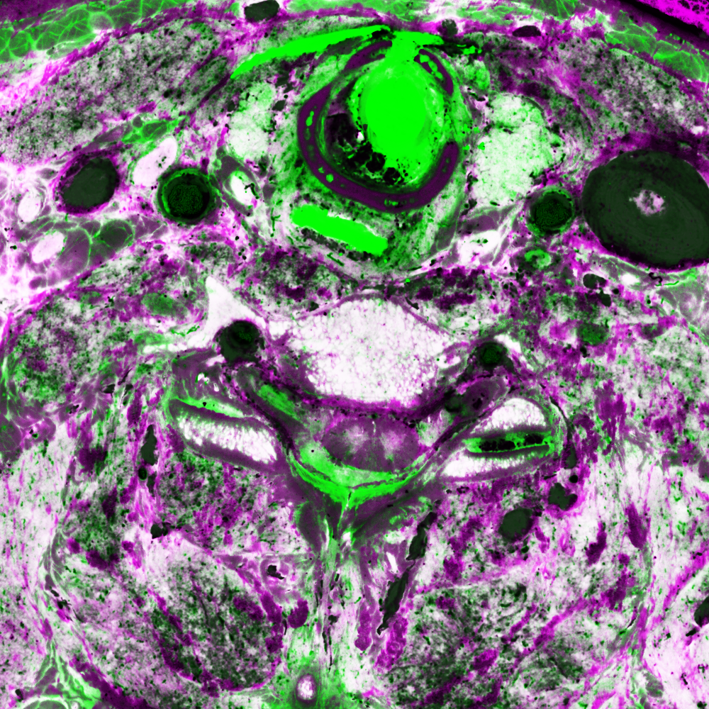
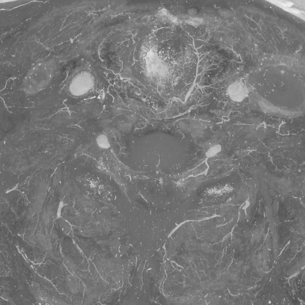
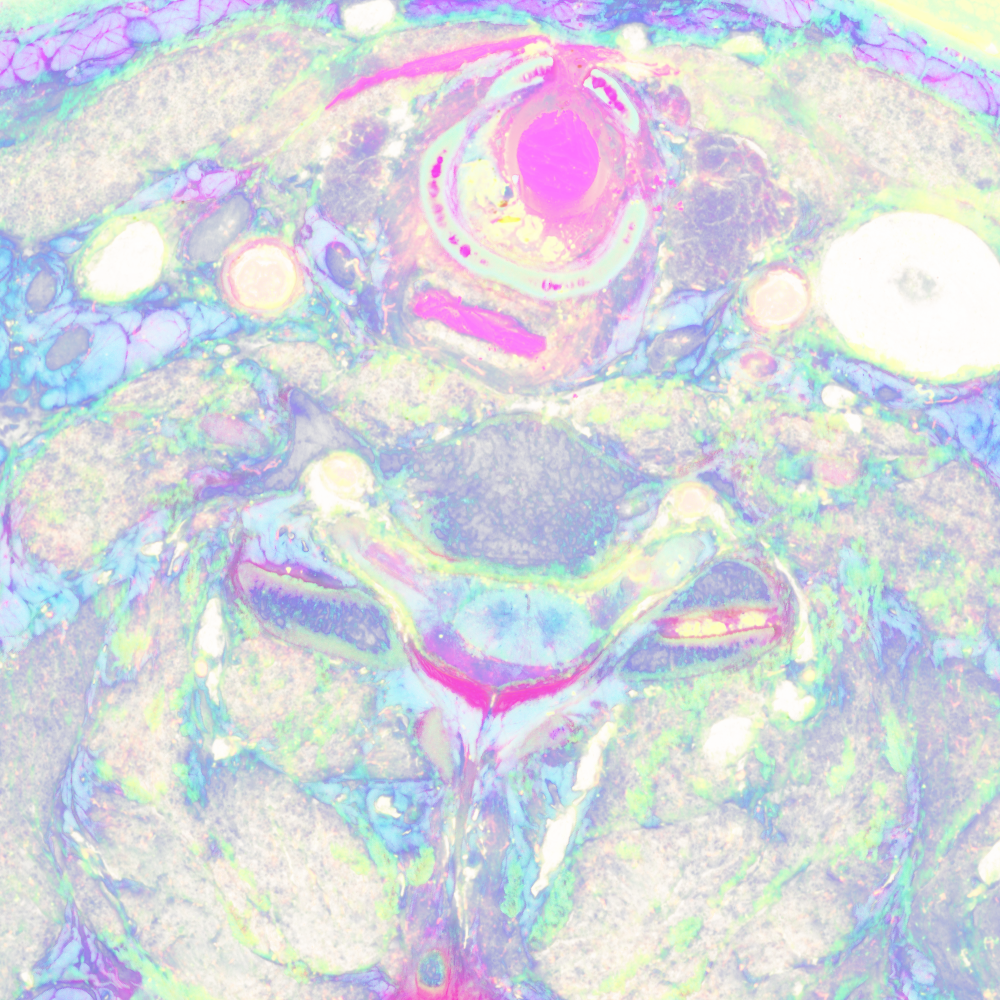
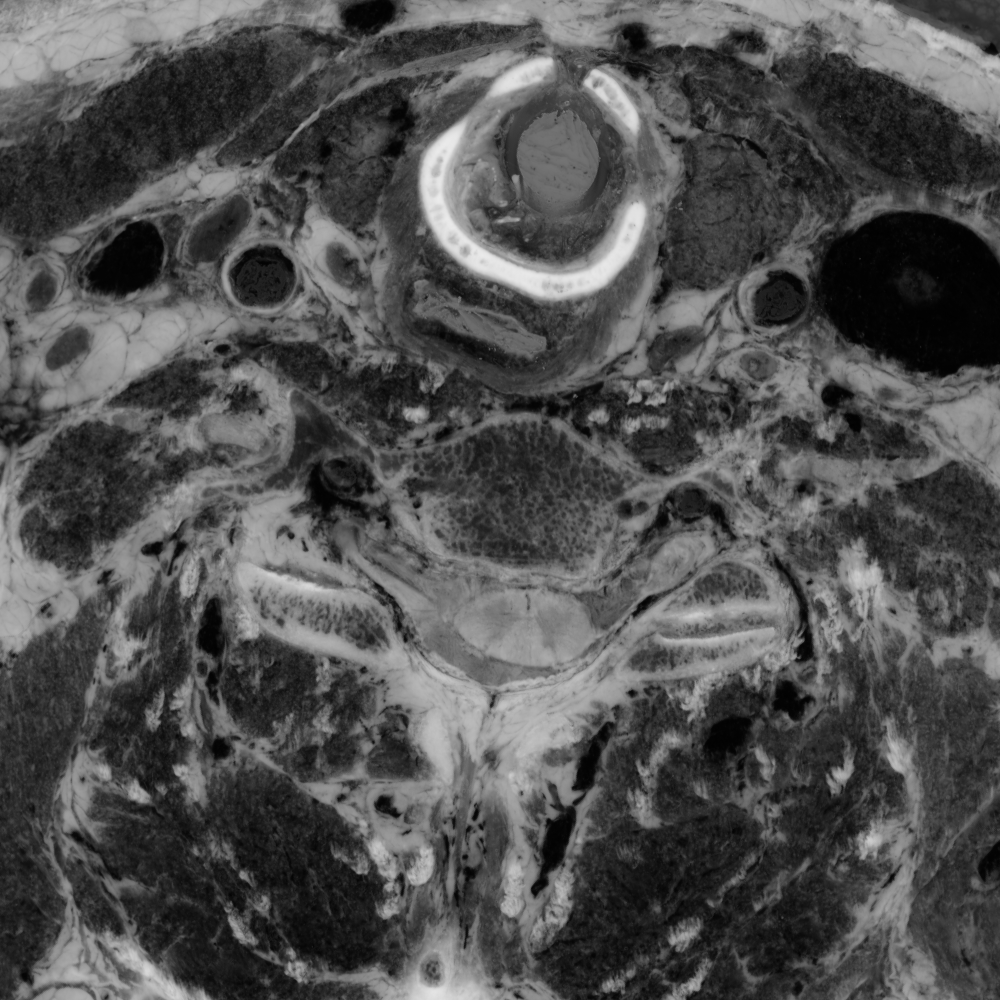
Here's a comparison of an RGB slice with a slice that shows only the smaller two (orthogonal to brightness) components from the PCA. In the second image, the RGB values come from the smallest, medium, and smallest principal components, respectively:
unu slice -i rgb-crop2.nhdr -a 3 -p 30 -o rgb-z30.png
unu resample -i rgb-z30.png -k cubic:0,0.5 -s = x0.4 x0.4 -o rgb-z30th.png
unu slice -i pca-crop2.nhdr -a 3 -p 30 | unu dice -a 0 -o ./
unu heq -i 0.pgm -b 2048 -s 1 -o 0.pgm
unu heq -i 1.pgm -b 2048 -s 1 -o 1.pgm
unu join -i 0.pgm 1.pgm 0.pgm -a 0 -incr -o pca-z30.png
unu resample -i pca-z30.png -k cubic:0,0.5 -s = x0.4 x0.4 -o pca-z30th.png
| 
|
| rgb-z30.png | pca-z30.png |
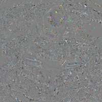
It turns out that neither principal component is by itself very good for showing vasculature, but if you weight the smaller two components by -1 you get something okay. Ideally this could be explored in some interactive way.
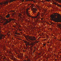
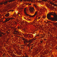
echo "-1 -1 0" | unu 2op x pca-crop2.nhdr - \
  | unu project -a 0 -m sum | unu quantize -b 8 -o crop2/pcaV.nhdr
unu project -i crop2/pcaV.nhdr -a 2 -m max -o pcaV-zmax.png
unu resample -i pcaV-zmax.png -k cubic:0,0.5 -s x0.4 x0.4 -o pcaV-zmaxth.png
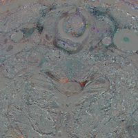
Finally, I wanted to see what new information the UV slices gave us. The UV slices were cropped and joined exactly as the RGB slices above to generate a 3x1000x1000x100 volume. The regular RGB and UV volumes were joined together, and the covariance matrix generated. One has a choice of how one weights the different components, so I tripled the weight of the UV green and blue channels, while nixing the the UV red channel, since there didn't seem to be much signal there.
In matlab:unu join -i rgb-crop2.nhdr ../../uv/1400-1499/crop2/uv-crop2.nhdr \ -a 0 -o rgbuv-crop2.nhdr pca/covar -i rgbuv-crop2.nhdr -w 1 1 1 0 3 3 -o uvcovar.txt
>>    x = dlmread('uvcovar.txt');
>>    [v,d] = eig(x);
>>    dlmwrite('pcd.txt',v')
>> v

v =

   -0.0041    0.0300   -0.5634   -0.5021    0.5080    0.4141
    0.0022   -0.1814    0.7670   -0.0807    0.4241    0.4386
    0.0133    0.2176   -0.2203    0.8323    0.2528    0.3839
   -0.9996    0.0242    0.0061    0.0095    0.0080   -0.0016
    0.0210    0.9427    0.2054   -0.2061   -0.1201    0.1088
   -0.0120   -0.1722   -0.0592   -0.0778   -0.6955    0.6906

>> d

d =

    0.0001         0         0         0         0         0
         0    0.0588         0         0         0         0
         0         0    0.1213         0         0         0
         0         0         0    0.2095         0         0
         0         0         0         0    1.7679         0
         0         0         0         0         0    8.6054
pca/xform -i rgbuv-crop2.nhdr -m pcd.txt -q -o pcauv.nhdr
unu crop -i pcauv.nhdr -min 2 0 0 0 -max 4 M M M \
  | unu dice -a 0 -o crop2/pcauv
unu jhisto -i crop2/pcauv0.nrrd crop2/pcauv1.nrrd -b 256 256 -t float \
  | unu gamma -g 10 | unu heq -b 2046 -s 1 | unu rmap -m cmap.txt \
  | unu flip -a 2 | unu quantize -b 8 -o pcauv-jhist-01.png
unu jhisto -i crop2/pcauv0.nrrd crop2/pcauv2.nrrd -b 256 256 -t float \
  | unu gamma -g 10 | unu heq -b 2046 -s 1 | unu rmap -m cmap.txt \
  | unu flip -a 2 | unu quantize -b 8 -o pcauv-jhist-02.png
unu jhisto -i crop2/pcauv1.nrrd crop2/pcauv2.nrrd -b 256 256 -t float \
  | unu gamma -g 10 | unu heq -b 2046 -s 1 | unu rmap -m cmap.txt \
  | unu flip -a 2 | unu quantize -b 8 -o pcauv-jhist-12.png
| 
| 
|
| pcauv-jhist-01.png | pcauv-jhist-02.png | pcauv-jhist-12.png |
unu slice -i crop2/pcauv0.nrrd -a 2 -p 30 \
  | unu heq -b 256 -s 1 -o pcauv0-z30.png
unu slice -i crop2/pcauv1.nrrd -a 2 -p 30 \
  | unu heq -b 256 -s 1 -o pcauv1-z30.png
unu slice -i crop2/pcauv2.nrrd -a 2 -p 30 \
  | unu heq -b 256 -s 1 -o pcauv2-z30.png
unu resample -i pcauv0-z30.png -k cubic:0,0.5 -s x0.4 x0.4 -o pcauv0-z30th.png
unu resample -i pcauv1-z30.png -k cubic:0,0.5 -s x0.4 x0.4 -o pcauv1-z30th.png
unu resample -i pcauv2-z30.png -k cubic:0,0.5 -s x0.4 x0.4 -o pcauv2-z30th.png
| 
| 
|
| pcauv0-z30th.png | pcauv1-z30th.png | pcauv2-z30th.png |
unu join -i pcauv?-z30.png -a 0 -incr -o pcauv012-z30.png
unu resample -i pcauv012-z30.png -k cubic:0,0.5 -s = x0.4 x0.4 -o pcauv012-z30th.png
unu slice -i pcauv.nhdr -a 0 -p 5 | unu slice -a 2 -p 30 -o pcauvP-z30.png
unu resample -i pcauvP-z30.png -k cubic:0,0.5 -s x0.4 x0.4 -o pcauvP-z30th.png
|
| 
|
| pcauv012-z30th.png | rgb-z30.png | pcauvP-z30th.png |
But based on this initial exploration, I would say that it will very difficult to isolate nervous tissue by value-based segmentation in color space; either the 3-D space of original RGB, or the 6-D space of RGB plus UV data.